Conecta Tutoriales // Adobe User Group
View allAll Photos Tagged tutorial
I followed a Julieanne Kost tutorial the other day and somehow I must have missed a step because it wasn't supposed to be quite like this. One day I will start again but in the meantime I thought I'd keep this anyway, I quite liked it.
These are 10 images of mine, severely cropped after applying 2 blur filters.
…Or how to squeeze flowers into those teeny-weenie drops
I’ve had several people text me about the earlier “Drops of Art (Carney)” post and that they appreciated the explanation of how refractions works. Some requested additional information about creating water drop photos, so I’m posting this older photo and original tutorial:
I have always been drawn to nature and wildlife photography. I love taking my camera way up north to capture images of seldom-seen animals and exotic scenery. Unfortunately, we can’t always plan distant adventures to shoot photographs of moose and northern lights. But we can train our eyes to find the unexpected beauty in our own backyards.
My fascination (some might call it an obsession) with water drops began when I bought a Nikon D200 last summer. Sadly, the lens I wanted was out of stock. There was no way I was going to just look at my camera body while I waited, so I picked up a Nikkor 60mm macro. Through that lens I discovered worlds of complexity hidden within the simplest tiny drops of water.
I’m often asked if the images inside the water drops are real or the product of Photoshop. Let me assure you they are real, and anyone can find them if they know how to look. Simple physics produces these tiny, beautiful and common images. Water is cohesive, it naturally bonds together in the shape of a sphere, and in that shape it functions as a miniature lens that will refract nearby objects. Using that organic lens as seen through your technological lens, will allow you to explore those tiny, complex worlds.
The water drop photos on my stream have been the result of an evolutional process. My most viewed, most faved and most interesting photo (according to flickr) was taken almost by luck, lying flat on my belly using a Diet Coke can as tripod. But after a great deal of trial and error, I’ve come up with a few simple, consistent steps for more easily creating a water drop photograph.
1. Focus
2. Focus
3. Composition
4. Background
1. Focus: No, that's not a typo; focus is listed twice, and for a very good reason. It’s necessary to consider the focus of the water drop itself as well as the focus of the subject displayed within the drop. My initial concern is the water drop itself and the plant on which the drop is located. I like to set my camera to aperture priority to control the depth of field. The trick is to have enough depth of field so the drop and the plant (and maybe some nearby drops) are all in focus, while leaving the background sufficiently blurred so it doesn't compete for attention. I generally use f8 to f10 but I’ll sometimes stop down to f18 if the background does not need as much blur. I also find I get a sharper focus by backing away just a little and cropping the photo, rather than getting as close as possible in an attempt to get maximum magnification.
2. Focus: As seen in the example above, the water drop is in focus as is the image of the flower seen through the water drop, but the flower itself is not in focus. That effect is achieved not by adjusting the camera, but by relying on the water drop to act as a fixed focal lens. In other words, instead of adjusting the camera I adjust the object I want to appear within the water drop. I simply move it back or forward until I've found the clarity of focus I want. Some photos look better with blurred refractions. For the greatest clarity I've found the object should be 3-4 inches behind the water drop. This, of course, may vary if using a different macro lens. Be sure to experiment.
3. Composition: Obviously, the guidelines for good composition apply to water drop photographs. Attention should be given to the Rule of Thirds, to simplicity, to the geometry within the frame, and to all the usual elements of visual composition. It's important to remember, though, when photographing water drops that the very shape of the drop influences compositional decisions. Since the lens of the water drop is spherical (or nearly so), slight adjustments in the camera position…left, right, up, down…can have a radical effect on what is seen within the drop. Again, experiment.
4. Background: If you're working from nature, your control over the background is necessarily limited. You have to work with what you've got. As mentioned earlier, the unique qualities of the organic lens formed by a drop of water allows you to make minor adjustments in the camera position that will have a profound effect on what's seen within the drop. With a few simple props, you can gain better control over the background. For example, I often rely on a large sheet of insulation, which is bright blue on one side. I originally used it to block the wind, but noticed that even on the dreariest of days it can mimic a perfect azure sky.
Other Considerations: Almost every time I set out to take photographs of water drops, I learned something new. There was always some new factor to consider. I learned, for example, I could get bigger, more cohesive and more interesting drops on humid days. I discovered that even the slightest wind could have disastrous effects on macro focusing, as well as on the water drops themselves. I found that very slightly adjusting the exposure (-0.3EV to –0.7EV) would compensate for the natural sheen of the surface of the water drop, keeping it from being somewhat burnt out. Most important, I had to teach myself to remember that because a water drop acts as an organic lens, it presents everything upside down and in reverse (just like a pinhole camera or a large format camera).
So now I’m one of the few people who looks forward to really still, stifling, humid days. And even though my beautiful Nikkor 18-200mm has arrived, I still have my macro on more than half the time. Water drop photos are not only real, but also addicting to try to master.
That's it. That's how it's done. It's as simple as learning how chess pieces move, and just as complex as a game of chess. Good luck and think small.
Thanks!
Steve
As quite a number of you have asked here is how I do the texture.
First of all you do need to have Photoshop, I am sure you can do it in another way but I don't know that and maybe someone else does.
Oi gente....
Fiz um Tutorial (que tá hilário) de um look que eu uso de dia e de noite...
Veja aqui!!!
Estou aguardando o feedback de vcs, gente....
É a primeira vez q eu faço um vídeo e eu tava meio nervosa....rs...
Perdoem os erros, ok?!?
Espero opiniões e sugestões!!
E críticas tbm...
rs
Bjoooooos
EDIT
Meninas....
Disponibilizei o video numa qualidade melhor aki ó
Que feliz!!! Hj o flickr colaborou comigooo.
Mel, esse é especial para vc! É o look do amigo oculto. Finalmente.. Rs...
Para ler, no tamanho grande fica melhor. Não tá gigante pq não tem muitos detalhes, então não precisa!
BEIJOS
When the worldwide Covidcorona shutdown happened, I decided to take my best photography tutorial from store.stuckincustoms.com and make it FREE so people could learn from the Beginning Photography videos while they were all cooped up. We just checked Shopify and we gave away $125,000+ worth so people really seem to love it! Anyway, this is a last warning that it will only last another 24 hours... so get on in there if you haven't yet!
Dec 12
Well since I didn't feel like ordering a bunch of legos flashmasks a decided to try to make my own.
You will need:
-Green stuff (or something like it)
-A thin but hard plastic sheet
-A stud
-A lego head to sculpt on
This is how you can do it for yourself step by step:
1-Cut of the antistud-ring part of a stud.
2-Glue a thin piece of plastic on top of the ring on the side you cut.
(to prevent the sculpting material to get in the antistud)
3-Put it onto a lego head (tip is to take a scrappy head and glue a stud underneath to make it easier to remove it afterwards and then put lots of oil(for example olive oil) on top of the head)
4-Make a thin pretty rough sculpt around the head.
5-Cut out the eye parts and the underline of the mask and sand it.
(sculpt again if needed)
6-Remove it from the head. (It won't stick to the head if ypu use the oil on the head)
7-Paint it as you want.
(8-Add other details to it. You can use for example a hard, thin plasticsheet or just sculpt)
Hope you feel inspired :)
Comment if you did get inspired and what you think of it.
This helmet is not done for what I'm going to use it for. :P
This is actually really old but yesterday I noticed I never posted it, so here it is, a tutorial on light stencils.
I have told you about GIMP, a free Image Manipulation Program. It works really well, and I´d say as well as Photoshop, and the bonus...IT´S FREE!
I took the originals of few of my photos that I´ve manipulated in Photoshop and re-did them in GIMP, getting the same results.
But as always, it´s best to start slowly and get to know the program and first of all, learn how to download GIMP. For those of you who don´t have gimp, here is a link to how to download it:
www.flickr.com/photos/soffia/2339766783/
The tutorial with explanation images is here: www.soffia.net/gimptutorial02.html
1. Select from the menu: File → Open and choose the Image you´re gonna work with
2. Select from the menu: Colors → Brightness-Contrast...
3. Drag the slider up to 20 or write the number 20 in the box next to contrast. Click OK. Play around with different numbers in both brightness and contrast.
This tutorial is done in Photoshop CS3, and you need some basic knowlegde to follow it. The numbers are the exact ones I used.
Step by step snapshots at www.soffia.net/tutorial.html
1. I duplicade the layer twise, on one layer I erase out carefully the mountain with soft eraser, opacity 100 flow around 60. (you can also use masks) One layer is just to have the photo as it is.
2. Name the layers ( image01) mountains, clouds and just_in_case_layer.
3. Go to creatae new fill or adjustment layer and choose Levels. (Image 02) I tweeked the 3 arrows untill I got 8 ~ 0,73 ~ 200
4. Go to creatae new fill or adjustment layer again but this time choose Brightness/Contrast. and put in -12 for brightness and contr. -28 (Image03)
5. Go to creatae new fill or adjustment layer again and choose Hue/Saturation. (Image 04)
take up saturation to 22
6. For now, I´m fairly happy with the mountains, so now I drag the Clouds layer on top of all the layers. (Image 05)
7. Then I merge the mountains with all the adjustment layers by selecting all the layers, and choose merge layers (Image 06)Name the Layer mountains again if it´s called hue/saturation.
8. Now we can work on the clouds, you can turn off the mountains layer by clicking on the eye on the left. Go to creatae new fill or adjustment layer and choose Levels. (Image 02) I tweeked the 3 arrows untill I got 18 ~ 0,84 ~ 215
9. I want a little more contrast in the big cloud so duplicade the clouds layer, name it cloud-contrast go to Image - Adjustment - Levels. Use 59~ 0,64~ 195. The reason why I choose levels from there is cause I only want it to affect the new cloud layer(Image 07)
10. with the cloud-contrast layer picked, go to Image - Adjustment - Brightness/Contrast and put brightness to +36 and contrast +17
11. I find the cloud too red, so go to Image - Adjustment - hue/saturation, in Edit: choose
Reds and take the saturation down to -42. After that I rease around it so the layer would look like this (Image 08)
12. Let´s go to the Clouds layer again, Go to creatae new fill or adjustment layer and choose Brightness/Contrast. put in +45 for brightness (Image03)
13. Go to create new fill or adjustment layer (Image 04) and choose Hue/Saturation. In Edit:
Blues hue: -13 sat: -67
Cyans hue: -10 sat: -57 (or tweek the numbers untill you´re happy with the colors......)
15. Merge the layers by selecting Cloud-contrast,clouds and the all the adjustment layers(image 06) (you can also select the layers and hit Ctrl + E )
16. Turn on the Mountains Layer. Flatten image. Then I did some more adjucstment with hue/sat, cyan -9 and -39 then blues -4 and -22 and Yelloes -35. And then I went to levels and did 8 ~ 1,16 ~ 255.
17. Then I put the lomo gradient fill with 40 % opacity on that layer
I did use the clone stamp to erase out a part of the sky, the dark bottom part... :P
And finally I ran it through Neat Image, a software I bought the other day. neatimage.com/
I could probably spend another hour tweeking and tuning. But let´s say this done for now.
This Bunny was based on this tutorial: tutsplus.
It took me a little while - and now I see that I have chosen the wrong export cmyk instead of rgb. UPDATED: its changed back to the right colors :-)
1 » foto original;
2 » Selecione o rosto sem selecionar olhos, boca e narinas;
3 » Após selecionar, copie (ctrl+c), cole (ctrl+v) e duplique a camada colada (ctrl+j). Na cama da meio, aplique um desfoque gaussiano (Menu Filtro/Desfoque/Desfoque gaussiano/5,0 OK). Na última camada (a de cima), você vai aplicar uma alta frequencia (Menu Filtro/Outros/Alta Frequencia - high pass/1,5 OK). A imagem ficará cinza, então mude para sobrepor (overlay) e una as camadas. Obs.: Caso precise arrumar alguma coisa que ficou "embaçada demais", vá na camada do desfoque gaussiano e passe uma borracha macia com uma opacidade baixa.
4 » Boca: Selecione a boca e vá em Menu Camada/Nova camada de preenchimento/Cor sólida. Escolha uma cor que fique boa pra boca e clique em OK. Caso fique borrado, é só usar a borracha macia (sempre usando a borracha macia =))
5 » Como fica a camada =)
6 » Olhos (oba!): Os olhos são que nem a boca. Você seleciona onde você quer a sombra e o lápis. Nesse passo, fiz o lápis e o delineador. Junto à foto tem as camadas. =)
7 » Mesma coisa. Selecione os olhos e pinte com o preenchimento de camada. Caso precise, dê um desfoque gaussiano pra ficar mais realista e tire um pouco da opacidade ou use a borracha, também. Mudei a cor dos olhos, também. Deixei mais viva a cor. É o mesmo passo. =)
8 » Como os olhos ficaram e o blush, que é a mesma coisa. Selecione as maçãs do rosto e vão em Menu Camada/Nova camada de preenchimento/Cor sólida/Escolha a cor OK e tire a opacidade. Será necessário dar uma desfocada (ctrl+f, caso tenha sido o último filtro que você usou =))
9 » Resultado.
Espero que tenham gostado e que eu tenha ajudado! hehe.
Qualquer dúvida, perguntem! =D
My friend, "pixels in my head" sent me a tutorial for the "lomo effect" and I had to try it. The original version of this image is posted 5 photos before this one. I don't know if I accomplished the desired effect, but it is fun. Please check out Dewaun's photostream to see his lomo effect image:
www.flickr.com/photos/dewaun/304521245/
He has also posted the tutorial website.
What do you think? I'm going to have to experiment some more...
Tutorial.
Duplicate layer, right click on layer and choose duplicate layer, name it 01.
Now you have 2 Layers, called Background and 01. Make sure the 01 layer is chosen.
Go to Layer - New Adjustment layer - Brightness Contrast. brightness 0 contrast +17
Go to Layer - New Adjustment layer - Levels - the numbers are 12, 1,00, 215.
Now I´m happy with the sky for now, so now we´ll fix the rocks in the forground.
Duplicate the Background layer, name it 02, and drag it on top of all the layers.
Go to Image - Adjustment layer - Levels ( nb, now go to IMAGE not LAYER) Set it to 17 , 1,91 , 196
With the Erase tool(or Masks) erase the sky and the hill.
Go to Layer - New Adjustment layer - Hue/Saturation. Choose:
Cyan, -18, -31, 0
Blues, -16, -23, 0
And finally I put a little lomo vignette ( how to? you´ll find that here www.flickr.com/photos/soffia/1398672858/in/set-7215760238...
The opacity on the vignette layer on this photo here is 50%
In this advanced Photoshop tutorial I will show you how to create a nice floating woman in a forest. We will turn the forest from day to night effect in Photoshop and we will mask the sky using Calculations. We will create realistic depth of field using a Depth Map and we’ll paint realistic hair and light effects.
Tutorial here: www.psdbox.com/tutorials/fantasy-photoshop-tutorial-float...
I've got a little good news under the stars here in New Zealand for you all on a rather dreary week! I don't know if you've seen my two recent videos on "Despair" and "Anxiety" - but in one of them I mentioned that a great way to escape from your own crazy-monkey mind is to help other people!
I'm not saying this is a self-congratulatory way, but just because it's kinda cool and maybe it will help others be outward-focused as well! First, if you're bored at home, why not learn photography, eh? I took my best Beginning Photography course, filmed here in New Zealand, and made it TOTALLY FREE - people seem to love it and Stu says we have over $50,000 worth of downloads already - that's awesome and I hope you all are enjoying it.
Link below...
Also, I want to send a shout out to my friends over at Monday.com for helping out with a new information-sharing initiative that's just about to get started here in NZ that should help with the COVID-19 sitch.
Besides all that stuff, I'm gonna make some more videos here in the next several days... people seem interested in these topics: 1) conspiracy theories and why you shouldn't believe them 2) my full death experiences and why I'm not afraid to die 3) what kind of evolved society will emerge after this 4) what the heck I get up to on a daily basis in solo isolation 5) ways to thrive and create in this new paradigm... and more!
I may even make some fun videos with good 'ol Gino. Hey man I have a lot of spare time and I can't play video games ALLLL day!!
store.stuckincustoms.com/collections/tutorials/products/b...
Ever wondered how to build good tudor style walls?
Check out our latest tutorial by Titus V. on brickbuilt.
Hey everyone.
Isaac and John asked me to write a small tutorial for my waterfall design to be featured on their awesome site www.brickbuilt.org/.
Check it out here!
I create this image in my new video tutorial. It's all about Giants ;)
I shot the background in Dubai and the models in the studio ;)
If you like to see more: tutorial.adriansommeling.com
TUTORIAL ♥♥
A lot of people asked me how special shaped bokehs are done. I decided to put together a tutorial and explain things in details.
This is a single shot out of the camera! Nothing was added in Photoshop.
Special thanks to Tony who helped me with the picture formatting!
#28
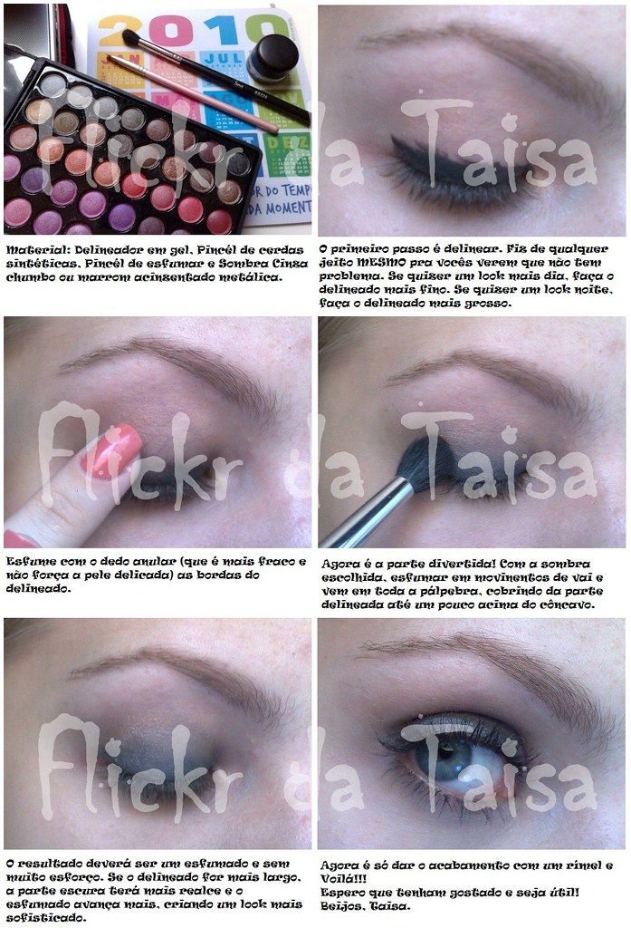
Oi meninas, final do ano a gente tem aquele monte de eventos né? É festinha disso, encerramento daquilo, coquetel, amigo secreto, festa de fim de ano da empresa... pensando nisso resolvi hj fazer uma make não muito cheguei, mas bem bonita pra esses tipos de evento.
Fotografei o passo a passo, mas tô com uma preguiça enorme de editar, vcs perdoam???? rs rs rs
O que usei:
- Fixador de Sombra Contém 1G
- Sombra Pérola do trio Hippie Chic NYX
- Sombra 06 Duda Molinos
- Sombra Marrom Cintilante Contém 1G
- Iluminador Sun Light Nivea
- Jumbo Eyeshadow cor Gold NYX
- Rímel Ashtoning AVON
Depois eu aviso quando postar o tutorial tá?
Many of you have requested a Poseable Arms Tutorial, so here it is, as promised! I explained the best I can, but if you have further questions, don't hesitate to ask. Have extra pieces in case of an accident; you may need multiple test trials for this (I know I did :P). I hope you can use this tutorial to improve your figures! View on all sizes for close-ups on the instructions.
What you will need:
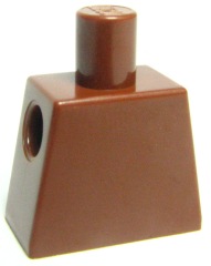
-Torso - www.bricklink.com/PL/973.jpg?1
-Arms - www.bricklink.com/PL/981982.jpg?0

-Old skeleton arm - www.bricklink.com/PL/6265.gif?0
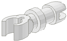
-Lever - www.bricklink.com/PL/4593.gif?0

-A crafting knife
-Superglue
-Andrew
Inspired by THIS Tutorial - with thanks!
Somehow, this song comes to mind when I look at my little creation - ENJOY!
This is the south Moulton Barn on Antelope Flats road near Moose Junction in Grand Teton National Park. The panorama was constructed from two 12.5 megapixel hdr images( 5 exposures each). The full size original is 9551 x 3155 pixels. It was so easy to produce I thought I would share this as a tutorial.
View large - 'Moulton Panorama' On Black
View Orginal Size - Moulton Panorama
View the entire Tetons - East and West Set
View the Tutorial Set.
View my - Most Interesting according to Flickr
Other tutorials you may be interested in...
2. A Simple method of Dodging and Burning
3. Lab mode for Pumping up the Color
I'm writing a series of reroot tutorials, and just posted the first part on my blog: lovalizious.blogspot.nl/2013/12/blythe-reroot-tutorial-pa...
Let me know what you think!
Gostaria do tutorial destes box, para passar para uma amiga muito querida Lelê Ceschini, se alguém tiver, agradeço!
bjos
This tutorial explains how I built the 45° roof of my Riften Watchtower, and also shows the method I used to make the plank siding underneath the roof-line.
Check it out on brickbuilt.
This is the second tutorial geared around the frame warping and a little more on shadowing using PS CS2. Also see below for the first tutorial on creating a OOB as well. Please let me know of any errors or if you have questions here.
Working on a temple and decided to add an interior. Wanted to play around a bit with the floor and found some inspiration looking at -LittleJohn and Katie Walker’s work so I decided to make a tutorial :) Hopefully some people will find it useful. The full build should be done fairly soon so stay tuned ;)
NEW VIDEO! iPhone Photography Tutorial: Lippen - Surreal Portrait #04 #video
Check link on my Instagram profile for my channel. OR here’s for direct link to video: youtu.be/Ok9e_PtsUGU
Enjoy!
#surreal #icolorama #superimpose #lensdistortions #mextures #iphoneart #mobileart #iphoneonly
•
•
•
•
•
•
•
•
•
•
•
•
#instagram #mobileartistry #shotaward #artsick #fineartphg #expofilm #enter_imagination #graphicroozane #thecreativers #manipulationteam #moodcommunity #launchdsigns #milliondollarvisuals #imaginativeuniverse
#iphoneography #iphone #photography
These are the tutorials I managed to put together during 2018. Not that many, but still a number of them. Most of them were nature themed, and about half of them were a result of my Element Experimentation builds.
Making tutorials is a rather different experience as compared to normal building. It takes a great deal of time and effort to put a tutorial together, compared to making regular builds. You have to take many pictures, think through the flow of the technique and write good descriptive texts for each picture. Tutorials also play out differently on different platforms, so often you have to create multiple versions of the tutorial to fit the platforms you post on.
Also, for me, pretty much all tutorials I make are of techniques I've already showcased in builds before, so tutorials doesn't bring anything new to the table - it just shows how a previously used technique is made.
These two things combined makes tutorial making more of a chore than fun, to be honest. It's a lot of work and it doesn't result in a nice new build. So why do it?
I have personally learned loads from tutorials made by others, and so I have reaped the benefits of their hard work with very little effort on my side. So, making tutorials of your techniques is a way of contributing back to the LEGO community. It may not be the most fun, or get you the most likes or comments, but it's still a satisfying experience knowing that you have given something back.
And of course it puts a smile on your face when you see people starting to use your techniques in their own builds :) I have noticed that both my spruce techniques are seeing quite some use these days, so that's something I'm really happy about :)
This is a visual of one way to improve dark eyes. There are several other things you can do including using a hue/sat adjustment layer combined with it's mask to eliminate color in the whites of the eyes. It's not shown here. LARGE IN SEPARATE WINDOW