Conecta Tutoriales // Adobe User Group
View allAll Photos Tagged Tutorial
Macro Mondays - Beads
Image measures approx. 1" on the long side.
***Thank you www.flickr.com/photos/vibeke/52922816961/in/gallery-57734... for sharing the video tutorial!***
Happy Macro Mondays : )
…Or how to squeeze flowers into those teeny-weenie drops
I’ve had several people text me about the earlier “Drops of Art (Carney)” post and that they appreciated the explanation of how refractions works. Some requested additional information about creating water drop photos, so I’m posting this older photo and original tutorial:
I have always been drawn to nature and wildlife photography. I love taking my camera way up north to capture images of seldom-seen animals and exotic scenery. Unfortunately, we can’t always plan distant adventures to shoot photographs of moose and northern lights. But we can train our eyes to find the unexpected beauty in our own backyards.
My fascination (some might call it an obsession) with water drops began when I bought a Nikon D200 last summer. Sadly, the lens I wanted was out of stock. There was no way I was going to just look at my camera body while I waited, so I picked up a Nikkor 60mm macro. Through that lens I discovered worlds of complexity hidden within the simplest tiny drops of water.
I’m often asked if the images inside the water drops are real or the product of Photoshop. Let me assure you they are real, and anyone can find them if they know how to look. Simple physics produces these tiny, beautiful and common images. Water is cohesive, it naturally bonds together in the shape of a sphere, and in that shape it functions as a miniature lens that will refract nearby objects. Using that organic lens as seen through your technological lens, will allow you to explore those tiny, complex worlds.
The water drop photos on my stream have been the result of an evolutional process. My most viewed, most faved and most interesting photo (according to flickr) was taken almost by luck, lying flat on my belly using a Diet Coke can as tripod. But after a great deal of trial and error, I’ve come up with a few simple, consistent steps for more easily creating a water drop photograph.
1. Focus
2. Focus
3. Composition
4. Background
1. Focus: No, that's not a typo; focus is listed twice, and for a very good reason. It’s necessary to consider the focus of the water drop itself as well as the focus of the subject displayed within the drop. My initial concern is the water drop itself and the plant on which the drop is located. I like to set my camera to aperture priority to control the depth of field. The trick is to have enough depth of field so the drop and the plant (and maybe some nearby drops) are all in focus, while leaving the background sufficiently blurred so it doesn't compete for attention. I generally use f8 to f10 but I’ll sometimes stop down to f18 if the background does not need as much blur. I also find I get a sharper focus by backing away just a little and cropping the photo, rather than getting as close as possible in an attempt to get maximum magnification.
2. Focus: As seen in the example above, the water drop is in focus as is the image of the flower seen through the water drop, but the flower itself is not in focus. That effect is achieved not by adjusting the camera, but by relying on the water drop to act as a fixed focal lens. In other words, instead of adjusting the camera I adjust the object I want to appear within the water drop. I simply move it back or forward until I've found the clarity of focus I want. Some photos look better with blurred refractions. For the greatest clarity I've found the object should be 3-4 inches behind the water drop. This, of course, may vary if using a different macro lens. Be sure to experiment.
3. Composition: Obviously, the guidelines for good composition apply to water drop photographs. Attention should be given to the Rule of Thirds, to simplicity, to the geometry within the frame, and to all the usual elements of visual composition. It's important to remember, though, when photographing water drops that the very shape of the drop influences compositional decisions. Since the lens of the water drop is spherical (or nearly so), slight adjustments in the camera position…left, right, up, down…can have a radical effect on what is seen within the drop. Again, experiment.
4. Background: If you're working from nature, your control over the background is necessarily limited. You have to work with what you've got. As mentioned earlier, the unique qualities of the organic lens formed by a drop of water allows you to make minor adjustments in the camera position that will have a profound effect on what's seen within the drop. With a few simple props, you can gain better control over the background. For example, I often rely on a large sheet of insulation, which is bright blue on one side. I originally used it to block the wind, but noticed that even on the dreariest of days it can mimic a perfect azure sky.
Other Considerations: Almost every time I set out to take photographs of water drops, I learned something new. There was always some new factor to consider. I learned, for example, I could get bigger, more cohesive and more interesting drops on humid days. I discovered that even the slightest wind could have disastrous effects on macro focusing, as well as on the water drops themselves. I found that very slightly adjusting the exposure (-0.3EV to –0.7EV) would compensate for the natural sheen of the surface of the water drop, keeping it from being somewhat burnt out. Most important, I had to teach myself to remember that because a water drop acts as an organic lens, it presents everything upside down and in reverse (just like a pinhole camera or a large format camera).
So now I’m one of the few people who looks forward to really still, stifling, humid days. And even though my beautiful Nikkor 18-200mm has arrived, I still have my macro on more than half the time. Water drop photos are not only real, but also addicting to try to master.
That's it. That's how it's done. It's as simple as learning how chess pieces move, and just as complex as a game of chess. Good luck and think small.
Thanks!
Steve
As quite a number of you have asked here is how I do the texture.
First of all you do need to have Photoshop, I am sure you can do it in another way but I don't know that and maybe someone else does.
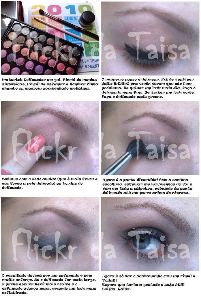
Oi gente....
Fiz um Tutorial (que tá hilário) de um look que eu uso de dia e de noite...
Veja aqui!!!
Estou aguardando o feedback de vcs, gente....
É a primeira vez q eu faço um vídeo e eu tava meio nervosa....rs...
Perdoem os erros, ok?!?
Espero opiniões e sugestões!!
E críticas tbm...
rs
Bjoooooos
EDIT
Meninas....
Disponibilizei o video numa qualidade melhor aki ó
Que feliz!!! Hj o flickr colaborou comigooo.
Mel, esse é especial para vc! É o look do amigo oculto. Finalmente.. Rs...
Para ler, no tamanho grande fica melhor. Não tá gigante pq não tem muitos detalhes, então não precisa!
BEIJOS
When the worldwide Covidcorona shutdown happened, I decided to take my best photography tutorial from store.stuckincustoms.com and make it FREE so people could learn from the Beginning Photography videos while they were all cooped up. We just checked Shopify and we gave away $125,000+ worth so people really seem to love it! Anyway, this is a last warning that it will only last another 24 hours... so get on in there if you haven't yet!
OMG it is March already! And it's time for a new LAUNCH!
The Cyber Bracelet - [Chris Two Designs] and the Universal Emoji HUD -[Chris Two Designs], Launching on the Cyber Fair March 4th.
Taxi: [Chris Two Designs] at Cyber Fair by Access
• The Cyber Bracelet Includes:
- Works with the "Universal Emoji HUD" that contains 245 different emojis
- Summoning Animation: Wear your Bracelet fully open or only the first Ring
- Hologram: Display all your Emojis on a floating holographic screen
- Particle System: Send flying Emojis to anyone around you
- Neon Colour: Infinite options (colour picker)
- Always On Mode: Wear your Bracelets open or closed.
- When OFF, the bracelet layer will cascade in an animation sequence
This is actually one of the locations that Lee and Patrick from Fstoppers.com and I used as a lesson while filming Photographing The World. While some of you already know that, something you may not know is that Lee almost got us kicked out of here for flying his DJI Phantom 2! Apparently local building security thought we were using it to spy on people in their tiny apartments. Thankfully I was able to sweet talk my way out of the situation and still come away with the shot!
It’s unbelievable to me that people can live so tightly packed in like this. On the other hand, it’s also really cool to think that a place that most people rarely give a second look, or consider to be so ugly, can look so beautiful and interesting to a photographer. It reminds me of all those years ago when I was wandering the Stockholm Underground and came across what has always been one of my favorite photos in my portfolio, Belly of the Beast. It’s seeing places like this that always remind me that beauty is truly in the eye of the beholder.
To learn the techniques I used to shoot and post-process this image, you can find all the info about my new tutorial video series by visiting: bit.ly/landcape-cityscape-photography-tutorials
Dec 12
Well since I didn't feel like ordering a bunch of legos flashmasks a decided to try to make my own.
You will need:
-Green stuff (or something like it)
-A thin but hard plastic sheet
-A stud
-A lego head to sculpt on
This is how you can do it for yourself step by step:
1-Cut of the antistud-ring part of a stud.
2-Glue a thin piece of plastic on top of the ring on the side you cut.
(to prevent the sculpting material to get in the antistud)
3-Put it onto a lego head (tip is to take a scrappy head and glue a stud underneath to make it easier to remove it afterwards and then put lots of oil(for example olive oil) on top of the head)
4-Make a thin pretty rough sculpt around the head.
5-Cut out the eye parts and the underline of the mask and sand it.
(sculpt again if needed)
6-Remove it from the head. (It won't stick to the head if ypu use the oil on the head)
7-Paint it as you want.
(8-Add other details to it. You can use for example a hard, thin plasticsheet or just sculpt)
Hope you feel inspired :)
Comment if you did get inspired and what you think of it.
This helmet is not done for what I'm going to use it for. :P
My new BW post processing video tutorial is now ready for download, for a limited time get all 9 videos for the price of 1
Video 1 My Complete BW Workflow
Video 2 Mastering BW Conversions
Video 3 Fine Art Architecture
Video 4 Fine Art Landscape
Video 5 Fine Art Seascape
Video 6 Fine Art Cityscape
Video 7 Fine Art Long Exposure
Video 8 Fine Art Street
Video 9 Minimal Photography
also included are my photoshop files and post processing notes!
An extremely comprehensive post processing tutorial for fine art BW photography
www.vulturelabs.photography/product-page/b-w-post-process...
I made a picture tutorial for creating this image. It was done digitally in Paint Shop Pro X. I made the tutorial for my Smudgepainting group here on Flickr and for all my Digitalnuts friends.
metaversetutorials.blogspot.com/
I have been working on a tutorial site for some of the participants of a virtual conference session, those amongst them who are new to online 3D worlds:
isea2011.sabanciuniv.edu/metaverse-papers
The idea is to do it mostly with screenshots, onto which I have added numerical legends and arrows to show how things flow on the menus. So, hopefully it should only take a few hours to run through the basics of the interface, and also like a quick reference guide for when they are actually online.
Although the examples and locations used are all at NGrid, where the event will be held, I am hoping that novices at other grids can also get usage out of this.
© by Jean Claude Castor I 030mm - Photography I 030mm-Travel
I processed this pic in Lightroom CC Classic only. If you want to know how I did that, feel free to check out my free tutorial videos on my homepage :
030mm-photography.com/lr-tutorial-grundlagen-workflow-in-...
This is actually really old but yesterday I noticed I never posted it, so here it is, a tutorial on light stencils.
I have told you about GIMP, a free Image Manipulation Program. It works really well, and I´d say as well as Photoshop, and the bonus...IT´S FREE!
I took the originals of few of my photos that I´ve manipulated in Photoshop and re-did them in GIMP, getting the same results.
But as always, it´s best to start slowly and get to know the program and first of all, learn how to download GIMP. For those of you who don´t have gimp, here is a link to how to download it:
www.flickr.com/photos/soffia/2339766783/
The tutorial with explanation images is here: www.soffia.net/gimptutorial02.html
1. Select from the menu: File → Open and choose the Image you´re gonna work with
2. Select from the menu: Colors → Brightness-Contrast...
3. Drag the slider up to 20 or write the number 20 in the box next to contrast. Click OK. Play around with different numbers in both brightness and contrast.
This tutorial is done in Photoshop CS3, and you need some basic knowlegde to follow it. The numbers are the exact ones I used.
Step by step snapshots at www.soffia.net/tutorial.html
1. I duplicade the layer twise, on one layer I erase out carefully the mountain with soft eraser, opacity 100 flow around 60. (you can also use masks) One layer is just to have the photo as it is.
2. Name the layers ( image01) mountains, clouds and just_in_case_layer.
3. Go to creatae new fill or adjustment layer and choose Levels. (Image 02) I tweeked the 3 arrows untill I got 8 ~ 0,73 ~ 200
4. Go to creatae new fill or adjustment layer again but this time choose Brightness/Contrast. and put in -12 for brightness and contr. -28 (Image03)
5. Go to creatae new fill or adjustment layer again and choose Hue/Saturation. (Image 04)
take up saturation to 22
6. For now, I´m fairly happy with the mountains, so now I drag the Clouds layer on top of all the layers. (Image 05)
7. Then I merge the mountains with all the adjustment layers by selecting all the layers, and choose merge layers (Image 06)Name the Layer mountains again if it´s called hue/saturation.
8. Now we can work on the clouds, you can turn off the mountains layer by clicking on the eye on the left. Go to creatae new fill or adjustment layer and choose Levels. (Image 02) I tweeked the 3 arrows untill I got 18 ~ 0,84 ~ 215
9. I want a little more contrast in the big cloud so duplicade the clouds layer, name it cloud-contrast go to Image - Adjustment - Levels. Use 59~ 0,64~ 195. The reason why I choose levels from there is cause I only want it to affect the new cloud layer(Image 07)
10. with the cloud-contrast layer picked, go to Image - Adjustment - Brightness/Contrast and put brightness to +36 and contrast +17
11. I find the cloud too red, so go to Image - Adjustment - hue/saturation, in Edit: choose
Reds and take the saturation down to -42. After that I rease around it so the layer would look like this (Image 08)
12. Let´s go to the Clouds layer again, Go to creatae new fill or adjustment layer and choose Brightness/Contrast. put in +45 for brightness (Image03)
13. Go to create new fill or adjustment layer (Image 04) and choose Hue/Saturation. In Edit:
Blues hue: -13 sat: -67
Cyans hue: -10 sat: -57 (or tweek the numbers untill you´re happy with the colors......)
15. Merge the layers by selecting Cloud-contrast,clouds and the all the adjustment layers(image 06) (you can also select the layers and hit Ctrl + E )
16. Turn on the Mountains Layer. Flatten image. Then I did some more adjucstment with hue/sat, cyan -9 and -39 then blues -4 and -22 and Yelloes -35. And then I went to levels and did 8 ~ 1,16 ~ 255.
17. Then I put the lomo gradient fill with 40 % opacity on that layer
I did use the clone stamp to erase out a part of the sky, the dark bottom part... :P
And finally I ran it through Neat Image, a software I bought the other day. neatimage.com/
I could probably spend another hour tweeking and tuning. But let´s say this done for now.
1 » foto original;
2 » Selecione o rosto sem selecionar olhos, boca e narinas;
3 » Após selecionar, copie (ctrl+c), cole (ctrl+v) e duplique a camada colada (ctrl+j). Na cama da meio, aplique um desfoque gaussiano (Menu Filtro/Desfoque/Desfoque gaussiano/5,0 OK). Na última camada (a de cima), você vai aplicar uma alta frequencia (Menu Filtro/Outros/Alta Frequencia - high pass/1,5 OK). A imagem ficará cinza, então mude para sobrepor (overlay) e una as camadas. Obs.: Caso precise arrumar alguma coisa que ficou "embaçada demais", vá na camada do desfoque gaussiano e passe uma borracha macia com uma opacidade baixa.
4 » Boca: Selecione a boca e vá em Menu Camada/Nova camada de preenchimento/Cor sólida. Escolha uma cor que fique boa pra boca e clique em OK. Caso fique borrado, é só usar a borracha macia (sempre usando a borracha macia =))
5 » Como fica a camada =)
6 » Olhos (oba!): Os olhos são que nem a boca. Você seleciona onde você quer a sombra e o lápis. Nesse passo, fiz o lápis e o delineador. Junto à foto tem as camadas. =)
7 » Mesma coisa. Selecione os olhos e pinte com o preenchimento de camada. Caso precise, dê um desfoque gaussiano pra ficar mais realista e tire um pouco da opacidade ou use a borracha, também. Mudei a cor dos olhos, também. Deixei mais viva a cor. É o mesmo passo. =)
8 » Como os olhos ficaram e o blush, que é a mesma coisa. Selecione as maçãs do rosto e vão em Menu Camada/Nova camada de preenchimento/Cor sólida/Escolha a cor OK e tire a opacidade. Será necessário dar uma desfocada (ctrl+f, caso tenha sido o último filtro que você usou =))
9 » Resultado.
Espero que tenham gostado e que eu tenha ajudado! hehe.
Qualquer dúvida, perguntem! =D
Hey everyone. Here's a basic tutorial for the wall technique that you can find in my Wizard's Gate build.
1. Start with a row of headlight bricks attached together. This row can be as long as you want the wall to be.
2. Place one plate on the front-most headlight bricks and two plates on the bricks that are further back. add headlight bricks, alternating studs on the back row and 1x1 tiles on the front.
3. Attatch 1x1 with one stud out to the headlight bricks and 1x1 bricks to the studs left on the front row.
4. Add alternating clips on top of the front row as seen in the picture.
5. Attach 1x1 and 1x2 plates onto the clips leaving a small gap between each to achieve a stonework effect. In long sections of this wall, you will run out of space to slide the 1x2 tiles along the clip to acheive the horizontal gap. But that's ok! Just skip one stud and continue the pattern with the clips attached to the other side of the 1x2 plates.
6. You can achieve a streamlined base to the wall using a bracket or any other half plate offset and three plates on top of that. The wall is 3.5 plates out from the headlight bricks and 7 plates above the initial starting plate. Feel free to use your own brickmath to close those gaps, I just showed what worked for me.
Hope that this helps anyone who was wondering how the wall was constructed. Feel free to try it out for yourself!
Tutorial.
Duplicate layer, right click on layer and choose duplicate layer, name it 01.
Now you have 2 Layers, called Background and 01. Make sure the 01 layer is chosen.
Go to Layer - New Adjustment layer - Brightness Contrast. brightness 0 contrast +17
Go to Layer - New Adjustment layer - Levels - the numbers are 12, 1,00, 215.
Now I´m happy with the sky for now, so now we´ll fix the rocks in the forground.
Duplicate the Background layer, name it 02, and drag it on top of all the layers.
Go to Image - Adjustment layer - Levels ( nb, now go to IMAGE not LAYER) Set it to 17 , 1,91 , 196
With the Erase tool(or Masks) erase the sky and the hill.
Go to Layer - New Adjustment layer - Hue/Saturation. Choose:
Cyan, -18, -31, 0
Blues, -16, -23, 0
And finally I put a little lomo vignette ( how to? you´ll find that here www.flickr.com/photos/soffia/1398672858/in/set-7215760238...
The opacity on the vignette layer on this photo here is 50%
I've got a little good news under the stars here in New Zealand for you all on a rather dreary week! I don't know if you've seen my two recent videos on "Despair" and "Anxiety" - but in one of them I mentioned that a great way to escape from your own crazy-monkey mind is to help other people!
I'm not saying this is a self-congratulatory way, but just because it's kinda cool and maybe it will help others be outward-focused as well! First, if you're bored at home, why not learn photography, eh? I took my best Beginning Photography course, filmed here in New Zealand, and made it TOTALLY FREE - people seem to love it and Stu says we have over $50,000 worth of downloads already - that's awesome and I hope you all are enjoying it.
Link below...
Also, I want to send a shout out to my friends over at Monday.com for helping out with a new information-sharing initiative that's just about to get started here in NZ that should help with the COVID-19 sitch.
Besides all that stuff, I'm gonna make some more videos here in the next several days... people seem interested in these topics: 1) conspiracy theories and why you shouldn't believe them 2) my full death experiences and why I'm not afraid to die 3) what kind of evolved society will emerge after this 4) what the heck I get up to on a daily basis in solo isolation 5) ways to thrive and create in this new paradigm... and more!
I may even make some fun videos with good 'ol Gino. Hey man I have a lot of spare time and I can't play video games ALLLL day!!
store.stuckincustoms.com/collections/tutorials/products/b...
Ever wondered how to build good tudor style walls?
Check out our latest tutorial by Titus V. on brickbuilt.
In this advanced Photoshop tutorial I will show you how to create a nice floating woman in a forest. We will turn the forest from day to night effect in Photoshop and we will mask the sky using Calculations. We will create realistic depth of field using a Depth Map and we’ll paint realistic hair and light effects.
Tutorial here: www.psdbox.com/tutorials/fantasy-photoshop-tutorial-float...
Hey everyone.
Isaac and John asked me to write a small tutorial for my waterfall design to be featured on their awesome site www.brickbuilt.org/.
Check it out here!
Step 1 - Taking the Image
When I first started off using my DSLR, I knew diddly squat about camera settings, auto-bracketing, manual mode etc...
Experimenting with different settings, looking at various tips and tutorials have improved my knowledge vastly on this.
So here we go then…Firstly there are two main ways to create the source images needed for HDR.
- Autobracketing
- One raw image
Autobracketing:
Most DSLR camera’s have the ability to bracket multiple exposures. This is simply a way to tell the camera to take several shots in quick succession, each at different exposures. For example, in this image a -2, 0, +2 setting was used to take three shots.
When deciding on how many auto-bracketing exposures to use, you will need to consider the contrast range of the scene. If there is a higher contrast range, consider using a wider bracket setting.
Now this may not be possible on some cameras. My own Canon 400D only has the ability to bracket 3 shots, but some cameras are able to go as high as nine. Normally 3 exposures are suffice for me when shooting in interior locations, such as churches and other buildings.
When I do need more than 3 exposures, I normally take auto-bracketing off in Aperture Priority mode and fire out 5 or more shots by manually changing the shutter speed each time.
One RAW image:
The other way to produce the 3 shots needed is to take 1 photo and adjust it in a RAW editor such as Lightroom, Aperture or any other one you may use.
The main advantage with this is that you can produce a HDR shot with moving subjects such as cars and people. The downside from experience is that if an image contains dark shadows, the exposure adjusting followed by the HDR process has a tendency to create a lot of noise. The other thing that is debated quite often is that by taking 1 raw image, it doesn’t truly capture the full dynamic data range of a scene.
Camera Settings
-Shoot in RAW – it allows you to capture more dynamic range data than using JPEGs.
-Use a tripod. In some places this can be difficult, especially in churches. Alternatively, try and find some kind of ledge, bench, stack of books or take up an awkward stance and take the image handheld.
-Use Aperture Priority mode on your camera. As you will be combining several images into one, you don’t want your Depth of Field (DOF) to change between shots, as the final image will appear all out of focus.
-Keep the ISO setting to the minimum. The higher the ISO setting, the more noise it will generate. I try to keep mine at 100 whenever I can.
* You can enlarge any of the screenshots below, by clicking on the image and following the high resolution link from there.
** Update: I have loaded the 3 original hi-res exposures for you guys/gals to experiment with. Click on them below and then save. Have fun and it will be great to see what you can come up with.
*** Update 2 - Be sure to check out my latest tutorial which focuses more on the post processing techniques in Photoshop. You can find that tutorial here.
Much more to see here : fabienbravin.pixu.com/gallery
Follow me on facebook : www.facebook.com/fabien.bravin
A new tutorial section on my web site to discover the behind the scene : fabienbravin.pixu.com/blog
I used a wooden thrift store plaque as a base and added cereal box cardboard details. Coated in gesso, painted with chalk paint, aged a bit with brown wax and added a door knob.
It is a little short, but works ok for Blythe in a diorama.
Gostaria do tutorial destes box, para passar para uma amiga muito querida Lelê Ceschini, se alguém tiver, agradeço!
bjos
This tutorial explains how I built the 45° roof of my Riften Watchtower, and also shows the method I used to make the plank siding underneath the roof-line.
Check it out on brickbuilt.
I was hoping to put this tutorial up a while ago, but never got the chance to complete it until now. I received a lot of requests from people who wanted to know the workflow on the Times Square image(below). It’s fairly similar to my previous tutorial (the first few stages relating to the camera setup and Photomatix processing are pretty much the same), although this one concentrates more on the post processing in Adobe Photoshop.
If anyone wants to practice with the original images, let me know and I’ll upload them. You can see my original HDR tutorial here.
* You can enlarge any of the screenshots below, by clicking on the image which will take you through to the larger image.
The tutorial can also be found over on my blog http://blog.sandmania.co.uk.
Working on a temple and decided to add an interior. Wanted to play around a bit with the floor and found some inspiration looking at -LittleJohn and Katie Walker’s work so I decided to make a tutorial :) Hopefully some people will find it useful. The full build should be done fairly soon so stay tuned ;)
My photography book (LAST FEW COPIES) www.philsharp-photo.com/shop
Take my portrait tutorial course:
www.domestika.org/en/courses/3579-modern-headshot-photogr...
Follow me on Instagram:
Okay, so I made this tutorial a while back, and I shared it on my Facebook MOC page.
I've got the link to the rest of the tutorial below!It's relatively simple and decently sturdy. Plus, IMO it fits in pretty good with an Oriental setting. :)
Enjoy and God bless!
www.facebook.com/LEGObyNelson/photos/pcb.1083726751661965...
These are the tutorials I managed to put together during 2018. Not that many, but still a number of them. Most of them were nature themed, and about half of them were a result of my Element Experimentation builds.
Making tutorials is a rather different experience as compared to normal building. It takes a great deal of time and effort to put a tutorial together, compared to making regular builds. You have to take many pictures, think through the flow of the technique and write good descriptive texts for each picture. Tutorials also play out differently on different platforms, so often you have to create multiple versions of the tutorial to fit the platforms you post on.
Also, for me, pretty much all tutorials I make are of techniques I've already showcased in builds before, so tutorials doesn't bring anything new to the table - it just shows how a previously used technique is made.
These two things combined makes tutorial making more of a chore than fun, to be honest. It's a lot of work and it doesn't result in a nice new build. So why do it?
I have personally learned loads from tutorials made by others, and so I have reaped the benefits of their hard work with very little effort on my side. So, making tutorials of your techniques is a way of contributing back to the LEGO community. It may not be the most fun, or get you the most likes or comments, but it's still a satisfying experience knowing that you have given something back.
And of course it puts a smile on your face when you see people starting to use your techniques in their own builds :) I have noticed that both my spruce techniques are seeing quite some use these days, so that's something I'm really happy about :)