View allAll Photos Tagged RetroStyle
FACEBOOK:https://www.facebook.com/Mss.Diversity
INSTAGRAM: instagram.com/rragtime_cat
Photographer: Jens Peltzer
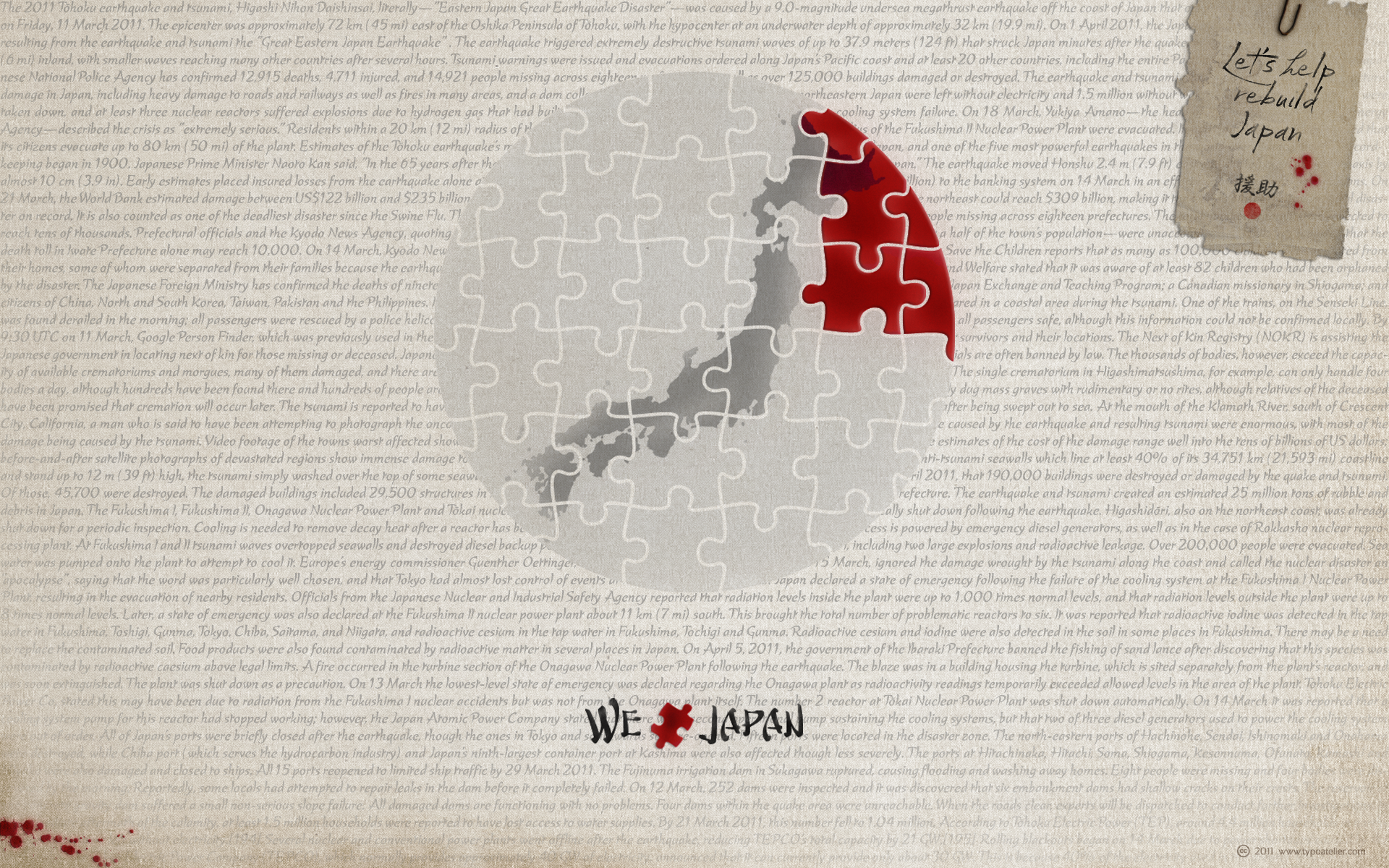
This Wallpaper I created to show the vector graphics of my little [typo]graphic puzzle—»We Rebuild Japan« in use. In case you like this vector graphics, feel free to download and use them. The download, as well as further information, you may find here: LINK
Typefaces in use:
Nate Piekos’ (BLAMBOT) beautiful, japanese-like, calligraphic script face »Musashi BB«.
Musashi BB is a loose, ink brush-like typeface with all-caps lowercase and enlarged caps uppercase. Named after the legendary Japanese swordsman and author of the Book of Five Rings, Miyamoto Musashi. This font contains a samurai-sized complement of European characters.
Jeremy Dooley’s (INSIGNE) elegant, brush-drawn, calligraphic script face »Kasuga Brush«.
Kasuga Brush is a contemporary script with eastern influence and authentic brush drawn character. The script offers two variants. One is slightly distressed along the character’s edges while the other is painted with a dry brush for interesting texture. Sixty-four optional ligatures add a realistic, hand-drawn effect and ensure that no two letters in a word repeat.
Neil Summerour’s (POSITYPE) japanese, rough and rustic script face »Fugu«.
Fugu is expressive, smooth and rough, tasty but sticky. This dichotomy demanded a new name. The rough and smooth texture suggested the name Fugu—oddly delicate while rough and functional.
Picture is made with the film camera fully immersed under water. Film size 18x24 cm. Monocle. Without shutter. Xray film. DS51 flash. In the shooting process we used live saving diver's dry suite СПГ-К and sealing off rebreather ИДА-59М. Both were used as a diver's life saving equipment in Russian Navy for emersion from submarine (deep until 220 m).
Black and white studio wedding portrait of bride and groom in traditional attire, photographed in Szentendre, Hungary, 1928. The picture was taken by photographer Ferencz Fiedler.

Typefaces in use:
Raphael Boguslav’s and Jill Pichotta’s (Font Bureau) decorative, flared serif typeface »Avia«.
AVIA: We have all seen proofs where faulty platemaking or light inking has lost all hairlines in a delicate roman. Raphael Boguslav observed the effect and understood it as a sophisticated form of stencil design. He used the idea in a logotype for Abex Corporation, then expanded it into Avia, a prize-winning PhotoTypositor font for Visual Graphics Corporation.
Jill Pichotta has added the Light and Bold for Font Bureau.
and
Jan Party’s (B&P Type Foundry) voguish typeface »Sang Bleu«
»Sang Bleu« is also available at »Fontshop«.
I passed by Zellers store last weekend. I always like the retro design and style of this little family restaurant.
So I asked the permission of the store manager and took a shot of it.
I like the pattern of the tiles on the floor. This is the shot taken with my Fuji compact.
Happy weekend!
Non-lieu ("non-place" or "nonplace" in English) is a concept, introduced by French anthropologist Marc Augé. It describes transient spaces where people maintain anonymity and which lack the cultural or historical significance to be considered true "places" in anthropological terms. Augé contrasts this concept with "anthropological places," which are spaces that reinforce identity and facilitate meaningful social interactions among individuals with shared cultural references. Non-places, however, do not serve as meeting points or foster a sense of community. In essence, a non-place is an area we pass through rather than inhabit, where individuals remain detached, unnamed, and lonely.
Quality prints, greeting cards and many products can be purchased with a money-back guarantee at >> kaye-menner.pixels.com/featured/aged-beauty-by-kaye-menne...
A pink Rose reflecting on a shiny surface. Digitally enhanced in Photoshop to create an aged or vintage effect.
THE FINE ART AMERICA LOGO / MY WATERMARK WILL NOT APPEAR ON PURCHASED PRINTS OR PRODUCTS.
Black-and-white portrait of a baby sitting on an ornate armchair, taken in Hungary during the 1920s.
Nikon FM2n | Nikkor 105mm 1.8 AIS | Ilford XP2 @ 1600 | Processed normal by CVS | Scanned on Epson V500 | Levels Adjustment in GIMP
Available Light B&W 35mm Photojournalism by Johnny Martyr
Thanks for checking out my work!
Toronto, Canada.
Model: Binibining Edda
Vlog: youtu.be/n3MPNrJKRZI?si=B3VaPsXONYr12IBR
Twitter: twitter.com/TheJennire
Instagram (Photographyl): www.instagram.com/jennirenarvaezphotography/
Instagram (Personal): instagram.com/thejennire
TikTok: www.tiktok.com/@thejennire
1942 black-and-white portrait of a young woman in a swimsuit, sitting on a dock by the water in Ráckeve, Hungary.
Wallpaper 1920x1200 created with Underwares outstanding and unique script face »Liza Pro«. Liza was designed by Bas Jacobs, Akiem Helmling and Sami Kortemäki.

Liza
Liza, lettres d’amour
Flirting, fashionable, provocative, emotional, casual, moderate, extremely sensible & beautiful - Liza Pro covers it all. Liza Pro, Underware’s latest creation, is a live-script typeface. Thanks to its extremely intelligent OpenType architecture, she approaches human hand lettering as close as technically possible. Liza Pro deeply analyzes the text. Out of a stock of 4000 hand crafted characters, Liza creates the most optimal combination. All of this works automatically. All you need to do is typing your lettres d’amour, and Liza makes the text always look different. She gives your creative piece the impression par excellence. Erotique mais intelligent. She is as clever as we could imagine.
She kept all folks at Underware busy for a couple of years. It all started one rainy night back in May 2004 but quickly changed into a fatal affair exceptionnelle. But now, 5 years later we are quite sure: this is something serious. Yes, we are talking about real love. L’amour pour la vie.
Liza Pro is a package of 4 fonts which work together. Liza Display Pro rocks the script lettering to the max. The build-in Out-of-ink feature, LetterSwapper and Protoshaper makes this font a realtime-digital-calligrapher. She’ll swash up your text drastically, giving long strokes, loops and swashes to letters if their context allows. Liza Text Pro has a more silent, moderate character - she’s well behaving sister of Liza Display Pro, designed to walk long pieces of text in a lively script style. Liza Caps Pro adds more possibilities and functionality to these two script fonts. It bridges the gap in case running script lettering doesn’t do the job, but it also works perfectly on its own. Every capital letter appears in various shapes to obtain the manual lettering feeling. Liza Ornaments Pro is for extra delicatesse et est plus charme. Four heart winning fonts, pour la langue l’amour!
Closer shot of the bedroom...the bowl holding the flowers is from the Re-ment Room Data Japanese room set, and the gerbera daisies are from Re-ment Storage Beauty. The lamp is Megahouse Retro Style. : )
Feeling privileged to be featured 'In The Spotlight' of Outdoor Photography magazine Issue 282 this month.
It was a pleasure being interviewed by writer & photographer Nick Smith where I detailed my photographic journey from the beginning, as well as naming my main inspirations and sharing my top tips for others.
Now available to purchase physically from newsagents, as well as digitally online.
Black and white vintage photo of a woman in traditional attire, standing indoors in a decorated room, 1933.
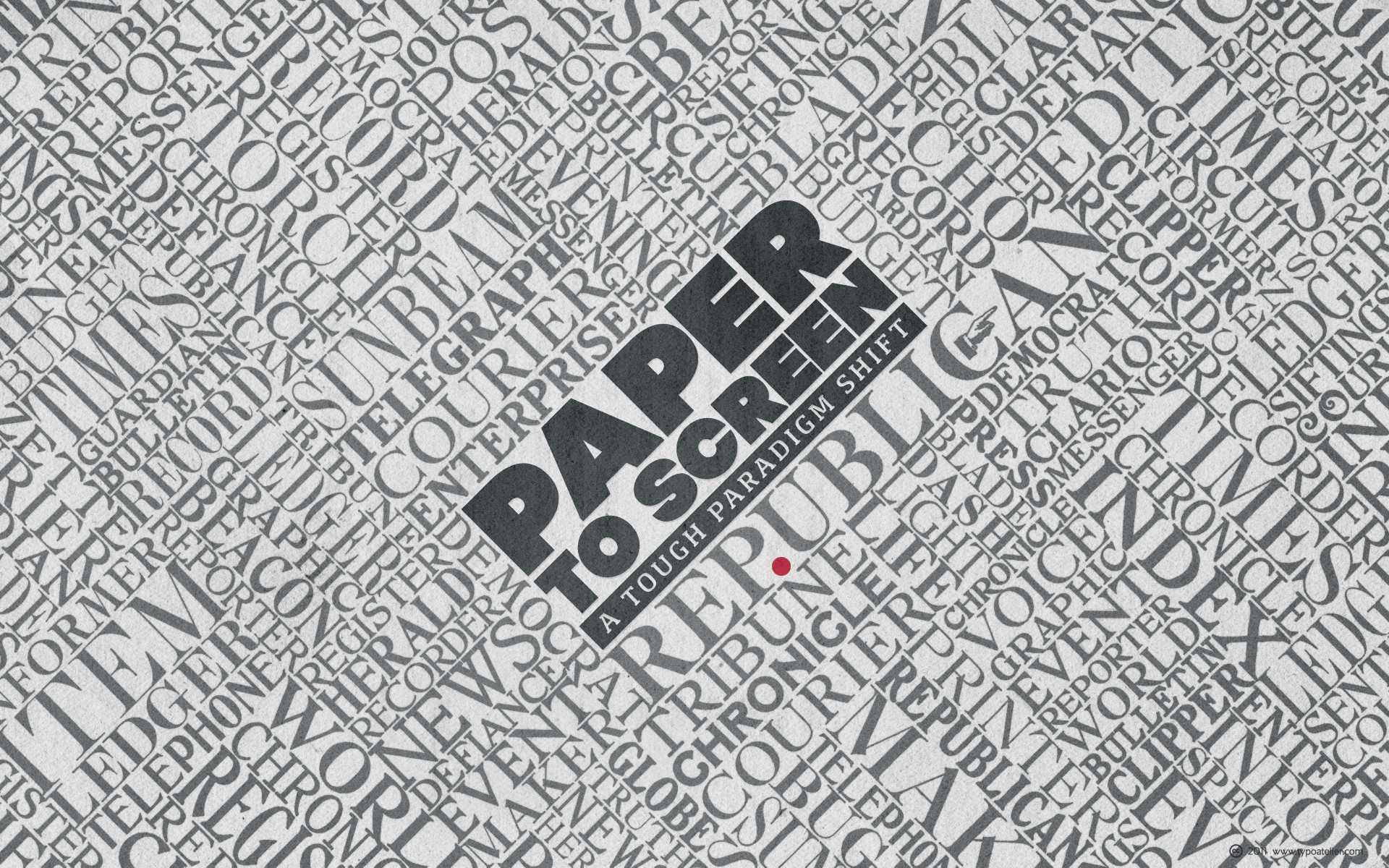
The beautiful »Newspaper Headings« which I used for this Wallpaper, I »recovered« from the following old »Foundry Specimen Books«:
Keystone Type Foundry (1906)
American Type Founders Co. (1906)
Barnhart Bros. & Spindler Type Founders
Palmer & Rey Type Founders (1887)
The typefaces which I used for the lettering in the center are:
Svetoslav Simov’s (Fontfabric) clean, elegant, sans serif typeface »Code Pro«.
Code Pro is a font family inspired by the original Sans Serif fonts like Avant Garde or Futura, but with a modern twist. It is clean, elegant and straight-to-the-point. Code font is applicable for any type of graphic design—web, print, motion graphics, etc.—and perfect for t-shirts and other items like posters and logos.
Rui Abreu’s (Fountain) balanced, modern slab serif typeface »Foral Pro«.
Foral Pro is a modern slab serif, organic and balanced, with harmonized proportions and polished forms. It is a eight-weight typeface, ranging from Light to Extra Bold with matching italics. It come with Small Caps and a wide range of OpenType features, allowing extensive and versatile use.
Model Left: Miss Diversity
Model Right: Sakira Sandra
Photographer: Heiko Kalweit
Shooting for Vintage Flaneur
Model Right: Miss Diversity
Model Left: Sakira Sandra
Photographer: Heiko Kalweit
Shooting for Vintage Flaneur
Toronto, Canada.
Model: Alexandra Palma
Vlog: www.youtube.com/watch?v=-wuWSC8hmGg&t=65s
Twitter: twitter.com/TheJennire
Instagram (Photographyl): www.instagram.com/jennirenarvaezphotography/
Instagram (Personal): instagram.com/thejennire
TikTok: www.tiktok.com/@thejennire
Toronto, Canada.
Model: Binibining Edda
Vlog: youtu.be/n3MPNrJKRZI?si=B3VaPsXONYr12IBR
Twitter: twitter.com/TheJennire
Instagram (Photographyl): www.instagram.com/jennirenarvaezphotography/
Instagram (Personal): instagram.com/thejennire
TikTok: www.tiktok.com/@thejennire
FACEBOOK:https://www.facebook.com/Mss.Diversity
INSTAGRAM: instagram.com/rragtime_cat
Photographer: Jens Peltzer
Der Benz Patent-Motorwagen Nummer #1 war der Name des ersten von Carl Benz erbauten Automobils mit Verbrennungsmotor.
Im Vergleich zu Daimlers 4- rädrigen Motor-kutsche, motor - carriage, 1886, gilt diese Entwicklung als neue Form der Fortbewegung.
5 Personen sind Paten des Automobiles.
Ein Prototyp (engl. Prototype) ist ein Entwurfsmuster (design pattern) .
Otto und Maybach gelten als Motorentwickler,
Benz und Daimler als Erfinder des Autos.
Bertha Benz finanzierte den Entstehungs-prozess des "automobiles". Damit ist seine Frau Bertha Benz Inhaberin des Patentrechtes des ersten Automobiles.
Berta Benz, Carl Benz's wife, funded the bold development of the first car with a combustion engine. In fact Bertha Benz is the proprietor of the patent of the world's first car, first automobile called 'Patent - Motor-wagen' .
(Nachbau / Replica).
Das Patent für dieses Dreiradfahrzeug wurde von Benz am 29. Januar 1886 eingereicht und als DRP Nr. 37435 am 2. November 1886 erteilt. Am 3. Juli 1886 führte Benz die erste öffentliche Probefahrt in Mannheim durch.
Angelassen wurde der Motor durch beherztes Drehen des Schwungrades.
Dass der Treibstoffvorrat im Vergaser nicht für eine längere Strecke reichte, stört beim Benz Patent-Motorwagen nicht weiter.
Höchstgeschwindigkeit: ~ 16 km/h
Leergewicht: 265 kg
Immerhin brauchte der Antrieb des Fahrzeugs auf 100 Kilometer rund 10 Liter des seinerzeit noch immer als gefährlich geltenden Ligroins.
Spätere Messungen der Technischen Hochschule Stuttgart ergaben 0,9 PS/662 W bei 400 Umdrehungen.
Der Wagen blieb ein Einzelstück, ebenso wie sein direkter Nachfolger Patent-Motorwagen Nummer 2.
Er wurde zunächst zum Vierradwagen umgebaut und später ausgeschlachtet.
1903 wurde er rekonstruiert. Dieser Benz Patent Motor-Wagen Nr.1 steht heute im Verkehrszentrum des Deutschen Museums in München
°°°°°°°°°°°°°°°°°°°°°°°°°°°°°°°°°°°°°°°°°°
Mercedes-Benz Museum
Mercedesstraße 100, 70372 Stuttgart
0711/1730000
Click , &
carriage [ here not horse-drawn]
Kutsche
Fiaker {m} [österr.]
Push F11 - Full - screen
Grossformat
Enjoy
© View LARGE on BLACK
For your Eyes only ©
°°°°°°°°°°°°°°°°°°°°°°°°°°°°°°°°°°°°°°°°°°°
... komfortable Kalesche mit umlegbarem Regendach auf drei Rädern; ein Tricycle.
Durch einen Druck auf einen unter der Steuervorrichtung angebrachten Hebel setzt sich der Wagen in Bewegung.
Seine größte Fahrschnelligkeit ist die eines im scharfen Trabe fahrenden Fuhrwerkes.
16 - 18 km/h
Quelle:
Neueste Nachrichen, München
16. september 1888
Bertha Benz financed the developing process, and she to modern standards is to be seen as owner of the patent-rights.
rétromobile
Voiture à moteur breveté Benz - 1886
more details
commons.wikimedia.org/wiki/Category:Benz_Patent_Motorwage...
FLUIDR
Flickr My Stream
NEW TOOL with EXIF info
___________
My FAVES
with FLUIDR
__________
°°°°°°°°°°°°°°°°°°°°°°°°°°°
SX1 Is best of
SX1IS Canon Powershot
°°°°°°°°°°°°°°°°°°°°°°°°°°°°