View allAll Photos Tagged RetroStyle
Photographer: Patrick NDK Photography
Hair/Location: Little Shop of Beauty
Outfits: Angel Design
Assistant: NM photographie
Elegant black-and-white portrait of a young man in formal attire, Szeged, Hungary, photographed in 1927 by Auer Fivérek.
Portrait of Miss Malì
Picture: Davide Morino
Edit: Davide Morino
Outfit, makeup and hairstyle: Miss Malì
Historic black and white class photo from 1908 of students and teachers at the Bólyai Főreáliskola in Budapest, Hungary.
It's close to two years since I lost Rhona, my beloved wife of almost half a century and it hasn't gotten any easier. Neither Christmases, New Years, myself nor my life will ever be the same.
This McDonald's is located across from the Muscle Shoals Walmart Supercenter, and thankfully hasn't been given a modern makeover like yesterday's previously posted Jonesboro location. Since this drive-by photo turned out not so good, here's Google's 2016 Street View to glance over as well. Note how the left end of the building was extended for a large drive thru portico (making the front of the place seem rather massive!), as seen in that linked photo. Per Google Earth, this location was built (or extensively remodeled) sometime between 2001 and 2005, with the previous incarnation possibly being a wide, mansard-style building (hard to tell for sure from the very fuzzy 2001 aerial - could even be a car wash, dog park, or small movie theater was on the site previously, haha)!
____________________________________
McDonald's, Woodward Ave. (Hwy 72) at Waverly Ave., Muscle Shoals AL
Wardrobe Stylist: Mirey Enverova (www.behance.net/mireyenverova3b63)
Clothing Designer: Kara Mia Fenoglietto (www.karamiadesign.com)
Shoe Designer: Alanna Cunningham (alee.cunni@gmail.com) Watch Designer: Thomas Wall (www.thomaspwall.com) Hairstylist: Samantha Gribble (www.samanthagribble.com) Makeup Artist: Hayley Kassel (www.hayleykassel.com) Model: Natalie Elise (Lubbers) (www.facebook.com/pages/Natalie-Elise-model/261511940541864)
Photographer: Allison Kortokrax of Korto Photography (www.kortophotography.com)
www.vogue.it/en/photovogue/Portfolio/c2e482a3-a5b3-4918-a... ImagePhotography
© Korto Photography 2013
Instagram: KortoPhoto
Cool cars, cooler outfits, and a whole lot of sunshine at the Classic Car Boot Sale, King’s Cross, Spring 2026.
A black-and-white photo of a young girl in traditional Hungarian attire from 1941, posing confidently.
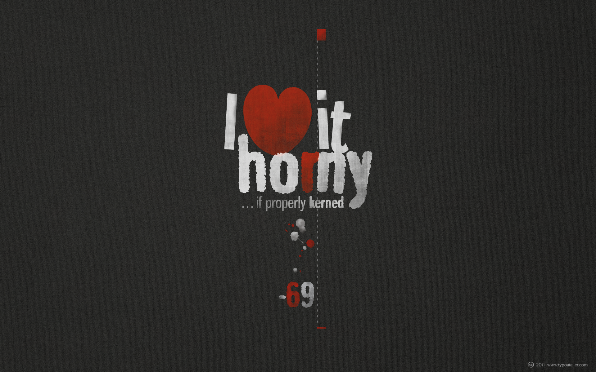
Typeface in use:
Ray Larabie’s (TYPODERMIC) narrow, grotesque, versatile and striking headline faces »Gnuolane« and »Gnuolane Jump«.
Gnuolane is a serious headline font in five weights. While it borrows from 19th Century grotesque models, it possesses a superelliptical sixties sneer. Gnuolane includes old-style numerals, ordinals, superiors, inferiors, f-ligatures and class-based kerning.
I created this lettering to be printed on my black T-shirts. Hopefully summer will come soon.
Elizabeth Taylor is wearing a beautiful dress by My Dolly Dollsl www.etsy.com/shop/MyDollyDolls on ETSY
Doris is also featured in the New Issue of 1Sixth: The Fashion Issue is now for sale.
About the Book
One of a Kind Artists for dolls from Integrity Toys, Hot Toys to Barbie with repainted and restyled dolls by Noel Cruz this feature is focused on fashion by designers such as Antonio Realli, Ryan Liang of SHANTOMMO and ElenPriv as well as fashions by Mattel and Dressmaker Details. If you are a doll collector then this beautiful book is for you or someone who collects.
Matte 80 Version (Printed $49.99):
www.blurb.com/b/10546843-1sixth
PDF Version is $9.99
GLOSS 70 Economy Version Magazine
www.blurb.com/b/10547194-1sixth
Print Version is $34.99
Author website
1sixth.co
You can also shop and display Noel Cruz repaints via RedBubble here: www.redbubble.com/people/stevemckinnis/shop under the collection NOEL CRUZ!
Photos by Steve McKinnis of stevemckinnis.com
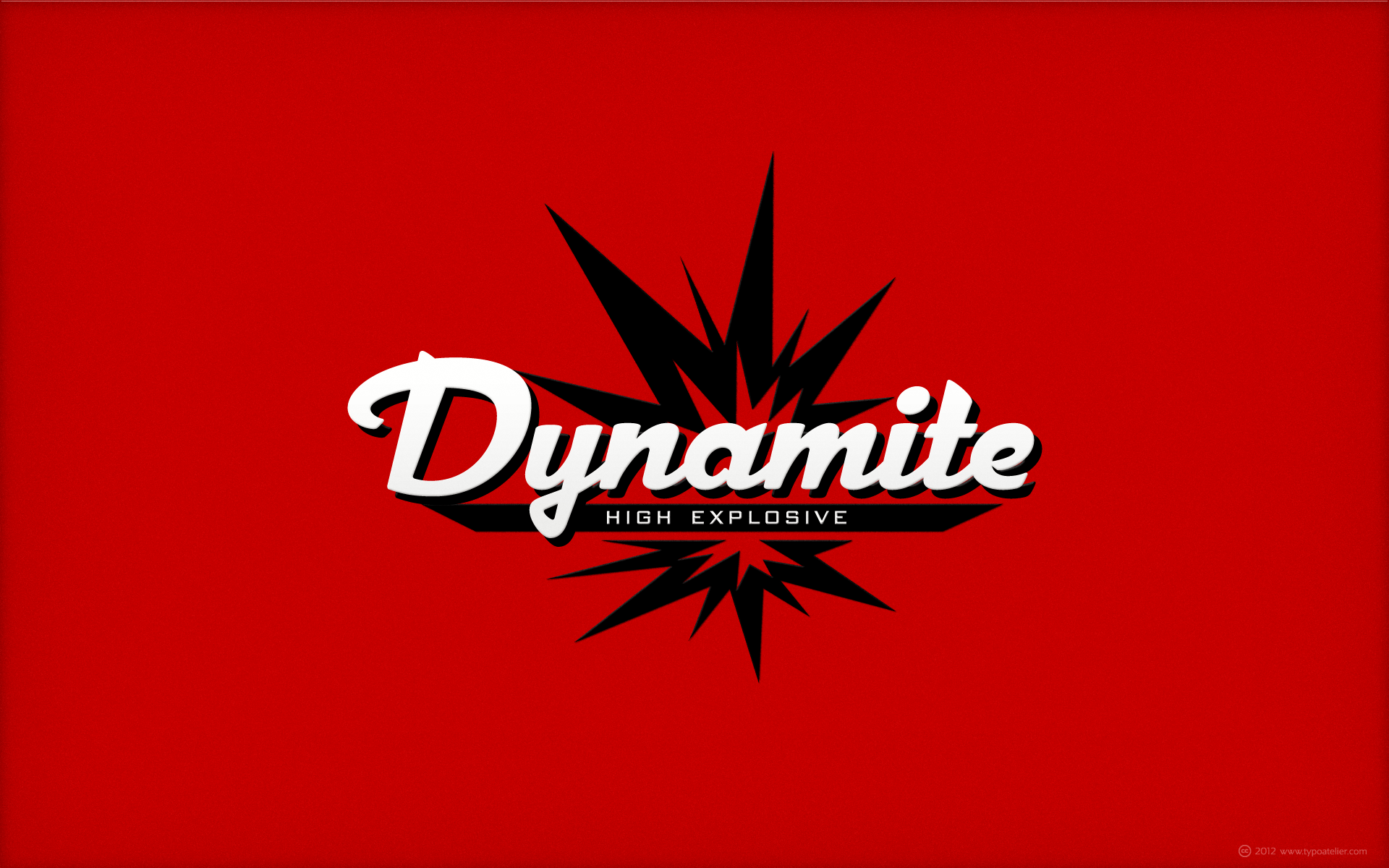
... created with Michael Doret’s | Alphabet Soup outstandingly beautiful script face »Dynascript«.
Typography enters the Space Age! Dynascript brings the ease of “Pushbutton Automatic” to your typesetting experience. Dynascript is actually Two fonts in One–without switching fonts you can instantly change from Dynascript’s connecting font to the non-connecting italic with the simple push of a button. For more details download “The Dynascript Manual” from the Gallery Section.
What is Dynascript? Dynascript is the slanted script cousin of Dynatype. It shares many of the characteristics of it’s sibling, but is drawn entirely from scratch and has it’s own unique character.
To some it may be reminiscent of various mid-century neon signage, and of sign writing, Speedball alphabets and even baseball scripts. The design of Dynascript also takes some cues from a historical typographic curiosity that began in Germany in the ‘20s and which lasted into the ‘60s—when Photo-Lettering gave it the name "Zip-Top". Basically it was believed to be the wave of the future—that by weighting an alphabet heavier in its top half, one could increase legibility and reading speed. The jury’s still out on whether or not there’s any validity to this claim, but I think you’ll agree that in the context of this design, the heavier weighting at the top of the letters helps to create some uniquely pleasing forms, and a script unlike any other.
Typesetters across the planet will also be able to set copy in their language of choice. Dynascript’s 694 glyphs can be used to set copy in: Albanian, Basque, Catalan, Cornish, Croatian, Czech, Danish, Dutch, Esperanto, Estonian, Faroese, Finnish, French, Galician, German, Hungarian, Icelandic, Indonesian, Irish, Italian, Kalaallisut, Latvian, Lithuanian, Malay, Maltese, Manx, Norwegian Bokmål, Norwegian Nynorsk, Oromo, Polish, Portuguese, Slovak, Slovenian, Somali, Spanish, Swahili, Swedish, Turkish, and Welsh—and of course English. Sorry! Off-world languages not yet supported.
土耳其-爱琴海地区-Izmir省-以弗所-游客与猫咪
Cat sitting on ancient ruins, in Ephesus, an ancient Greek city and UNESCO World Heritage Site in Selçuk, Izmir province, Aegean region of Turkey.
© All rights reserved. You may not use this photo in website, blog or any other media without my explicit permission.
Photographer: Patrick NDK Photography
Hair/Location: Little Shop of Beauty
Outfits: Angel Design
Assistant: NM photographie

Model, MUAH: Miss Diversity
www.facebook.com/Mss.Diversity
Dress: Sterling Gold
Photographer: Heiko Kalweit
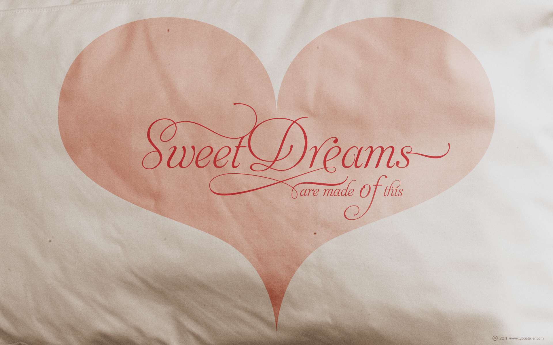
Typeface in use:
Maximiliano Sproviero’s and Sabrina Mariela Lopez’ (TYPESENSES) charming, stunningly beautiful script face »Aphrodite Slim Pro«.
Aphrodite Slim Pro is not just a lighter version of its sister Aphrodite Pro. Aphrodite Slim Pro has duplicated the quantity of characters of its partner, and that means more than 500 new glyphs, reaching a total of more than 1000.
More delicate and meticulous, Aphrodite Slim Pro is once more a new typography with deep calligraphic ideals: We immersed ourselves into the world of each calligraphy ductus and each calligraphy masters by studying from decoration to lettering books.
This was the key for the logic of Aphrodite Slim’s behavior.
The new concept of Aphrodite Slim Pro was to join diverse styles of calligraphy in one in order to achieve an autonomous expressiveness, in fact, this is what calligraphy aims to, and we agreed to bring those ideals to the world of typography: It is justifiable to be inspired in hundred-year-old calligraphies, but it is even better if the results you obtain have a plus. A personal plus. During the creation process we were wondering whether it was possible to mix certain strokes of such rigid styles as uncial, (Li•n’s favourite style), with strokes of the copperplate, (Sav’s favourite style), and also to take and mix cualities of cancelleresca cursiva, formata and moderna; finally giving our creation a roman-transition italic look.
So Aphrodite Slim takes ideals and aspects from those formal styles, following its own logic though, and emphasizing the fact of being a decorative typography.
Calligraphy masters of our past are who we are in debt with. They are the cause we have lovely letters now. They have been spontaneous at the moment of creation, what differs from the type-designers of nowadays, whose spontaneity is more limited.
Digital faces that we are used to see these days are a result of long hours of optical adjustments, grids, macros and inspirations of other existing typography, but without personal contributions.
Aphrodite Slim wants to refute this. Its mission is to rescue de spontaneity of the artesanal lettering in order to obtain unique words; those which only calligraphy masters of our past or lettering artists of our present could give us.
We have worked hard to achieve this, making Aphrodite the most universal font we could: It was necessary to study the most common words, focalizing more in the ones referring to “sensitivity”, of four of the most spoken languages in the world. Aphrodite Slim has an enormous quantity of decorative characters and special ligatures for phrases and words in English, French, Spanish and German. (See English, Français, Español, Deutsch PDF in the gallery section).
We promise there is no existing type that decorates/ligates glyphs and words like Aphrodite Slim does: It is the first time a font like this really considers its purpose. -The way glyphs are ligated is insane- :
Aphrodite Slim rescues some ideals of persons like Jan van den Velde (Italian cancilleresca writing of XVI Century) who understands ascenders and descenders as possibilities to beautify the lines of writing with curved strokes that seem to be dancing above and below of the words. This master also creates ascenders and descenders even where they are not necessary, on letters that do not actually need them:
Aphrodite Slim takes this ideal. The font counts with a wide range of glyphs that seem not to be satisfied with its more primitive form and prefer to extreme their parts to be decorative.
It also existed masters of calligraphy like José de Casanova of XVII Century, who, with a magnificant skill and a really personal mark, had the particularity of ligating words that were actually separated with spaces.
This is another innovative feature in Aphrodite Slim. An investigation of the most common beginnings and endings words of the English language was done. Having that feature activated (discretionary ligatures), common words will start to ligate or to be decorated even when they are separated by spaces.
Impossible to forget Francesco Periccioli of XVII Century and our experience us designers to face with works of him: His letters, that today are included in the group of cancellerescas modernas, have been a direct inspiration to the oldstyle figures and historical forms variables in Aphrodite Slim.
Giovanni Antonio Tagliente (XVI Century) and his particular way of making tails and diagonals longer than usual, qualities that our creation reflects too.
Finally, our adventures in Biblioteca Nacional and Barrio San Telmo, Buenos Aires, were essential for us to make Aphrodite Slim more complete and interesting: Sav did an excellent work when studying how the decorative miscellanea and swirls of early XX century were. She also investigated what particularities made those roman titling characters look antique so she could rescue some ideals for the oldstyle figures and historical forms variables. This also leaded her to create the ornaments variable in Aphrodite Slim.
We are really proud of presenting Aphrodite Slim Pro, a typography that was the result of days and nights of working hard, because we do love what we do; and we are glad we are living in a present that gives us the possibility to spread this kind of art, because that is the way we consider our job: Aphrodite Slim Pro is Art. Hope you can appreciate the enormous work this type has.
Features:
Aphrodite Slim Pro is the most complete variable.
It includes more than 1000 glyphs.
Thanks to the Open-Type programming, it counts with a easy way to change/alternate glyphs if the application in which the font is used supports this.
The variables contained in Aphrodite Slim Pro are also offered separately.
Aphrodite Slim Text: It is the variable for lines and paragraphs. Thus it is the least ornamental and the most accurate to achieve a satisfying legibility. It has the Standard Ligatures feature in order to improve the possible conflicts some glyphs could have by others.
Aphrodite Slim Contextual: It is the one that makes emphasis in decorating. It has the particularity of ligating/decorating words of common use in English, French, Spanish and German. It also has the quality of ligating common beginnings and endings of the common words in English.
Aphrodite Slim Stylistic: With similar features of Slim Contextual. It includes a set of decorative numbers for a display use.
Aphrodite Slim Swash: This one has special beginnings and endings to decorate words.
Aphrodite Slim Endings: It makes words look as a signature.
Aphrodite Slim Historical: It adds an antique look to the written word. It also has the special historical ligature function.
Aphrodite Slim Titling: This one is the most decorative. Its copperplate inspired ornaments give words a special color, in order to handle the quantity of decoration, it comes with the standard ligature feature, which has the most common ligatures plus others that make decorative swirls not to be conflictive.
Black and white studio wedding portrait of bride and groom in traditional attire, photographed in Szentendre, Hungary, 1928. The picture was taken by photographer Ferencz Fiedler.
A vintage sepia-toned portrait of four young men in military-style or uniformed clothing, captured in Hungary in 1938. The group poses formally in a studio setting, showcasing 1930s fashion and expressions of the era.
Model on the right: Miss Diversity
www.facebook.com/Mss.Diversity/
Louise D'Ivoire
Paula Walks
Dress: Sterling Gold
Photographer: Heiko Kalweit

Typeface in use:
Jordan Jelev’s and Svetoslav Simov’s (Fontfabric) striking, ultra-condensed, blackletter typeface »Grant«.
Grant is a custom font which is applicable for any type of graphic design - web, print, motion graphics etc and perfect for t-shirts and logos.
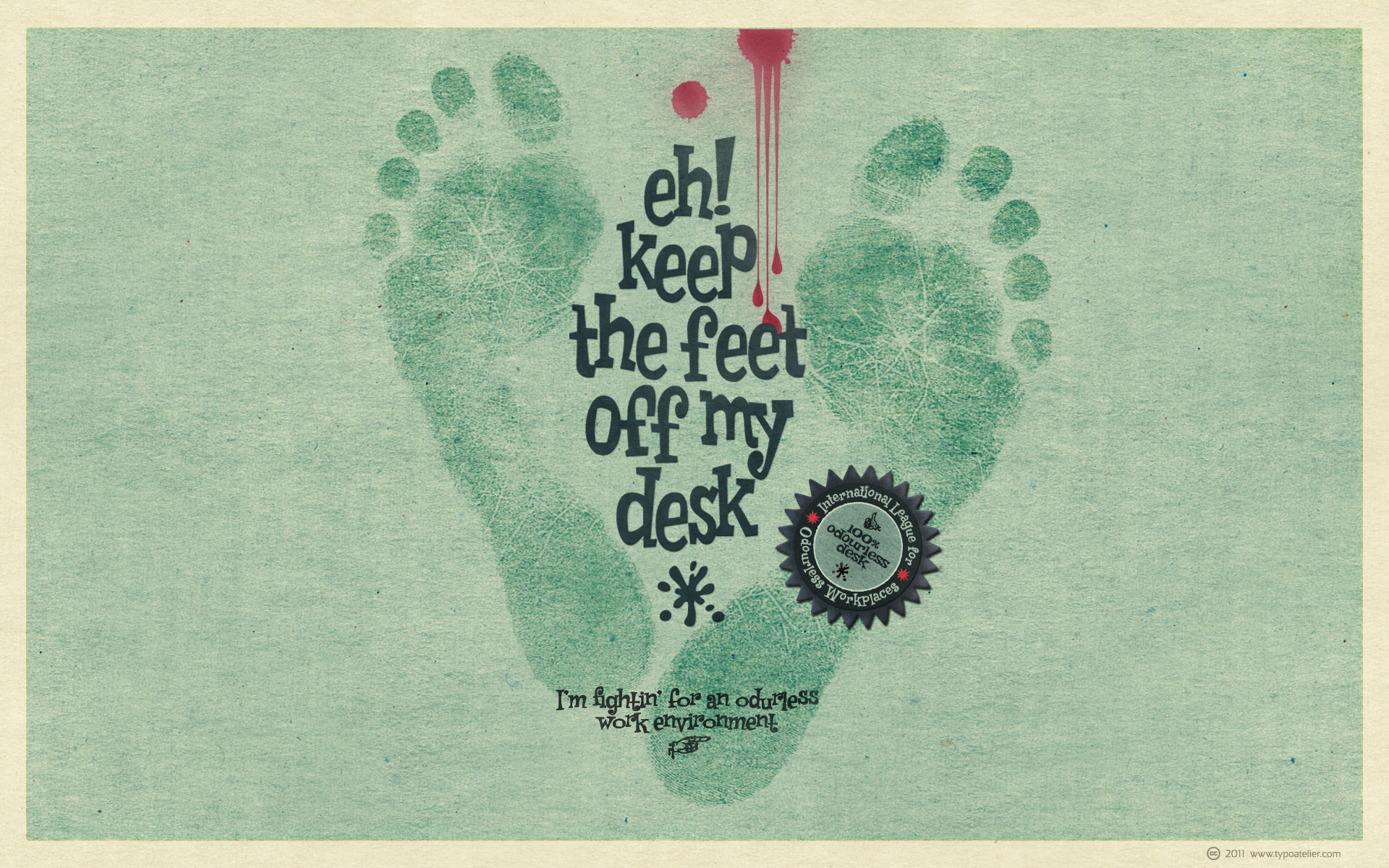
Typeface in use:
David (Squid) Cohen’s and Stewart Sandler’s (SIDESHOW) retro, sassy »Rat Fink« typeface family »Weird Bill«. (see also »Weird Bill Loose«, »Weird Bill High« and »Weird Bill Squat«)
Weird Bill is Squid’s tribute to his most prominent influence, Bill Campbell, model kit box illustrator extraordinaire and creator of the Weird-Ohs!. Bill’s series of goofy monster model kits in the early 1960s was such a hit that it has been reissued twice! Weird Bill is fun, freaky, frantic and full of frenetic frappery!