View allAll Photos Tagged smashingMagazine
April Desktop (1920x1200 please zoom in to see full details)
Enigma 2.0 Rainmeter Skin by Kaelri
Theme
NOOTO VS by lassekongo83
Wallpaper
Bring to Life by Hannah Kunar from Smashing Magazine Desktop Wallpaper Calendar: April 2009
Icons
Mostly from ecqlipse 2 Icon Set by chrfb and the rest from diferent users in the icon's category in deviantART
Good times with the Apart brands' friendly competitors, @markodugonjic, @indysigner, and Gru AKA Vitaly Friedman.
www.smashingmagazine.com/2008/11/30/50-beautiful-examples...
I have five photos in 50... Congrats other friends :))
Please no award, no fave...
My inspiration for The Smashing Coffee Mug Photo Contest. www.smashingmagazine.com/2011/10/26/the-smashing-coffee-m...
Smashing Magazine, one of my favorite online magazines has this February Desktop with and without a calendar. Check it out and see all the other amazing calendars you can download at Smashing Magazine.
Solodogs is running along side of Briana with a speedlight at 1/8 power on a boom while I ran backward shooting up at her. Very complex, very dangerous... ;-) Keeping the light the same distance from her is the assistant's job and it is harder than it seems. A difference of a foot can be 1/2 stop. John (solodogs) did a great job. I was able to get off about ten shots per run and we did it three times. This is compiled from the best of those runs.
A CybersalonAZ project. This poster's actual size is 8 feet wide by 4 feet high.
Resources used in the design:
"Morning in Strawberry" by Devon Christopher Adams (used with permission)
Hand Drawn Vector Icons by iammikesmith
SwirlyCurls Brush Kit by createsk8
Decorative Swirls (vector) by www.opengraphicdesign.com
Swirls Vector Illustrations Set from Smashing Magazine
Typefaces:
Collage created using Shape Collage
Collage stolen from:
www.drweb.de/magazin/farben-themen-und-paletten-10-mal/
Photos stolen from:
www.smashingmagazine.com/2008/10/26/retro-and-vintage-typ...
www.messersmith.name/wordpress/2010/12/26/get-high-on-dyn...
I've purposefully laid low during the Christmas holiday. I believe that this has been good for me. I know that some of my friends are concerned that I'm becoming a hermit, but that is not the case. In the last few months I've attempted to socialise normally, sometimes at the expense of my well being. Living in an atmosphere which relentlessly reminds me of my loss has not been easy. Normal social gatherings have been difficult.
Anyone who has suffered a loss of a spouse knows exactly what I'm talking about. Loneliness is intensified by being with loved ones who shared the life experience of knowing the person who once occupied the empty chair. One can feel very much alone even when surrounded by friends. At some point a decision must be made whether to continue to suffer that pain or to retreat for a while to allow strength to recover.
After the holidays I will begin to behave normally again. The time of relative solitude has been good for me. It's allowed me to gather my wits and gain a fresh perspective. I'll soon be starting a new year. Life will not be rosy. I don't expect that. There could still be major setbacks. However, I have accomplished much. I've taken control of many aspects of my life with which I was formerly out of touch. I've renewed my faith and strengthened it. My plan for 2011 is to recover as much as possible of my life here in Madang and shape it into something which will allow me to be a full person again. There is much which I have left behind and more yet will have to be considered as to its usefulness to me in the future. However, I can see that my future, though seen through a glass darkly, has promise. It is a different promise from any which I formerly imagined. But, it is not dark of necessity. I do have within my power, trusting in my faith, that I can make it bright if I take the right path.
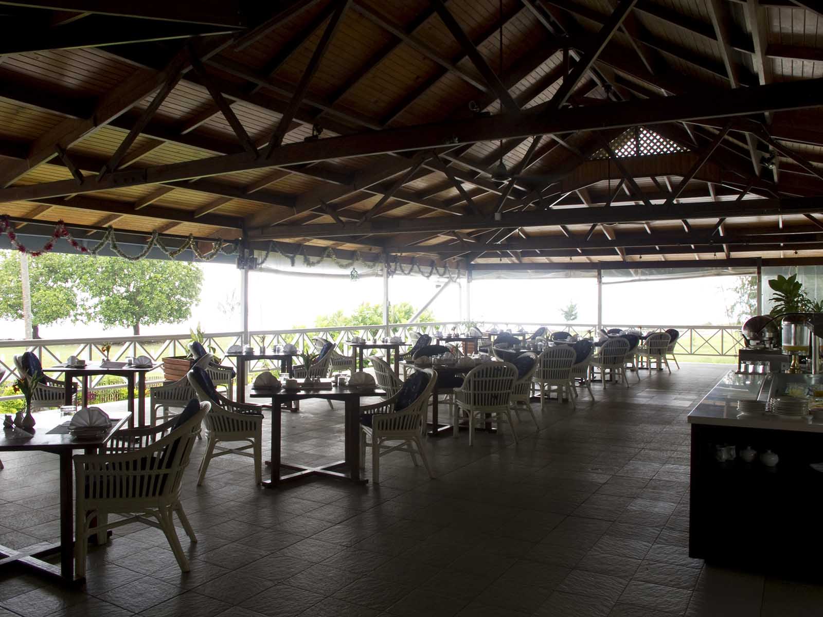
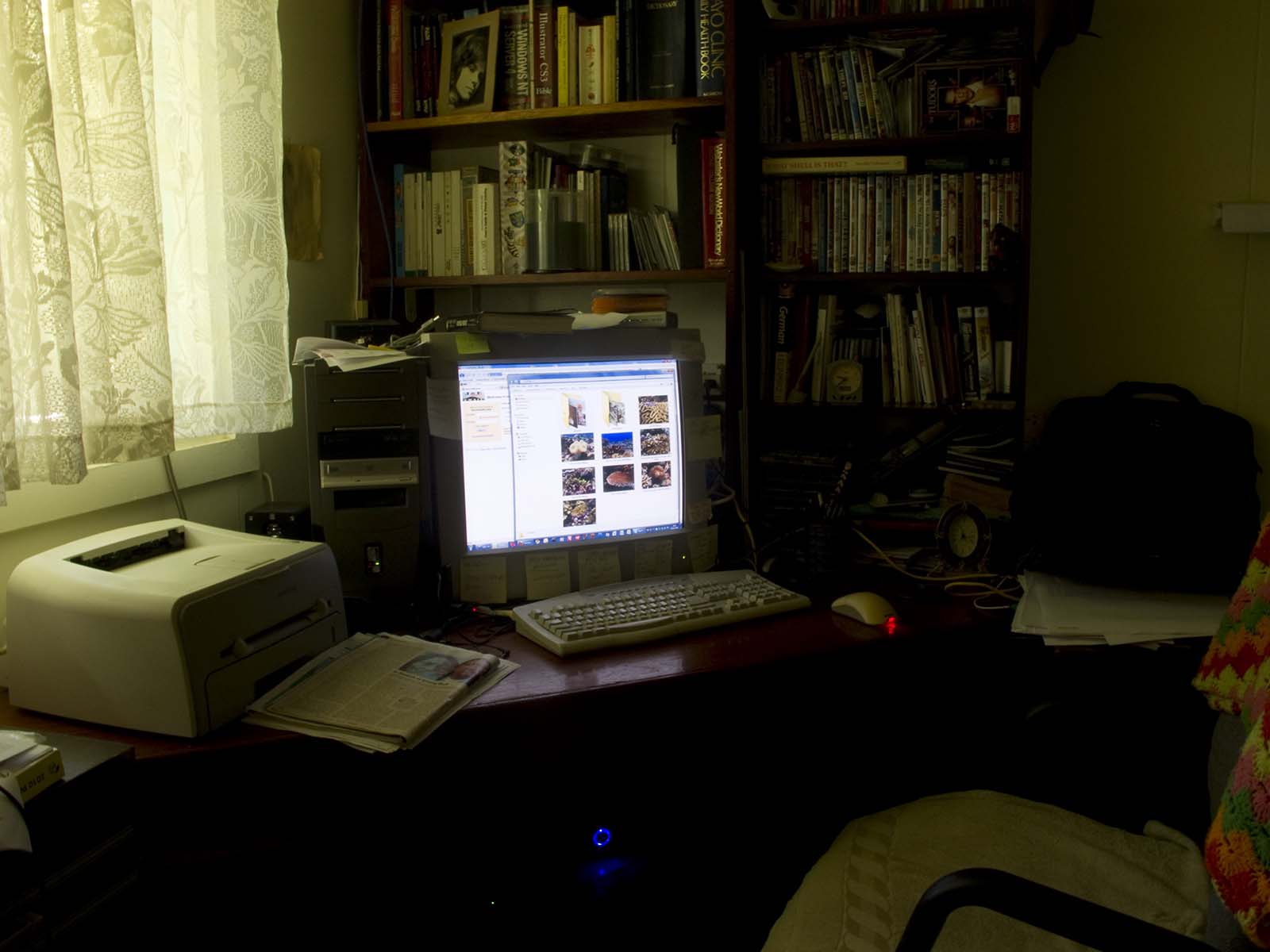
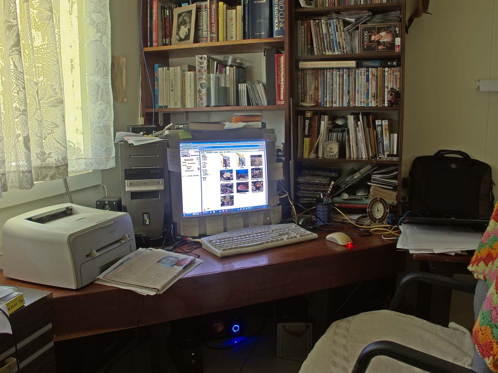
Through a dear friend I got an offer of a small photographic shoot for Coatwatcher's Hotel here in Madang. I was happy for the work, though it was not an easy job. As I was working on the images I experienced a sudden geek attack and decided to devote a post to the technique involved. Sudden geek attacks cannot be ignored.
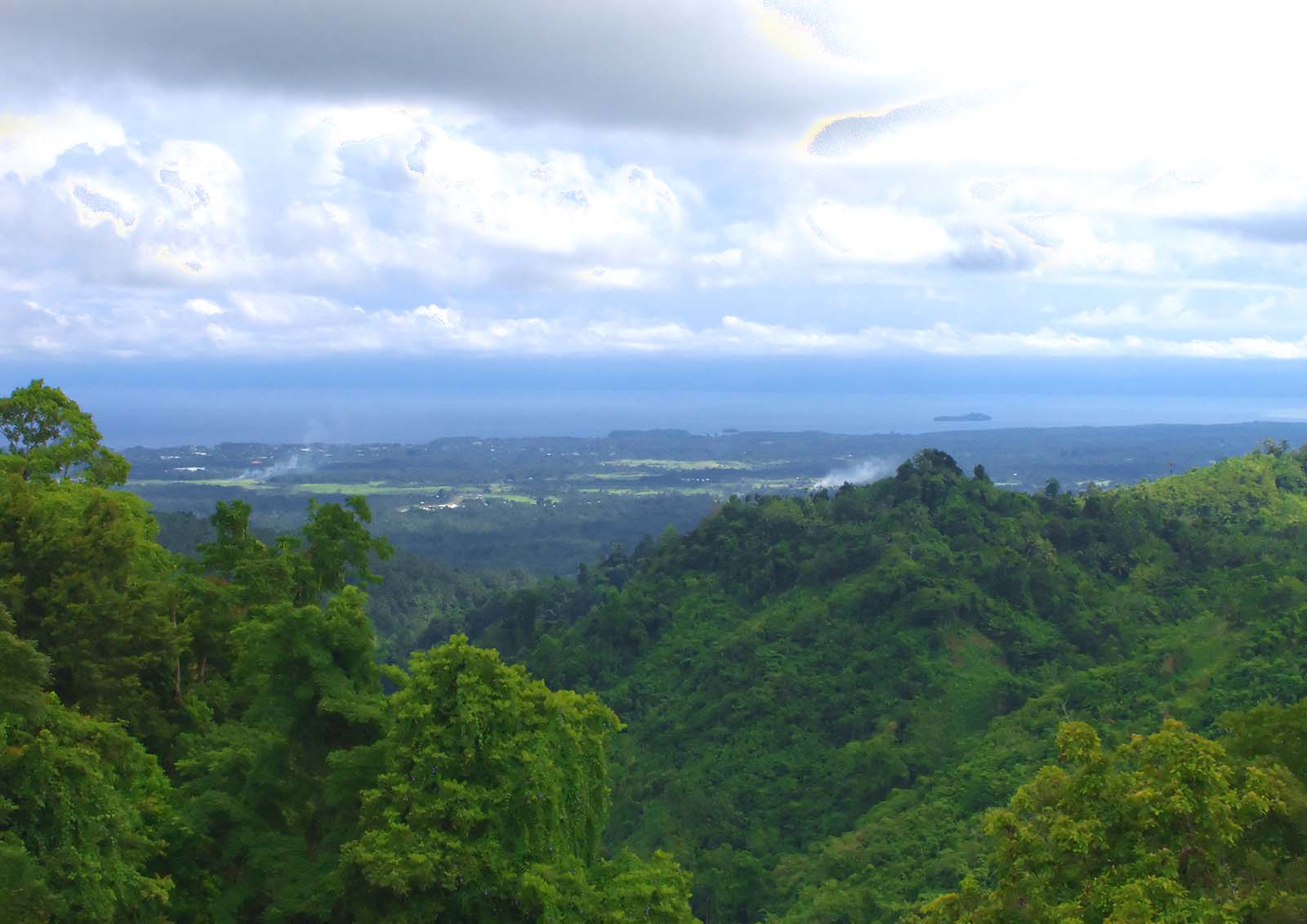
Here in this image you can see the problem. This is a shot of the hotel dining room looking out over Astrolabe Bay:
As you will note, it's not very exciting or aesthetically appealing. In fact, it's downright ugly. What's the problem? Well, the problem is that a lot of light is in the wrong places. This is a typical back-lit image. The camera cannot cope with the huge dynamic range of light levels varying from very bright to very dim. Our eyes adjust constantly to allow us to take in this range of brightness levels. Viewing this scene, you would be perfectly able to see all of the dark areas. As your eyes rise to the bright light outside, your eyes will compensate automatically. No camera can do this.
So, how can a photographer without complex and expensive lighting equipment take a decent photograph of this scene? A fantastic trick became available to photographers with the dawn of the digital age of cameras and powerful computer processors which can do the maths. It's called High Dynamic Range Photography. In theory, it's pretty simple. Anybody with a decent camera and a computer can do it. I wrote a post on HDR a couple of years ago.
The first image was what one might call a "normal" photograph. I simply set my Canon G11 on an automatic setting and took the shot. The result is miserable. However, what if we could take several shots, adjusting the camera for each level of brightness, and combine the best exposed portion of each frame into one image? That is exactly what HDR photography is all about.
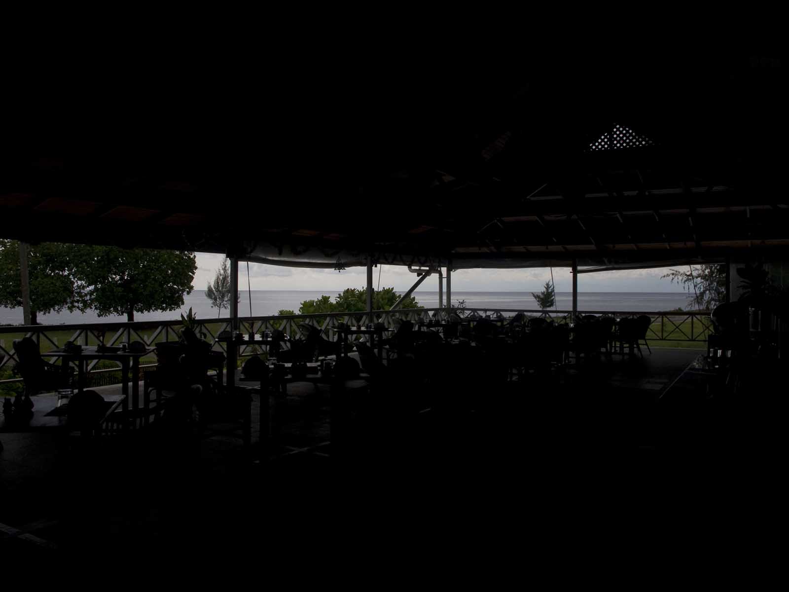
I first set my camera to get a well correctly exposed image of the outside area including the sky and water of Astrolabe Bay. It's even worse. The inside is completely black:
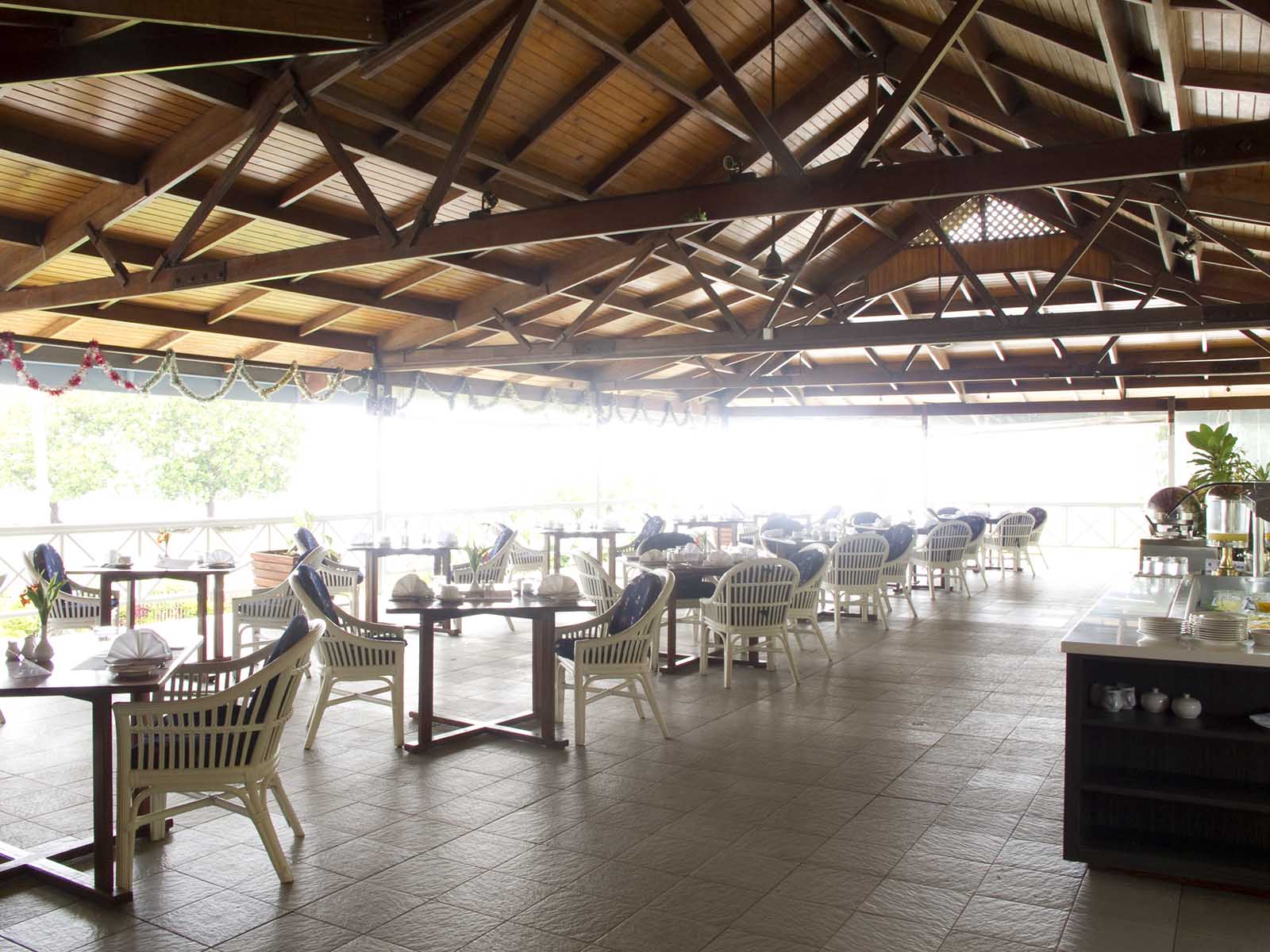
Next, I took another exposure with the camera set to capture the dark levels inside the dining room:
That's just as bad, except that you can now see the areas of the image which were nearly black. However, the outside area is completely washed out. I had my camera mounted on a tripod for these three shots. It's important that the camera does not change angle or distance to the subject. The software needs details of the images to remain in the same position on the frames so that it can match the images up perfectly before it begins the task of selecting the best exposed areas of each image to combing in the final HDR shot.
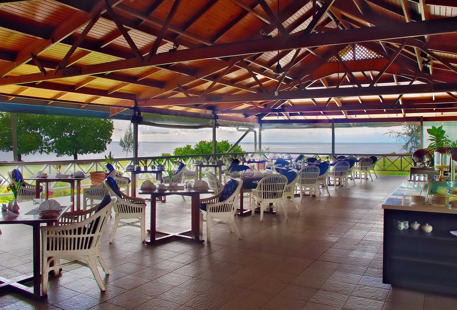
Then, using the Merge to HDR image of Photoshop, I combined the three images to produce this one:
This is a perfectly useable image for the calendar which the client wanted to produce. I'll now collect my pay.
It is a characteristic of HDR photography that most images appear a little strange to our eyes. We are not used to seeing such a compression of dynamic range. It really looks more like a painting than a photograph. However, for the client's purpose, it was the only way to get the shot.
Just for fun, I set up my tripod in my bedroom and took three shots of my little corner office. This is the underexposed shot:
I won't bore you with the overexposed shot or the auto setting shot. That would be tedious.
This is the combination of the three images: Certainly, I could have used flash to capture the same image, but that would give the shot that flashy, unreal effect which I don't like. The colour tones are rather sickly, because of the colour of the cloth on my curtains. I didn't bother to correct it. I wanted it to look exactly the way my eyes see it. I'm going to change to white curtains!
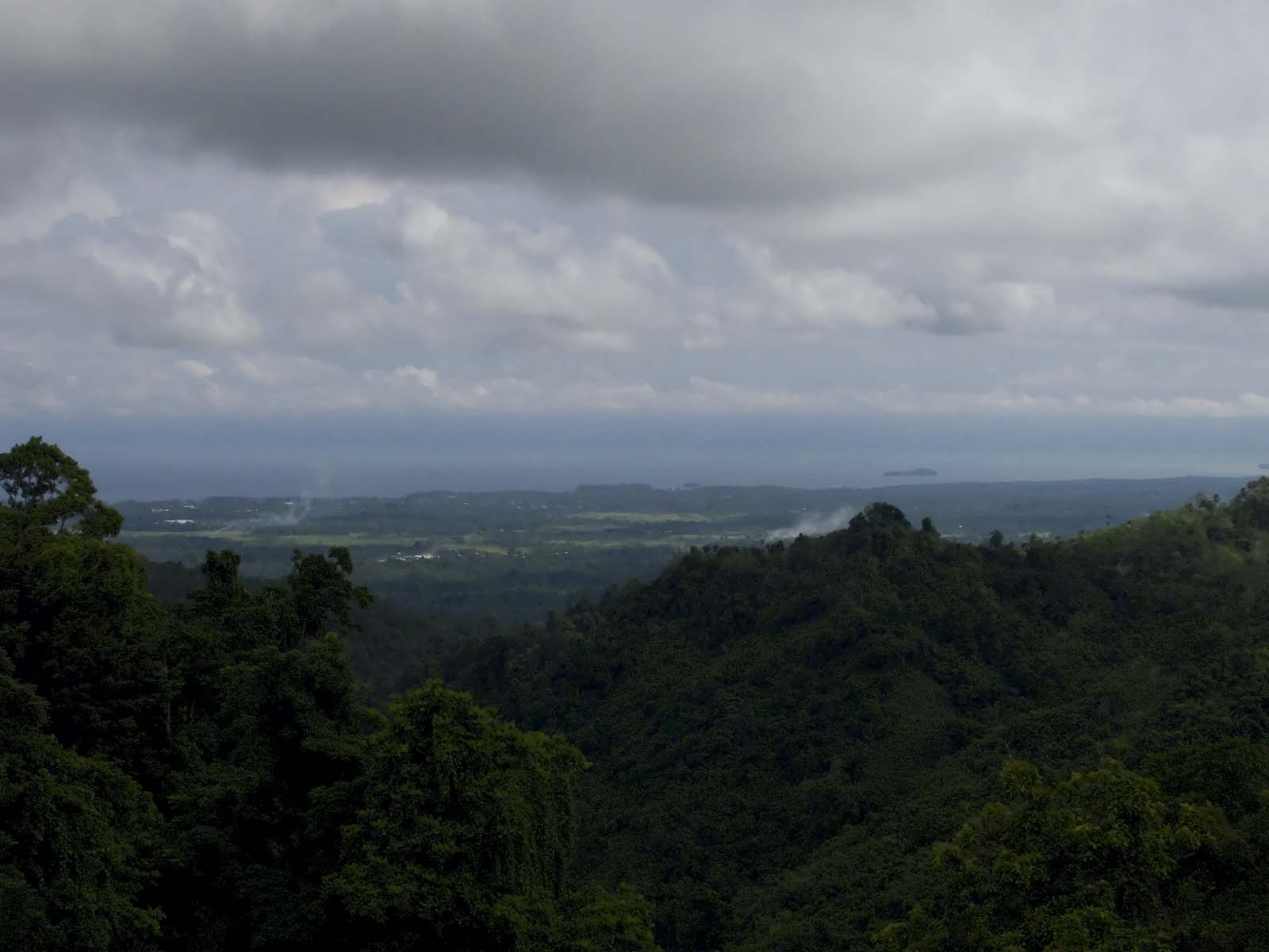
One does not absolutely have to use a tripod, given reasonably steady hands and firmly planted feet. I took a stroll up at Nob Nob mountain the other day with a friend. I'll have some nice nature shots from that visit in the next few days. They sky was cloudy and the light was miserable, not what you want for landscape photography. I shot two images. This one is correctly exposed for the dark foreground vegetation:
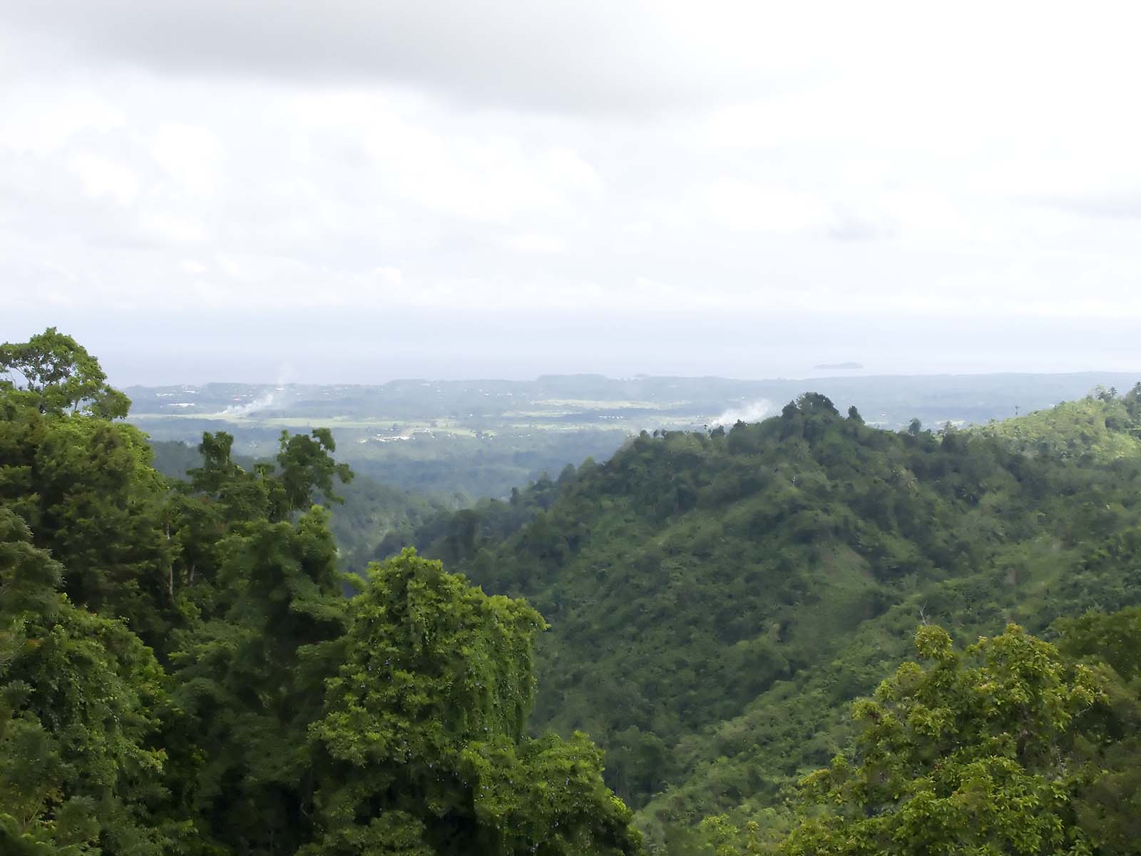
This one is exposed for the sky:
Even with only two exposures Photoshop did a credible job of producing a useable image:
It's not going to win any contests, but it's a nice picture. You might note some funny colour fringes around one of the clouds at the upper right. It's an artefact of the merging process. I didn't bother to correct it, because it's a good example of some of the problems which can crop up out of the blue, so to speak.
If you would like to see more examples of HDR photography, try here and here. Some of these I like and some I very much do not like. Certainly, HDR has a place as an artistic tool. However, if taken to extreme, it gets tiresome very quickly. So many shots look like cheap posters.
Okay, now I'm going to make some cheesy, cheap poster shots. I can hardly wait.
My new desktop for the end of summer
Wallpaper: Summer Colours
VS: Aiges II
Taskbar Icons: ecqlipse 2
Dock Icons: Underwater
RocketDock: Frost
RM: Caruso Set, IkonkoRainmeter
相關文章:
all screen formats available at wallpapers.vintage.it/27-super-mario-bros-1985-wallpapers.
For iPhone format visit iphonewallpapers.vintage.it/super-mario-bros-1985-iphone-...
This wallpaper was originally made for Smashing Magazine's July 2008 calendar roundup, which you can find here
I'm very happy with how this wallpaper came out :)
Free wallpaper on September 2011.
Sizes:
with calendar: 1024×768, 1024×1024, 1280×800, 1280×1024, 1440×900, 1600×1200, 1680×1050, 1920×1080, 1920×1200, 2560×1440
without calendar: 320×480, 1024×768, 1024×1024, 1280×800, 1280×1024, 1440×900, 1600×1200, 1680×1050, 1920×1080, 1920×1200, 2560×1440
Please, download here: www.smashingmagazine.com/2011/08/31/free-desktop-wallpape...
It is finally here... after more than a month waiting! (shipping to Brazil sometimes is a problem).
Every developer or designer who deals with HTML and CSS must buy this book!
And yes... the glasses... I'm getting old...
56/365
28/200 Thursday
It had to be done. Who can resist those overpriced tacky London souvenirs. The NY version of the T-shirt has somewhat got iconic status by now, strangely the London version never really took off.
I wanted to give the shot a grungy look as it reminds me of Camden Town (even though it was taken on Oxford Street) with its mixed crowd and punks on the bridge so I used a free cross processing action I found online.
Not much have changed. Reason for new submission is the android-inspired virtual desktop indicator / switcher at the mid-bottom of the shot.
Clicking the magnifying glass pops up a realistic pager with three (not so) little screenshots of the desktops. That's how it looks: img600.imageshack.us/img600/1851/pagerx.jpg
The virtual desktop app is VirtuaWin. The indicator (and the taskbar switcher at top-right) is done with VirtuaSam, a great Samurize plugin for VirtuaWin.
As in some andorid phones, switching desktops will slightly move the wallpaper, so I'm using an 1720x1050 picture with 20 pixel offset on the 1680x1050 screens.
Handy wallpaper: media.smashingmagazine.com/cdn_smash/wp-content/uploads/u...
The same with 2011 january calendar: media.smashingmagazine.com/cdn_smash/wp-content/uploads/u...
Ubuntu 9.10 Karmic Koala
Tema: Similar Suite
Iconos de la barra: Token
Iconos del escritorio: los encontre en iconfinder.net
El Reloj funciona con conky script modificado por mi.
Covergloobus: El Skin es un mod hecho por mi Ashes
El Wallpaper Ultimate Sophistication, esta en el post de Marzo de Smashing Magazine En muchas resoluciones.
You can download it from the Smashing Magazine website :: À télécharger sur le site de Smashing Magazine
Good times with the Apart brands' friendly competitors, @markodugonjic, @indysigner, and Gru AKA Vitaly Friedman.
Collage created using Shape Collage
Collage stolen from:
www.drweb.de/magazin/farben-themen-und-paletten-10-mal/
Photos stolen from:
www.smashingmagazine.com/2008/10/19/25-beautiful-examples...
Good times with the Apart brands' friendly competitors, @markodugonjic, @indysigner, and Gru AKA Vitaly Friedman.
Tilt Shift Photography is Awesome!
This technique is cool! Photographs of real life subjects made to look like miniature models of the real life thing, except they are the real thing! Check out some examples here.
Haha, no this ain't Tilt Shift Phogography! It's actually a model replica of a World War II German fighter plane, the Focke Wulf Wf 190A8 - Regarded as their best fighter plane at the time. This diarama was put together by my brother in law. Its not quite finished yet, but looks very detailed already. I think it looks cool! Anyway he's a model hobbyist as you can tell and far more patient than I could be at this sort of thing. I was unsure how this would turn out as an HDR image but I'm impressed at the result. There were a fairly large number of filters I put the image through to achieve the final result. Among them was Topaz Adjust, OnOne Phototools and Lucis Art.
Tech specs:
- 5 exposure HDR ranging from -/+2.
- Middle exposre taken at ISO100, f4, 1/30th sec.
- Canon Powershot G9.
HDR Spotting Testimonial
I started www.hdrspotting.com/ (and see the Editor's Picks too) with a friend to help bring more attention to other HDR photographers out there. We developed a cutting-edge "attention generation engine", designed to increase traffic for new and old artists all over the world. The site is still in beta, and thus, invite only. You have to know someone to get an invite (don't ask me - I don't hand them out). But you can pick up extra in the HDR group on Facebook, Flickr, and keep searching Twitter for when people have extras to give away.
Here is a testimonial from Brian Matiash:
I was first drawn to HDR Spotting because of the high quality HDR images that were shared by some very talented photographers. Since then, posting my best HDR images to HDR Spotting has become a natural part of my post-processing workflow. When a shot is finalized and ready to share, one of its first stops is at HDR Spotting. Now, most of my images average at least 1,500 views and my Editor's Choice shots average between 7,000 - 8,500 extra views!! I really am loving this added visibility to my work. Great job with the site, keep up the great work!
Smashing Magazine Book
Do you guys know Smashing Magazine? It's a great design resource, and they were kind enough to run this controversial piece by me called "10 Easy Steps to Advanced Photography Skills".
They have a new book out that is doing very well. It's called the "The Smashing Book", and if you are a designer or just interested in the subject matter, it's a great resource!
Daily Photo - Grand Central on a Rainy Night During the Holidays
I took this about the same time I went into Grand Central Station and performed my unique star-pattern maneuver to evade security guards. I described it in detail the next day when I spoke at B&H.
I've perfected a panoply of techniques to circumnavigate and befuddle security guards who don't like tripods. Maybe I will write a little e-book on this some day.
from the blog www.stuckincustoms.com
Vai ver eu la no smashingmagazine mermão.
=)
dpois d quase 1 mes q fui ser avisado da bagaça.
lerdo dmais.
www.smashingmagazine.com/2008/05/12/sexy-bold-and-experim...
A truly beautiful piece of work. I already started reading the ebook copy, but this is going to be a real delight.
Good times with the Apart brands' friendly competitors, @markodugonjic, @indysigner, and Gru AKA Vitaly Friedman.
my portfolio.
utilizes horizontal tinyscroll and highslide JS model. designed in illustrator cs4 + css/xhtml/javascript.
*featured in smashingmagazine*
Wallpaper for smashingmagazine.com
Download it for free here: www.smashingmagazine.com/2010/11/01/desktop-wallpaper-cal...
Available sizes:
with calendar: 320×480, 1024×768, 1024×1024, 1280×800, 1280×1024, 1440×900, 1680×1050, 1920×1080, 1920×1200
without calendar: 320×480, 1024×768, 1024×1024, 1280×800, 1280×1024, 1440×900, 1680×1050, 1920×1080, 1920×1200
Jeremy Keith on misunderstandings related to HTML and XHTML:
www.smashingmagazine.com/2009/07/29/misunderstanding-mark...
My post on the topic: julianschrader.de/20090801-misunderstanding-markup-xhtml-...
© ellen c anderson
larger size: i298.photobucket.com/albums/mm274/exploratoration/AUDIOJU...
leaf texture
www.smashingmagazine.com/2008/05/27/smashing-texture-cont...
speaker
Wallpaper “Winter forest” for Smashingmagazine.com
Download it for free on Smashingmagazine www.smashingmagazine.com/2010/12/31/desktop-wallpaper-cal...
or on my DeviantArt oxanaart.deviantart.com/art/Wallpaper-January-2011-191766423
Available sizes:
with calendar: 320×480 (iPhone), 1024×768, 1024×1024 (iPad), 1280×800, 1280×1024, 1440×900, 1680×1050, 1920×1080, 1920×1200, 2560×1440
without calendar: 320×480, 1024×768, 1024×1024, 1280×800, 1280×1024, 1440×900, 1680×1050, 1920×1080, 1920×1200, 2560×1440
This is a screenshot of my current desktop. Not that I'm really looking forward to the month of April. I'm just testing out the submission to Smashing Magazine's desktop wallpapers. I hope it get's accepted though.
The title of the wallpaper is Butterfly. I created the shapes, paths in illustrator and then lay it out in Fireworks.
If you want my wallpaper, let's hope it shows up on Smashing Magazine's April Desktop Wallpaper Calendar list.
Thanks!
UPDATE: The Butterfly is now availablae for download on Smashing Magazine! Thank you Smashing Magazine for including my work. You guys totally rock!
www.smashingmagazine.com/2009/03/30/desktop-wallpaper-cal...
1024×768, 1280×800, 1280×1024, 1440×900, 1600×1200, 1680×1050, 1920×1200
(Originally provided to readers of Smashing Magazine as part of their Smashing Textures Contest.)
A baby palm, found in Bankers Hill, with the top just at eye level, provides the perfect opportunity for a fan of green
So You Think You Can Scrap: Week 4
I joined in on the "So You Think You Can Scrap" contest hosted by Shabby Pickle Designs and After Five Designs. I didn't win anything but I am pleased with my layouts! Of the 6 weeks, this is my second fave! Jackie did the little "Emo Boy" illustration!
Credits
Papers: Catherine Designs “Pele Mele: Black & Cream Variation” blended with a fabric texture from my library, a photo of mine (tree branches) and a free texture from les brumes
Paint Mask: J Café “Blog Party Sampler 2: Art Gallery Collection”
Branch: Catherine Designs “Spring Retreat”
Stitching: New Life Designs “All Things Grow With Love”
Illustration: “Emo Kid” by BlooSweater My Daughter!
Clipart: Bird free from smashingmagazine.com
Brush: Paint Brush free from BittBox.com
Fonts: StamPete, Tiza
Haven't spent long reading this yet, but it definitely covers many of the issues we're facing: shop.smashingmagazine.com/products/design-systems-by-alla...
Actual size. Courtesy of Smashing Magazine's monthly desktop calendars:
www.smashingmagazine.com/2009/01/30/desktop-wallpaper-cal...