View allAll Photos Tagged script
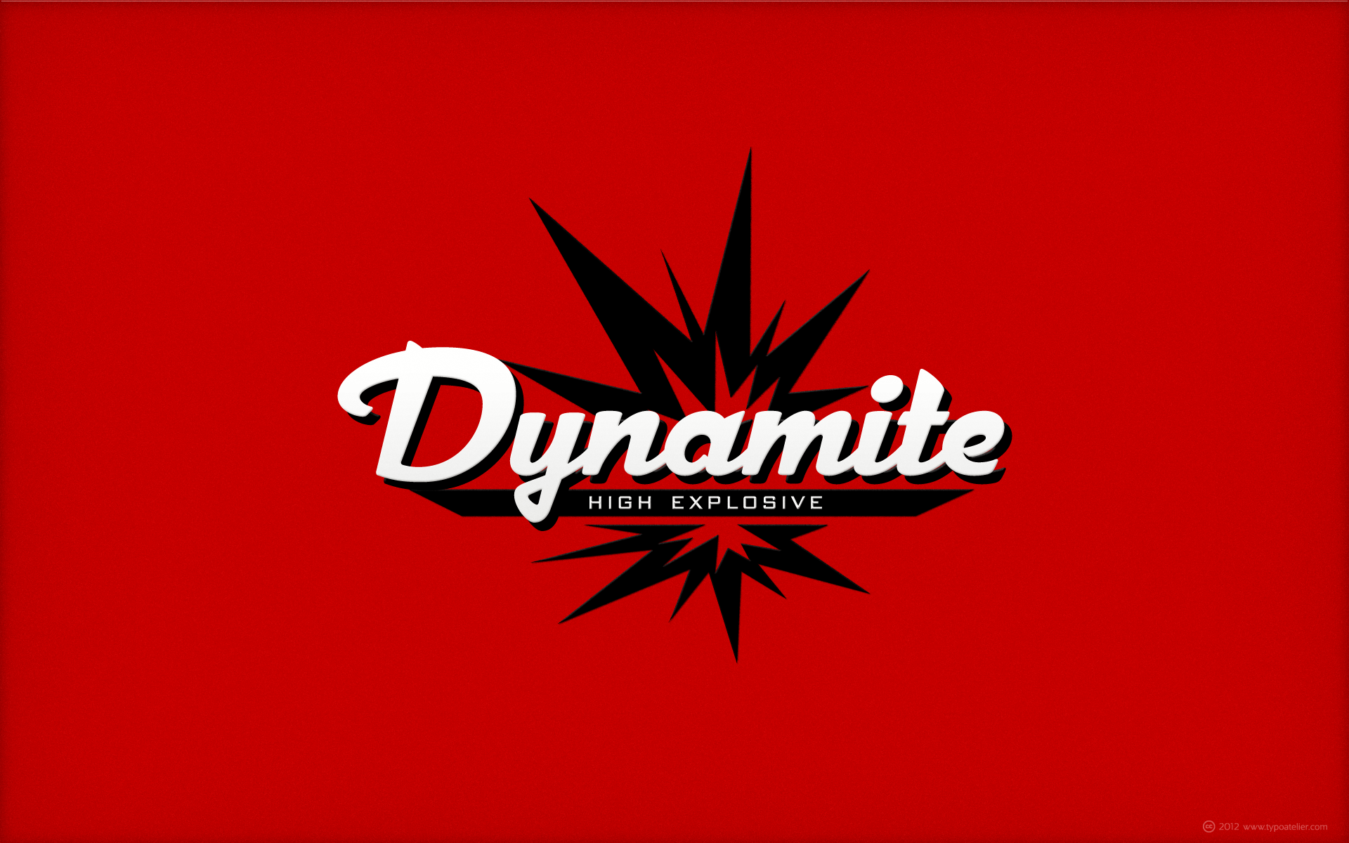
... created with Michael Doret’s | Alphabet Soup outstandingly beautiful script face »Dynascript«.
Typography enters the Space Age! Dynascript brings the ease of “Pushbutton Automatic” to your typesetting experience. Dynascript is actually Two fonts in One–without switching fonts you can instantly change from Dynascript’s connecting font to the non-connecting italic with the simple push of a button. For more details download “The Dynascript Manual” from the Gallery Section.
What is Dynascript? Dynascript is the slanted script cousin of Dynatype. It shares many of the characteristics of it’s sibling, but is drawn entirely from scratch and has it’s own unique character.
To some it may be reminiscent of various mid-century neon signage, and of sign writing, Speedball alphabets and even baseball scripts. The design of Dynascript also takes some cues from a historical typographic curiosity that began in Germany in the ‘20s and which lasted into the ‘60s—when Photo-Lettering gave it the name "Zip-Top". Basically it was believed to be the wave of the future—that by weighting an alphabet heavier in its top half, one could increase legibility and reading speed. The jury’s still out on whether or not there’s any validity to this claim, but I think you’ll agree that in the context of this design, the heavier weighting at the top of the letters helps to create some uniquely pleasing forms, and a script unlike any other.
Typesetters across the planet will also be able to set copy in their language of choice. Dynascript’s 694 glyphs can be used to set copy in: Albanian, Basque, Catalan, Cornish, Croatian, Czech, Danish, Dutch, Esperanto, Estonian, Faroese, Finnish, French, Galician, German, Hungarian, Icelandic, Indonesian, Irish, Italian, Kalaallisut, Latvian, Lithuanian, Malay, Maltese, Manx, Norwegian Bokmål, Norwegian Nynorsk, Oromo, Polish, Portuguese, Slovak, Slovenian, Somali, Spanish, Swahili, Swedish, Turkish, and Welsh—and of course English. Sorry! Off-world languages not yet supported.
I went wandering with a friend yesterday who looks up close at things I typically just walk by. I learned that there can be multiple lichens, mosses, and I don't know what, in one small area of tree bark. Here is what I think is Common Script Lichen", and some other things which I have no clue. Yet. My friend said the darker area is Beech Sucker. Sure.
Since I posted this, I have learned that these lichens actually need to be tested in a lab to determine for sure what they are. Also, the script lichen is called Graffiti Lichen, Genus Graphis.
There is a reason I am not a scientist.
Greasemonkey script to manage view and fave group memberships.
Script available here (current version 1.11).
SUDTIPOS NEWS
--------------------------------------------
We are proud to announce the release of Courtesy Script, our latest ornamental tribute to late S. XiX penmanship.
Get Courtesy > www.myfonts.com/fonts/sudtipos/courtesy-script-pro/
ABOUT COURTESY
--------------------------------------------
As in Victorian times, the precious, hand-lettered look of custom stationery is back in vogue. Enter Courtesy Script, my newest ornamental script typeface.
Courtesy captures the elegance and propriety of finely practiced Spencerian penmanship, in particular the Zanerian school. Its lowercase is notably understated, a simple monoline with very wide connections that ease readability. In the capitals, Courtesy adds variety in both the weight of the strokes, and in degrees of flourish — from merely fancy to over-the-top engrossery.
Based on an alphabet found in a 19th-century penmanship journal, Ale created hundreds of additional, stylistically complementary letterforms. Alternate capitals and lowercase letters, swashed lowercase forms, and ending and ornamental swashes; numerals, punctuation, and non-English and accented characters.
With virtually endless ways to customize its use, Courtesy helps designers create fluid, signature looks on stationery and invitations, book covers, fashion layouts, and packaging.
More fonts
Visit www.sudtipos.com
///// Sudtipos news //////
I m proud to announce the release of Feel Script. Take a look of the pdf at www.veer.com/download/pdf/feelscript.pdf
More about Feel at www.veer.com/products/typedetail.aspx?image=UMT0000300#sp...
Original picture and textures mine.
Watercolor script by PSP
If you want to see real watercolors with wonderful "zing" and style check out one of my newest contacts
Street art is visual art created in public locations, usually unsanctioned artwork executed outside of the context of traditional art venues. The term gained popularity during the graffiti art boom of the early 1980s and continues to be applied to subsequent incarnations. Stencil graffiti, wheatpasted poster art or sticker art, and street installation or sculpture are common forms of modern street art. Video projection, yarn bombing and Lock On sculpture became popularized at the turn of the 21st century.
The terms "urban art", "guerrilla art", "post-graffiti" and "neo-graffiti" are also sometimes used when referring to artwork created in these contexts.[1] Traditional spray-painted graffiti artwork itself is often included in this category, excluding territorial graffiti or pure vandalism.
Street art is often motivated by a preference on the part of the artist to communicate directly with the public at large, free from perceived confines of the formal art world.[2] Street artists sometimes present socially relevant content infused with esthetic value, to attract attention to a cause or as a form of "art provocation".[3]
Street artists often travel between countries to spread their designs. Some artists have gained cult-followings, media and art world attention, and have gone on to work commercially in the styles which made their work known on the streets.
Explosive - Scripts and Animations, High Quality Bento Animations, available in Full Perm and Standard versoion. Visit the store and watch live Animations: Walking, Combat, Emotive. Sitting, Lying, Dancing, Couple, Sport and Other. Some animations have built-in avatar physics. Scripts and Pose Stand are also available in the store, to inspire your photos. Reach for joy with Explosive Animations
Explosive - Scripts and Animations Store InWorld
maps.secondlife.com/secondlife/Ruined%20Mine/164/16/22
Explosive - Couples & Adult Animations Store InWorld
maps.secondlife.com/secondlife/Astralis/153/155/2001
Explosive Marketplace WEB Store
marketplace.secondlife.com/stores/157265
Explosive Facebook
www.facebook.com/SecondLifeExplosive
Explosive Youtube
www.youtube.com/@explosiveanimation4492/videos
Explosive - Scripts and Animations Group in Second Life
secondlife:///app/group/ed0897fe-4524-265f-3f1c-8cdc702596bb/about

New font by Ale Paul for www.sudtipos.com
--
Get the font MyFonts with a 35% introductory price > www.myfonts.com/fonts/sudtipos/auberge-script/
ABOUT AUBERGE SCRIPT
It took me a long time, but I think I now understand why people of my generation and older feel the need to frame current events in an historical context or precedents, while most of the young couldn't care less about what happened ten years ago, let alone centuries back. After living for a few decades, you get to a point when time seems to be moving quite fast, and it’s humbling to see that your entire existence so far can be summed up in a paragraph or two which may or may not be useful to whoever ends up reading the stuff anyhow. I suppose one way to cope with the serenity of aging is trying to convince yourself that your life and work are really an extension of millenia of a species striving to accept, adapt to, and improve the human condition through advancing the many facets of civilization -- basically making things more understandable and comfortable for ourselves and each other while we go about doing whatever it is we are trying to do. And when you do finally convince yourself of that, history becomes a source of much solace and even a little premonition, so you end up spending more time there.
Going far back into the history of what I do, one can easily see that for the most part it was ruled by the quill. Western civilization’s writing was done with quill pens for more than thirteen centuries and with newer instruments for about two. By the mid-18th century, the height of the quill experience, various calligraphy techniques could be discerned and writing styles were arranged in distinct categories. There are many old books that showcase the history of it all. I recommend looking at some whenever the urge comes calling and you have to get away from backlit worlds.
Multiple sources usually help me get a better perspective on the range of a specific script genre, so many books served as reference to this quill font of mine. Late 17th century French and Spanish professional calligraphy guides were great aides in understanding the ornamental scope of what the scribes were doing back then. The French books, with their showings of the Ronde, Bâtarde and Coulée alphabets, were the ones I referenced the most. So I decided to name the font Auberge, a French word for hotel or inn, because I really felt like a guest in different French locales (and times) when I going through all that stuff.
Because it is multi-sourced, Auberge does not strictly fit in a distinct quill pen category. Instead, it shows strong hints of both Bâtarde and Coulée alphabets. And like most of my fonts, it is an exercise in going overboard with alternates, swashes, and ornamental devices. Having worked with it for a while, I find it most suitable for display calligraphic setting in general, but it works especially well for things like wine labels and event invitations. It also shines in the original quill pen application purpose, which of course was stationery. Also, as it just occurred to me, if you find yourself in a situation where you have to describe your entire life in 50 words or less, you may as well make it look good and swashy, so Auberge would probably be a good fit there as well.
This is one quill script that no large bird had to die for.
A few technical notes
The Auberge Script Pro version includes 1800 glyphs, everything is included there. Also latin language support. We recommend you to use the latest design application to have full access to alternates, swashes, small caps, ornaments, etc. The images from the gallery uses this version. For better results use the fonts with “liga” feature on.
Awards
During 2014 the early develop of Auberge Script was chosen to be part of Tipos Latinos, the most important type exhibition in South America.
Take a look of the complet project at on.be.net/15Yq5XY
This script was found on the temple walls of the Tanjore Bragadeeshwara temple. This is very different from the present Tamil script.
“If you didn’t see me flip the script, you’re on the wrong page” – Capital Lights; Newport Party.
Gramatik - Flip the script ♫ youtu.be/DiP4797atvI
Flip The Script – A Photographer’s music diary by Kingsley Davis. The Flip the Script book is an unparalleled collection of photographs taken by UK photographer Kingsley Davis ( Flip the Script on Flickr), documenting some of the most talented artists, musicians, Dj’s and producers from both sides of the Atlantic to have emerged over recent times. The book with a special preface by Norman Jay MBE, is a who’s who of genre-defying artists from the last ten years. Some of the artists featured in the book are Estelle (cover), Omar, Marc Mac, Pharrell, Guru, Bashy, Jonzi D, N\'Dea Davenport, Ms. Dynamite, John Legend, Flying Lotus, KRS-One and many more. www.flipthescriptbook.com/
Photo taken with mobile phone (Nokia Lumia 930) and edited with PicMonkey.