View allAll Photos Tagged letterforms
Jos Neve Lettergreep, Jos Neve, 1973
Emigre Reference Library, Letterform Archive
Jos Neve was a Dutch phototype shop with locations in Amsterdam and Rotterdam. This 480-page type specimen catalog is undated, but was advertised in the Oct. 17, 1973 issue of Kontekst magazine. The magazine then wrote about the catalog in its Nov. 28, 1973 issue.
Jos Neve stocked display styles from Photoscript Ltd., the pioneering UK company with original typeface designs not commonly available elsewhere.
From Pubblicità in Italia, 1959–60. Collection of Letterform Archive.
A pretty early example of a lettering effect that reminded me of Brownjohn, Chermayeff and Geismar’s That New York and identity for The Electric Circus.
Grignani also used this distortion effect for another design 1959: an ad for arthritis medication.
Novel Effects with Novel Gothic brochure, undated.
Tholenaar Collection at the Letterform Archive. Better photos of this booklet in the Online Archive.
As far as I know, this is one of only two ATF specimens of Novel Gothic. For some reason it does not appear in the 1934 ATF catalog, which was their last major specimen book. The typeface was initiated by Charles H. Becker and finished by Morris Fuller Benton for ATF in 1928.
There are many digital typefaces in this 1920s showcard style (such as Kobalt), and many poor digitizations of Novel Gothic, but no faithful revival currently exists. Telenovela NF is a digital interpretation with an additional highlight effect, while Napoli and Naked Power are attempts to tame Novel Gothic’s comical personality into large, straightforward sans families.
Excerpts from Nebiolo specimens at Letterform Archive.
Nebiolo issued Microgramma in 1952. Available in lining sizes from 6pt to 36pt it was primarily intended for very small uses, thus the name. One of the features which improved tiny-size clarity is the flat crotch in ‘A, M, 1’. Eurostile arrived in 1962 and added a lowercase and more sizes. The caps are nearly identical to Microgramma except for conventionally sharp counters.
Among a large box of donations to Letterform Archive from DiSpigna, including a few original sketches and typeface development files. Will share more later.
Stouffer’s Inn opened in 1978, reviving the Cleveland Hotel. Harper, Hellams & Paige was an ad agency in Columbia, South Carolina, founded in 1967.
From the Tholenaar Collection at Letterform Archive.
Normal-Grotesk was released around 1943. It was reworked (see changed shapes here in red) from Haas’ Akzidenz-Grotesk (based on a Wagner & Schmidt design, c.1909). It is not the same as the Berthold Akzidenz-Grotesk, but both designs, along with Französische Grotesk, were models for Neue Haas-Grotesk (later Helvetica). Info from Indra Kupferschmid. See also her history in Helvetica Forever.
Polish book from the 1930s. From the collection of the Letterform Archive, San Francisco (letterformarchive.org).
Collection of Letterform Archive.
This is the earliest Headliners catalog I’ve seen. (See also Headliners neo-phototype(s), 1978–79 & 1987.)
The Headliners, Inc. was a phototype supplier founded in New York City in 1954 (a trademark was filed in 1961). Along with typefaces from other foundries, Headliners produced some of their own designs, as well as film reproductions of wood and metal type and extensions of other existing fonts. Later typefaces in their catalogs were prefixed with the “neo-” trademark and these were often classic designs with a raised x-height à la ITC.
In the early 1990s, the Headliners library was acquired by Treacyfaces who has released digital versions of several fonts in the collection. [Mark Simonson]
One of many 1960s–80s phototype catalogs from local typesetting shops donated to Letterform Archive by the California Historical Society
Shipping and Receiving, MPLS.
A loose collection of personal work also available at:
geotypografika.com
2010 © Erik Brandt
In this headline Dwiggins' calligraphy marries the whimsy of the text to the form. You can almost feel his enjoyment in assembling the twists of his pen into letterforms.
Collection of Letterform Archive.
12 x 12 sheets each reproducing a full alphabet selected by Theo Crosby, Alan Fletcher, and Colin Forbes, and printed by Mears, Caldwell, Hacker, Letterpress & Lithography, London SW9. Originally distributed as a Crosby/Fletcher/Forbes Christmas promotion, this set was distributed by Mears, Caldwell, Hacker to select clientele. [modernism101]
This typeface is unknown to me. Similar to Viktoria.
Novel Effects with Novel Gothic brochure, undated.
Tholenaar Collection at the Letterform Archive. Better photos of this booklet in the Online Archive.
As far as I know, this is one of only two ATF specimens of Novel Gothic. For some reason it does not appear in the 1934 ATF catalog, which was their last major specimen book. The typeface was initiated by Charles H. Becker and finished by Morris Fuller Benton for ATF in 1928.
There are many digital typefaces in this 1920s showcard style (such as Kobalt), and many poor digitizations of Novel Gothic, but no faithful revival currently exists. Telenovela NF is a digital interpretation with an additional highlight effect, while Napoli and Naked Power are attempts to tame Novel Gothic’s comical personality into large, straightforward sans families.
From a D. Stempl AG type specimen booklet for Ratio-Latein, spotted for sale on Letterform Archive’s table at the Typographics Book Fair
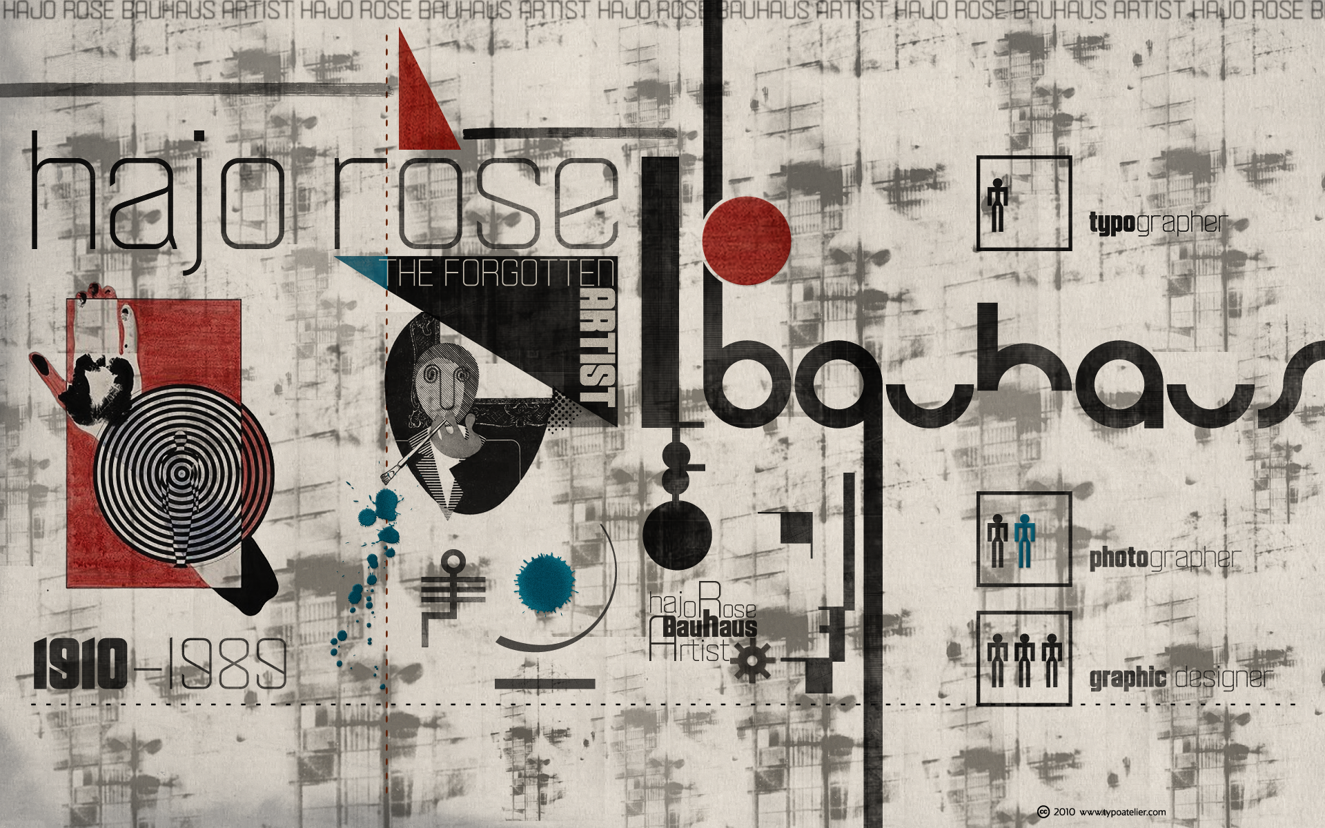
This Wallpaper 1920x1200 I dedicate to Hans Joachim Rose, a »forgotten« Bauhaus artist.
Typefaces in use:
The striking typeface »Velvet« designed by Mike Jarboe (Reserves).
Velvet is a heavy rounded block retro face inspired by the typeset album covers of the protopunk rock band The Velvet Underground.
Stylistically, Velvet’s extreme angled terminals exude a sense of tension and irreverance, contrasting the subtle rounded block letter forms.
The monoline Bauhaus typeface »Form« designed by Rick Banks (F37).
Form: After looking at Armin Hoffman’s Die Gute Form poster and Herbert Bayer’s universal typeface I constructed an alphabet based on their letterforms. Inspired by Wim Crouwel’s Soft Alphabet, I constructed a grid to create the modular alphabet and programmed very tight letterspacing into the font lending itself to the style of Die Gute Form.
Taken with Polaroid Automatic Land Camera 250. This is a scan of the Polaroid 667 negative in color mode. No Photoshop here other than the scan.
Great sign.
Czech book from the 1930s. From the collection of the Letterform Archive, San Francisco (letterformarchive.org).
No inspiration for ages... and then one day before my holiday a new work takes shape. Been wanting to do ABC posters for some time now! I hope you like it! Will be availalble in the shop very soon :)
Polish book from the 1930s. From the collection of the Letterform Archive, San Francisco (letterformarchive.org).
Typefaces in use:
lowercase »a«
Danila Orlovsky’s (ParaType) fashionable, geometric Didone »Circus Didot«.
Circus Didot typeface presents a rework of a typical neoclassical serif type in a constructivist style. Analyzing the shapes of characters author placed basic geometric figures — triangles, rectangles, circles… above the contours of letters.
Resulting constructions staying recognizable letters at the same time bore a resemblance to pictures of Russian avant-garde artists from 20th century. This discovery has brought an idea to design a typeface where the tendency of a modern serif type to rationalism and geometry is realized in maximum possible extent. The prototypes for the project were taken from the works of Didot, lettering experiments of Russian constructivists and art deco artworks.
The technique of juggling with shapes and overall grotesque approach to the design explains the selection of the name for the font.
ligature »rt«
Corey Holms’ geometric, monoline, sans-serif typeface »Area«.
Area hearkens back to the disco era, reminiscent of nightclub and record advertising.
The rounded simple forms are updated with the implementation of negative kerning, which gives the typeface its unique look and modern feel. It is enhanced by the addition of over 50 ligatures that refine the final type treatment even further.
and
Silas Dilworth’ (TypeTrust) clean, geometric sans-serif face »Breuer Text«.
Breuer Text is a simple geometric sans with relaxed curves and slightly condensed proportions suitable for moderate lengths of body copy. The italics are optically adjusted obliques with a selection of augmented lowercase glyphs for a warmer read.
Breuer Text offers the distinct aura of technical precision in a personable tone, ideal for instructional copy or safety warnings. Its basic structure and conservative letterforms maintain a level voice without turning robotic or sterile.
Pair with the two-font Breuer Headline family for a simple and complete editorial type system. Breuer Text includes Small Caps, Old Style Figures and Tabular Figures.
Mecanorma Graphic Products, 1973, 74, 75. Collection of Letterform Archive.
Puff Wind was Mecanorma contest winner which went on to appear on many European record covers. See also Premier Shaded and Busorama.
Novel Effects with Novel Gothic brochure, undated.
Tholenaar Collection at the Letterform Archive. Better photos of this booklet in the Online Archive.
As far as I know, this is one of only two ATF specimens of Novel Gothic. For some reason it does not appear in the 1934 ATF catalog, which was their last major specimen book. The typeface was initiated by Charles H. Becker and finished by Morris Fuller Benton for ATF in 1928.
There are many digital typefaces in this 1920s showcard style (such as Kobalt), and many poor digitizations of Novel Gothic, but no faithful revival currently exists. Telenovela NF is a digital interpretation with an additional highlight effect, while Napoli and Naked Power are attempts to tame Novel Gothic’s comical personality into large, straightforward sans families.