View allAll Photos Tagged letterforms
Torsten Bergentz, Stockholm, 1960s. Found in a book on mid-century Scandinavian advertising at the Letterform Archive.
Well?
On a humid day (shot this in almost full rain) it's hard to keep these negatives from really puddling drops of dew. They just don't ever dry out. I've taken the hair dryer to them in desperation. Not this one though. I just let it be wet. It dried up two days later. I'm glad it did.
Each one of these letters are individually wired to that piece of hog-fence. Really a thing of beauty to me. All the different sized type. All the care. The different collections of letters that these individual forms came from. Man.
Shot with Super Shooter Plus. Negative scan.
Mortimer Leach (1906–1975) was one of America’s leading lettering artists, and his work can be found in advertising throughout magazines and newspapers of the 1930s–60s. As an ArtCenter instructor, he taught many career letterers, a legacy that continued through the equally influential Doyald Young, and his Lettering for Advertising (1956) and Letter Design in the Graphic Arts (1960) are some of the best instructional books on the subject. At Letterform Archive we have a small grouping of his original inked boards (including tiny white-out corrections). I think they were some of the first pieces I saw when I visited Rob Saunders before there was an Archive. This week, I identified two originals that were reproduced in Lettering for Advertising: “Lockheed Constellation” and “The Bryson Lectures”.
Preview 01 here
Preview 03 here
Preview 04 here
For the past two and a half months I have been developing my first, cursive Arabic (and a Latin) typeface.
Normally, type designers tend to raise the Arabic characters upto the Latin x-height - which in my view distorts the letterforms from their true, cursive, fluid and diversified beauty. I understand the reason behind this though - it is to harmonise two alien scripts - and more often than not - it is the Latin script which was developed first and so the Arabic must follow suit.
As such, on this occasion, I began with the Arabic - and in doing so retained all its' calligraphic character without the calligraphic embellishments. It is essentially a monoline font - clean cut and simple - with minor but very necessary modulation (mostly on terminal endings) - which makes it perfect for use as a contemporary, Modernistic typeface.
The Arabic featured here has a fluid beauty to it resonant and respectful to the centuries of character development and handwriting systems developed through the many lifetimes of Master Khattats (calligraphers) around the world.
I am currently in the process of developing a matching Latin with the help of Swiss typographer, Bruno Maag, and his associates at the infamous type house, Dalton Maag, in London.
More will be revealed very soon :)
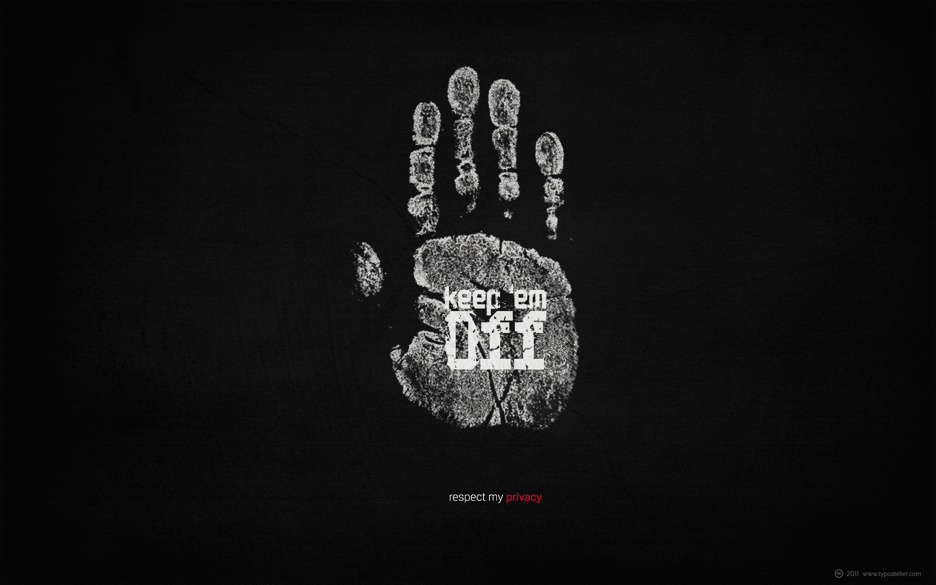
I created this grungy, simple, minimalist wallpaper for my desktop. You may resize it, modify it, use it on your desktop, iPhone or whatever you like.
Typefaces in use:
Carlos Fabián Camargo Guerrero’s (ANDINISTAS) futuristic, square, mechanical typeface »Codiga«.
Codiga is perfect for titles and badges that need to show a futurist and space sensation. Its angles are formed by straight lines and its san serif »monolineal« design allows its solid and rigid shapes stress its industrial and technology Look. Codiga consisting of 8 styles: Blanca, Gris, Negra, Super Negra, X1, X2, Stencil and Dingbats (Codiga Dingbats includes 26 illustrations characters). Codiga Blanca, Gris, Negra, Super Negra, X1, X2, Stencil include the complete character set with lower and upper case letters, numbers, accents, diacritics, puntuation and monetary symbols.
and
Silas Dilworth’ (TypeTrust) clean, geometric sans-serif face »Breuer Text«.
Breuer Text is a simple geometric sans with relaxed curves and slightly condensed proportions suitable for moderate lengths of body copy. The italics are optically adjusted obliques with a selection of augmented lowercase glyphs for a warmer read.
Breuer Text offers the distinct aura of technical precision in a personable tone, ideal for instructional copy or safety warnings. Its basic structure and conservative letterforms maintain a level voice without turning robotic or sterile.
Pair with the two-font Breuer Headline family for a simple and complete editorial type system. Breuer Text includes Small Caps, Old Style Figures and Tabular Figures.
The title page from the 1964 "Alphabet", an international annual of letterforms, a magnificent production put together by the highly regarded ICI 'house' printers, the Birmingham based Kynoch Press. It was edited by R S Hutchings and published for them by James Moran and was the only volume of an intended series issued. The right page folds out to reveal the full alphabet.
Medieval manuscripts, 18th-c writing book, brief history of type (metal, wood, linotype, photo, transfer, digital), Emigre (fonts, logo, magazine, mechanicals), 20th-century design icons (El Lissitzky, Rodchenko, Zwart, Dwiggins, Bayer, Beall, Burtin, Sutnar, Sister Corita, Rand, Bass, Lubalin, Studio Dumbar, Paula Scher), psychedelia (Wilson, Moscoso, Griffin), The Black Panther (Emory Douglas), Islam Aly artist book (The Square), civic action posters (Klijn, Games, Shahn, Glaser)
From a German lettering manual, 1930s
(«Die Schrift in Wort und Bild», Hrsg. Malerschule Zimmermann, Mannheim-Neckarau, o.J., um 1935/1940)
Present: Rob Saunders, EM Ginger, Mark Dimunation, Sumner Stone, Nicky Yeager, Sun Helen Isdahl Kalvenes, Simran Thadani, Jessica Hische, Russ Maschmeyer, Lizy Gershenzon, Travis Kochel
The Letterform Archive collects inspirational analog artifacts to digitize in high fidelity, for all who love letters. Read more about the organization on Typographica.
Thomas Glendon has a long established studio specialising in sculpture, letterform, ecclesiastical work and design in stone, wood and bronze. His sculptures may be seen at the Solomon and Davis Galleries, Dublin, the Kenny Gallery, Galway, The Lavitt Gallery, Cork and the No. 5 Gallery, Liverpool. Sculpture works have been exhibited at the R.H.A. annual summer show for a number of years. His work is included in a number of private collections in Ireland and abroad.
Czech book from the 1930s. From the collection of the Letterform Archive, San Francisco (letterformarchive.org).
See ‘Letterform Archive: Objects of Inspiration’ in Eye 100: www.eyemagazine.com/feature/article/letterform-archive-objects-of-inspiration
Mortimer Leach (1906–1975) was one of America’s leading lettering artists, and his work can be found in advertising throughout magazines and newspapers of the 1930s–60s. As an ArtCenter instructor, he taught many career letterers, a legacy that continued through the equally influential Doyald Young, and his Lettering for Advertising (1956) and Letter Design in the Graphic Arts (1960) are some of the best instructional books on the subject. At Letterform Archive we have a small grouping of his original inked boards (including tiny white-out corrections). I think they were some of the first pieces I saw when I visited Rob Saunders before there was an Archive. This week, I identified two originals that were reproduced in Lettering for Advertising: “Lockheed Constellation” and “The Bryson Lectures”.
Novel Effects with Novel Gothic brochure, undated.
Tholenaar Collection at the Letterform Archive. Better photos of this booklet in the Online Archive.
As far as I know, this is one of only two ATF specimens of Novel Gothic. For some reason it does not appear in the 1934 ATF catalog, which was their last major specimen book. The typeface was initiated by Charles H. Becker and finished by Morris Fuller Benton for ATF in 1928.
There are many digital typefaces in this 1920s showcard style (such as Kobalt), and many poor digitizations of Novel Gothic, but no faithful revival currently exists. Telenovela NF is a digital interpretation with an additional highlight effect, while Napoli and Naked Power are attempts to tame Novel Gothic’s comical personality into large, straightforward sans families.