View allAll Photos Tagged letterforms
"Will winning art awards facilitate artistic evolution or will I regress back to artistic doubt? {It's been 2 years since a merit occured-but I've grown a new ARTISTIC BRAIN INSTEAD}
Mortimer Leach (1906–1975) was one of America’s leading lettering artists, and his work can be found in advertising throughout magazines and newspapers of the 1930s–60s. As an ArtCenter instructor, he taught many career letterers, a legacy that continued through the equally influential Doyald Young, and his Lettering for Advertising (1956) and Letter Design in the Graphic Arts (1960) are some of the best instructional books on the subject. At Letterform Archive we have a small grouping of his original inked boards (including tiny white-out corrections). I think they were some of the first pieces I saw when I visited Rob Saunders before there was an Archive. This week, I identified two originals that were reproduced in Lettering for Advertising: “Lockheed Constellation” and “The Bryson Lectures”.
Some of my sketchbook calligraphy fun. This is a mix of materials and inks— collage antique paper, japanese art tape, walnut ink, shellac ink, Pilot parralel pens, Copic warm gray wide markers, Schaeffer calligraphy cartridge pens, pencil.
Lovely calligraphy— the darker areas are much deeper than the vertical letter stems. They are about a quarter of an inch deep in the darker areas.
From the Tholenaar Collection at the Letterform Archive.
Such a nice piece of work. No proper revival.
Wallpaper 1920x1200 created with the typefaces listed below:
Text Face
Alejandro lo Celsos (Pampa Type) unique serif typeface family»Arlt«.
»Arlt is a family of contemporary typefaces for a wide variety of applications. It includes text, display, and decorative fonts. Its style gives the text a sort of spicy atmosphere that makes it ideal for composing literature.
Arlt has been created for the demanding, inspired designers. Being the result of 3 years of intensive work, the types aim to balance a strong personality against comfortable readability. The fonts have been carefully crafted in every detail, to offer you the highest visual quality standards in typography.
Arlt is inspired by the novels and plays of Argentinean writer Roberto Arlt, active in the 20s and 30s. He pioneered the introduction of Lunfardo (Buenos Aires slang) into literature, and he was the first to write about the crook and the madman. His novels and plays refreshed the spirit of Hispanic literature of early 20th century, and anticipated the work of English-speaking writers such as Irvine Welsh or William Burroughs.
Arlt is a complex typeface. Its characters have vigorous counterforms. As individual shapes the letterforms can feel impulsive and capricious, but once they are combined into words, they look elegant and sober. The text line in Arlt creates a dynamic, stimulating rhythm, which is still very comfortable at immersed reading.
Arlt is a contemporary interpretation of the alphabet which finds inspiration in some classic sources. The italics are linked to the glamorous, mannerist typography of 17th century Baroque (Dutch designer Christoffel van Dijck, Hungarian printer Miklós Kis). While the romans are a new attempt at capturing the warmth and vehemence of Expressionism. This style may be traced back to the 18th century: the singular work of German punchcutter Christian Zinck, and later to some 20th century East European type designers such as Preissig, Dyrynk, Menhart, and Frantisek Storm, probably today’s finest representative.«
Handwriting
Nick Shinns (ShinnType) excellent, exceptionally versatile script face »Duffy Script«.
Duffy Script is an interpretation of the lettering of contemporary illustrator Amanda Duffy, aka Losergirl. Each font contains four glyphs for each character (including all numbers, punctuation, and symbols), which OpenType coding sets in “random” order for a subtle, natural effect. Use a curved path to further accentuate the bounced quality of the letters. Try out different combinations of glyphs by inserting the cursor in front of your headline and hitting the space bar repeatedly: each time,the text will be represented by a different sequence of glyphs.
Outline Slab Serif
Dino dos Santos’ (DSType) fashionable, decorative slab serif typeface »Anubis Pro«.
Alva Noto
Book :
Bauhaus Typography At 100
Letterform Archive
2022
CD :
Music At The Bauhaus
Stefan Wolpe . George ANtheil . Arnold Schoenberg . Joseph Matthias Hauer . Hanz Heinz Stuckenschmidt
Les Temps Modernes
LTM2533
Artwork . Oskar Schlemmer
iMusic :
Byetone
Typographer
Raster - Noton
RN92
GMA Sans Sérif ...
Novel Effects with Novel Gothic brochure, undated.
Tholenaar Collection at the Letterform Archive. Better photos of this booklet in the Online Archive.
As far as I know, this is one of only two ATF specimens of Novel Gothic. For some reason it does not appear in the 1934 ATF catalog, which was their last major specimen book. The typeface was initiated by Charles H. Becker and finished by Morris Fuller Benton for ATF in 1928.
There are many digital typefaces in this 1920s showcard style (such as Kobalt), and many poor digitizations of Novel Gothic, but no faithful revival currently exists. Telenovela NF is a digital interpretation with an additional highlight effect, while Napoli and Naked Power are attempts to tame Novel Gothic’s comical personality into large, straightforward sans families.
The Letterform Archive's "Subscription to Mischief" exhibition features a beautifully curated collection of ephemera from the dawn of graffiti zines in the 1990's.
letterformarchive.org/news/subscription-to-mischief-graff...
Under-appreciated Emory Douglas cover. Never has Dom Bold carried so much weight. More on Douglas and The Black Panther: letterformarchive.org/news/view/emory-douglas-and-the-bla...
A folded sheet tipped in the inside front cover of Schriften-Probe, Spamersche Buchdruckerei, Band 1, c.1930. I forgot to look for the artist credit, sorry! But I'll check later.
Tholenaar Collection at Letterform Archive.
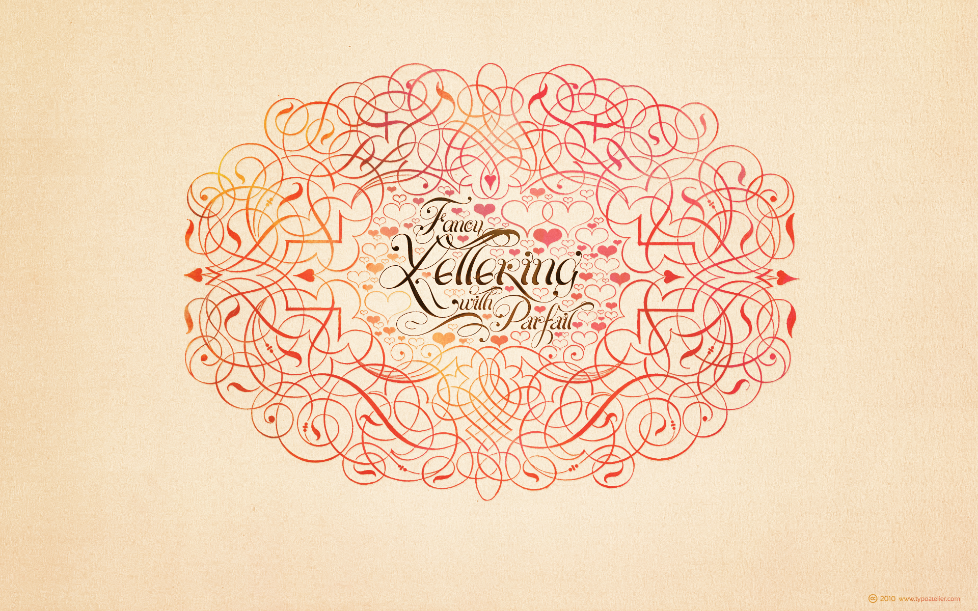
At request of one of my female flickr-contacts find here a »colorful« version of my »Fancy Lettering« Wallpaper 1920x1200 with Maximiliano Sprovieros (Lián Types) outstanding script face »Parfait Script Pro«
Parfait Script Pro takes its inspiration in the Spencerian script and the pointed brush lettering. Two styles of writing (of drawing letters, would say a calligrapher), which the designer successfully combined.
With over 850 glyphs, Parfait Script Pro is an Open-Type font designed by Maximiliano R. Sproviero between 2009 and 2010.
The Beginnings
Exactly a year ago, Lián started what would be Parfait Script today.
With the idea of creating a totally unique typography Lián started drawing the first letters by altering the typical ductus of the calligraphic styles he was practicing those days: This was, writing from the bottom to the top; something that calligraphy books do not support.
Being again a bit of a rebel, almost every letter of the alphabet were made like this. This gave Parfait such an unusual look.
Lián wanted a name which reflected this. So at first he named it Nonpareil Script, which as you may know, is a word from France that means with no comparison.
The more 2009 was coming to its end, the more Parfait Script was growing. The font was shouting for alternates, and that was when the most entertaining part began (and also when the name changed). Lián studied about the decorative swirls of the Spencerian script style and tried to include those lovely loops into his type. He also went into the pointed brush lettering world in order to add Parfait a gestural look. This was when lots of alternates came to life. Now, it was not only to alternate common ductus; now it was also to exaggerate contrasts of the strokes. Very thick and thin strokes all together.
2010 consisted in adding more and more alternates and ligatures. The font was prepared to be universally used, since it contains the enough glyphs and ligatures of the most common combination of letters and words.
Once more, a combination of styles gave wonderful results.
Parfait Script Pro and its voluptuous style hopes to be useful for whatever you design.
Technical
Parfait Script has more than 850 glyphs. It’s up to you to choose, it’s up to you to have fun. Parfait would love to play.
The font has lots of alternates. They'll for sure either embellish your words or provide more legibility. The alternates are: Standard Ligatures; Contextual Alternates; Discretionary Ligatures Swashes; Stylistic Alternates; Titling Alternates; Terminal Forms; Historical Alternates * ; Stylistic Ligatures; Stylistic Set 1 and 2 * ; Ornaments. (* These Alternates are only included in Parfait Script Pro).
Parfait Script Pro contains everything inside.
GRD 2000 Perso-Arabic Workshop with Leland Hill, VCU Qatar. Process photos of introductory level graphic design students enjoying an afternoon with type from another world.
Do not mess with him. Set your type right.
Cover of the 1929 Stempel Yearbook by Friedrich Wilhelm Kleukens. From the Tholenaar Collection at the Letterform Archive.
Video for Letterform Archive’s Home Library Share, an Instagram feature we ran after the pandemic prevented staff from doing tours on site.
From a type specimen booklet Letterform Archive was selling at the Typographics Book Fair (I forget which one exactly).
Jos Neve Lettergreep, Jos Neve, 1973
Emigre Reference Library, Letterform Archive
Jos Neve was a Dutch phototype shop with locations in Amsterdam and Rotterdam. This 480-page type specimen catalog is undated, but was advertised in the Oct. 17, 1973 issue of Kontekst magazine. The magazine then wrote about the catalog in its Nov. 28, 1973 issue.
Jos Neve stocked display styles from Photoscript Ltd., the pioneering UK company with original typeface designs not commonly available elsewhere.