View allAll Photos Tagged Small-cap
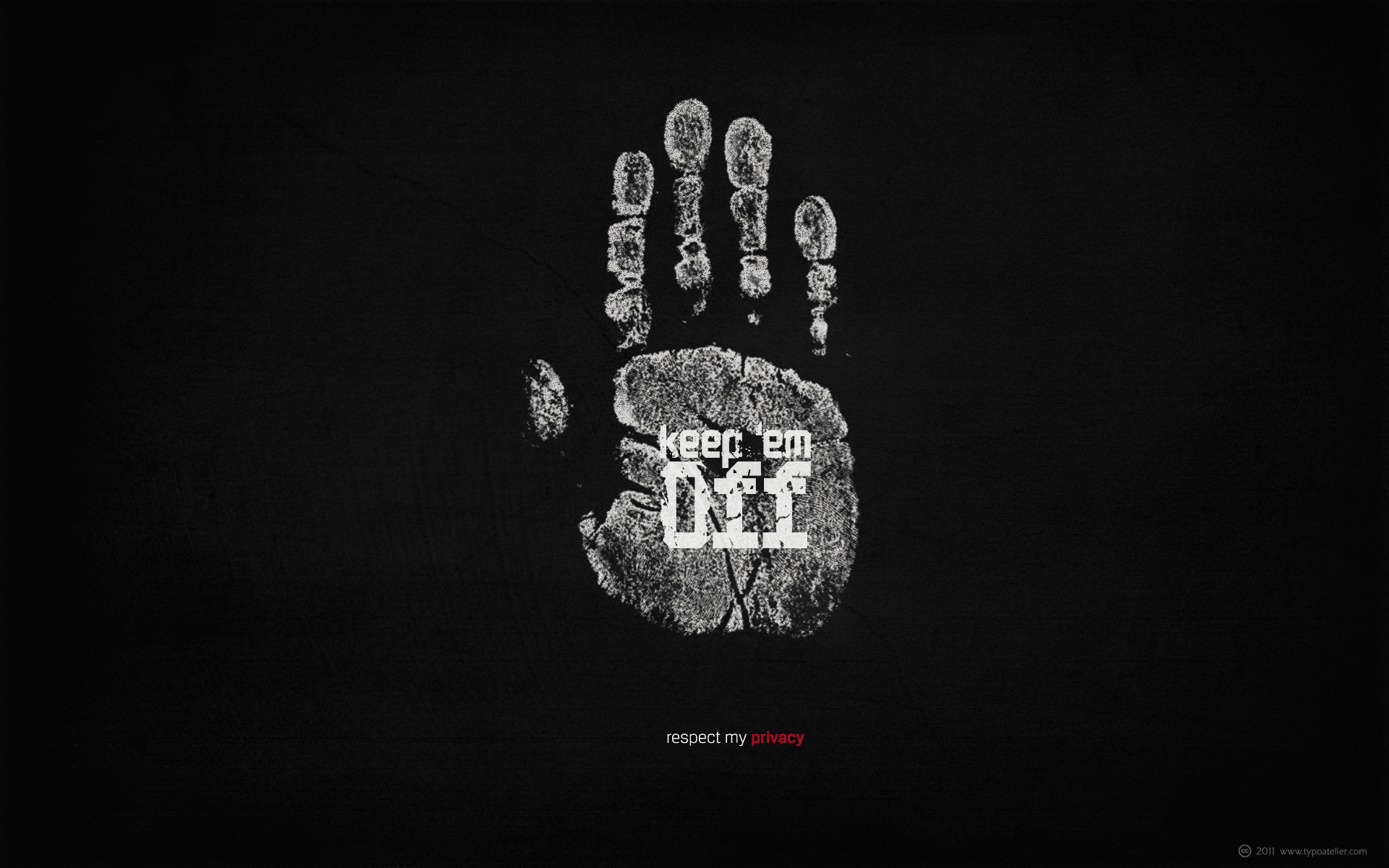
Wallpaper 1920x1200 created with Silas Dilworth’ (TypeTrust) ultra bold, chunky, geometric slab serif typeface »Facebuster«
Facebuster is a no–nonsense block serif display typeface with hard geometry and minimal negative space.
It’s ideal for making a strong yet playful statement. It comes equipped with OpenType Small Caps.
Result of »foolin’ around« with this striking typeface.
I created this grungy, simple, minimalist wallpaper for my desktop. You may resize it, modify it, use it on your desktop, iPhone or whatever you like.
Typefaces in use:
Carlos Fabián Camargo Guerrero’s (ANDINISTAS) futuristic, square, mechanical typeface »Codiga«.
Codiga is perfect for titles and badges that need to show a futurist and space sensation. Its angles are formed by straight lines and its san serif »monolineal« design allows its solid and rigid shapes stress its industrial and technology Look. Codiga consisting of 8 styles: Blanca, Gris, Negra, Super Negra, X1, X2, Stencil and Dingbats (Codiga Dingbats includes 26 illustrations characters). Codiga Blanca, Gris, Negra, Super Negra, X1, X2, Stencil include the complete character set with lower and upper case letters, numbers, accents, diacritics, puntuation and monetary symbols.
and
Silas Dilworth’ (TypeTrust) clean, geometric sans-serif face »Breuer Text«.
Breuer Text is a simple geometric sans with relaxed curves and slightly condensed proportions suitable for moderate lengths of body copy. The italics are optically adjusted obliques with a selection of augmented lowercase glyphs for a warmer read.
Breuer Text offers the distinct aura of technical precision in a personable tone, ideal for instructional copy or safety warnings. Its basic structure and conservative letterforms maintain a level voice without turning robotic or sterile.
Pair with the two-font Breuer Headline family for a simple and complete editorial type system. Breuer Text includes Small Caps, Old Style Figures and Tabular Figures.
New font by Ale Paul for www.sudtipos.com
--
Get the font MyFonts with a 35% introductory price > www.myfonts.com/fonts/sudtipos/auberge-script/
ABOUT AUBERGE SCRIPT
It took me a long time, but I think I now understand why people of my generation and older feel the need to frame current events in an historical context or precedents, while most of the young couldn't care less about what happened ten years ago, let alone centuries back. After living for a few decades, you get to a point when time seems to be moving quite fast, and it’s humbling to see that your entire existence so far can be summed up in a paragraph or two which may or may not be useful to whoever ends up reading the stuff anyhow. I suppose one way to cope with the serenity of aging is trying to convince yourself that your life and work are really an extension of millenia of a species striving to accept, adapt to, and improve the human condition through advancing the many facets of civilization -- basically making things more understandable and comfortable for ourselves and each other while we go about doing whatever it is we are trying to do. And when you do finally convince yourself of that, history becomes a source of much solace and even a little premonition, so you end up spending more time there.
Going far back into the history of what I do, one can easily see that for the most part it was ruled by the quill. Western civilization’s writing was done with quill pens for more than thirteen centuries and with newer instruments for about two. By the mid-18th century, the height of the quill experience, various calligraphy techniques could be discerned and writing styles were arranged in distinct categories. There are many old books that showcase the history of it all. I recommend looking at some whenever the urge comes calling and you have to get away from backlit worlds.
Multiple sources usually help me get a better perspective on the range of a specific script genre, so many books served as reference to this quill font of mine. Late 17th century French and Spanish professional calligraphy guides were great aides in understanding the ornamental scope of what the scribes were doing back then. The French books, with their showings of the Ronde, Bâtarde and Coulée alphabets, were the ones I referenced the most. So I decided to name the font Auberge, a French word for hotel or inn, because I really felt like a guest in different French locales (and times) when I going through all that stuff.
Because it is multi-sourced, Auberge does not strictly fit in a distinct quill pen category. Instead, it shows strong hints of both Bâtarde and Coulée alphabets. And like most of my fonts, it is an exercise in going overboard with alternates, swashes, and ornamental devices. Having worked with it for a while, I find it most suitable for display calligraphic setting in general, but it works especially well for things like wine labels and event invitations. It also shines in the original quill pen application purpose, which of course was stationery. Also, as it just occurred to me, if you find yourself in a situation where you have to describe your entire life in 50 words or less, you may as well make it look good and swashy, so Auberge would probably be a good fit there as well.
This is one quill script that no large bird had to die for.
A few technical notes
The Auberge Script Pro version includes 1800 glyphs, everything is included there. Also latin language support. We recommend you to use the latest design application to have full access to alternates, swashes, small caps, ornaments, etc. The images from the gallery uses this version. For better results use the fonts with “liga” feature on.
Awards
During 2014 the early develop of Auberge Script was chosen to be part of Tipos Latinos, the most important type exhibition in South America.
Take a look of the complet project at on.be.net/15Yq5XY
Wallpaper 1920x1200 created with Chris E. Lozos’ (DEZCOM) striking, »multiple-personality« type family »DEZ Boulder«
DEZ Boulder is a Bold Display Family in Three Personalities: ego, id, and alter.
Dez Boulder works like a character actor, presenting the author’s lines but not with the deadpan delivery of a news reporter. Boulder develops the role, adding meaning through facial expression, gesture, and body language.
The Dez Boulder family of display faces acts in a supporting role to give meaning to message and context to content. It is a very bold face, not understated. Each of its three personalities (and their sub-personalities) have a different timbre to speak the nuance of your message in a bold voice.
Dez Boulder averages more than 800 glyphs per style with uppercase, lowercase, small caps, proportional lining figures, small cap figures, superiors, inferiors, fractions, stylistic sets, alternates, ordinals, case specific punctuation, and more. It has a full range of diacritics and covers all European languages using the Latin script.
Barbie® bears incredible likeness to the flappers of the 1920s dance scene. Her dress is beaded on orange material with chartreuse, green, gold, and clear beads, and features a skirt made up of separate beaded panels. She wears a bubble-shaped coat of beaded leopard print lined in bright purple satin and trimmed in long brown fur, and dons a small cap covered with chartreuse, green, and gold beads with two blond curls peeking out. Her thigh-high stockings and shoes are painted onto her legs. Jewelry accents include a long chartreuse green beaded necklace and multicolored beaded bracelets. Porcelain body was specially sculpted to achieve "Charleston" posing.
Every now and then I feel a dire urge to tackle one of the Dorvack PA kits from the pile, and in early 2021 it was about time to build the next one. This one is canonical, and close to the OOB offering, even though it is not an original kit but rather a re-release (2008) from Aoshima’s PAC-48 twin combo kit. The PAC-48C “Doldian” is a bit obscure, though, because I have never seen this type (or better: its armament) in the OAV. It’s probably the usual alternative to the canonical model variants from the series.
Even though the Dorvack PAs are rather simple kits, they need some skill because the parts do not fit THAT well. However, you have to keep in mind that the molds were created in the early 80ies, as a quick merchandising shot for a new "Real Robot" TV series that were all the rage in Japan at that time, even though the series eventually flopped. The designs are also older than Yokoyama Kow's Ma.K./ZbV3000/Maschinenkrieger stuff, which they actually inspired!
The kit and its assembly:
Since I lacked an “authentic” PAC-48G in my collection, I decided to build the kit only with little modifications/improvements and stick to the OOB livery. As such, the only physical mods include slightly twisted legs (feet canted outwards for a more natural stance) and left arm, and I added some jet nozzles inside of the jump jet exhausts on the back. Fine plastic mesh was added to the gun and to the air intake on the back, in an attempt to hide the lack of depth in the orifices behind it.
To my surprise, the body parts of the kit were molded in an almost translucent, deep purple styrene with added mica pigments!? Weird. The kit went together quite well, but I have enough experience with these PAs to avoid the biggest troubles. For instance, I expanded the joints were plastic hits plastic, and the lower leg construction of the PAC-48, with its integral stabilizer jets on the heels, just does not fit properly.
Painting and markings:
The paint scheme is OOB, and I was lucky to have an original Gunze Sangyo PAC-48G kit and its instructions at hand, because they are better illustrated than the Aoshima documentation. For instance, the Aoshima painting instructions lack a rear view and respective details. The old document also shows better the different shades of metallic grey in which the model is to be painted, and lacks the fact that the helmet, the gun and a small cap/bulge on top of the air intake are in a slightly darker tone than the overall hull of this PA.
The basic overall tone became Humbrol 53 (Gun Metal; OOB this is a mix of silver and steel), a simple but suitable solution, after considering some other tones at hand, including car paints. The previously mentioned, darker sections on the gun and the hull were painted with a 3:1 mix of Humbrol 53 and 22 (Gloss Black), for a subtle difference.
Other hull sections like the upper legs and right arm were painted with Revell 09 (Anthracite), a very dark grey. The original instructions suggest something close to German WWII Panzergrau. The helmet’s front half was painted with Humbrol 19 (Gloss Red), the jump jet nozzle fairing became orange (Humbrol 18, originally it is supposed to be fluorescent orange, but found that rather cheesy) and the smaller veneer jet nozzles were painted with Revell 310 (Lufthansa Yellow). The “chest box” became bright white, a good contrast to the dull rest of this PA.
Deviating slightly from the original, I painted the ball joints on the arms and knees in Revell 91 (Iron Metallic), which is slightly brighter than Humbrol 53. Originally they are supposed to be painted matt dark grey, too, but IMHO this does not make them look like joints at all?
Another personal change is the visor slit’s design; the original PAC-48G features an opaque black surface with a silver/steel frame on the red helmet background, but I changed this into a black frame with a chrome PET foil inlay, with an OOB decal on top. The foil insert was also a cheap trick to hide the recessed seam of the hull halves that runs right down the visor slit, making it hard to sand it away or use putty.
As per usual, the kit received a black ink wash for weathering and some dry-brushing for light effects and panel shading. I also gave the metallic surfaces a treatment with grinded graphite, enhancing the metallic shine and giving the model a noticeably worn look that adds some seriousness to the colorful PA - after all, it is a piece of military equipment, fighting an alien invasion! Once the kit had been prepared this far, decals were added. All stencils and markings come from the PAC-48G's OOB sheet, which is quite exhaustive for such a small model.
After some more detail painting work the PA was sealed with matt acrylic varnish, and I gave the model a dusting with grey-brown mineral artist pigments, simulating dust in general and mud crusts around the feet in specific.
Another member for the growing Dorvack PA family, there are already more than 20 of them in the collection! The PAC-48G was still missing, and it was a quick build, but while the kit itself went together with relatively few problems, but I did not change much and could concentrate on the inherent flaws. It did not end up 100% authentic, and - in hindsight - the Gun Metal as basic color unfortunately turned out to be a little too dark and dull for the model, the Doldian does not look too spectacular in this rather greyish livery.
I am lucky to get this one in mint condition cheap. It comes with a Canon 50mm f1.8 lens and the original leather case. This is a rare 7sz or Type 2 rangefinder with only 4,000 made while there were 16,000 7s. Of course, the number of Canon 7 is much greater (137,500). The differences between a 7s and a 7sz are three: 1. the film rewind is larger for 7sz; 2. there is a small cap (plug) with access to rangefinder calibration inbetween "n" of Canon and "7"; the light meter guage is slightly rasied instead of flush with the top.
It uses Leica M39 screw mount. I hope to get a f1.4 or f1.2 lens. It can also mount a f.95 lens with baynet mount.
Wallpaper 1920x1200—a tribute to Andy Warhol as well as to Elvis »The King«—created once again with Chris E. Lozos’ (DEZCOM) striking, versatile, »multiple-personality« type family »DEZ Boulder«
DEZ Boulder is a Bold Display Family in Three Personalities: ego, id, and alter.
Dez Boulder works like a character actor, presenting the author’s lines but not with the deadpan delivery of a news reporter. Boulder develops the role, adding meaning through facial expression, gesture, and body language.
The Dez Boulder family of display faces acts in a supporting role to give meaning to message and context to content. It is a very bold face, not understated. Each of its three personalities (and their sub-personalities) have a different timbre to speak the nuance of your message in a bold voice.
Dez Boulder averages more than 800 glyphs per style with uppercase, lowercase, small caps, proportional lining figures, small cap figures, superiors, inferiors, fractions, stylistic sets, alternates, ordinals, case specific punctuation, and more. It has a full range of diacritics and covers all European languages using the Latin script.
New font by Ale Paul for www.sudtipos.com
--
Get the font MyFonts with a 35% introductory price > www.myfonts.com/fonts/sudtipos/auberge-script/
ABOUT AUBERGE SCRIPT
It took me a long time, but I think I now understand why people of my generation and older feel the need to frame current events in an historical context or precedents, while most of the young couldn't care less about what happened ten years ago, let alone centuries back. After living for a few decades, you get to a point when time seems to be moving quite fast, and it’s humbling to see that your entire existence so far can be summed up in a paragraph or two which may or may not be useful to whoever ends up reading the stuff anyhow. I suppose one way to cope with the serenity of aging is trying to convince yourself that your life and work are really an extension of millenia of a species striving to accept, adapt to, and improve the human condition through advancing the many facets of civilization -- basically making things more understandable and comfortable for ourselves and each other while we go about doing whatever it is we are trying to do. And when you do finally convince yourself of that, history becomes a source of much solace and even a little premonition, so you end up spending more time there.
Going far back into the history of what I do, one can easily see that for the most part it was ruled by the quill. Western civilization’s writing was done with quill pens for more than thirteen centuries and with newer instruments for about two. By the mid-18th century, the height of the quill experience, various calligraphy techniques could be discerned and writing styles were arranged in distinct categories. There are many old books that showcase the history of it all. I recommend looking at some whenever the urge comes calling and you have to get away from backlit worlds.
Multiple sources usually help me get a better perspective on the range of a specific script genre, so many books served as reference to this quill font of mine. Late 17th century French and Spanish professional calligraphy guides were great aides in understanding the ornamental scope of what the scribes were doing back then. The French books, with their showings of the Ronde, Bâtarde and Coulée alphabets, were the ones I referenced the most. So I decided to name the font Auberge, a French word for hotel or inn, because I really felt like a guest in different French locales (and times) when I going through all that stuff.
Because it is multi-sourced, Auberge does not strictly fit in a distinct quill pen category. Instead, it shows strong hints of both Bâtarde and Coulée alphabets. And like most of my fonts, it is an exercise in going overboard with alternates, swashes, and ornamental devices. Having worked with it for a while, I find it most suitable for display calligraphic setting in general, but it works especially well for things like wine labels and event invitations. It also shines in the original quill pen application purpose, which of course was stationery. Also, as it just occurred to me, if you find yourself in a situation where you have to describe your entire life in 50 words or less, you may as well make it look good and swashy, so Auberge would probably be a good fit there as well.
This is one quill script that no large bird had to die for.
A few technical notes
The Auberge Script Pro version includes 1800 glyphs, everything is included there. Also latin language support. We recommend you to use the latest design application to have full access to alternates, swashes, small caps, ornaments, etc. The images from the gallery uses this version. For better results use the fonts with “liga” feature on.
Awards
During 2014 the early develop of Auberge Script was chosen to be part of Tipos Latinos, the most important type exhibition in South America.
Take a look of the complet project at on.be.net/15Yq5XY
October 1, 2021
On a walk along the Punkhorn trails, we found some colorful little mushrooms growing.
All the heavy rain we've had recently must be bringing them out!
Brewster, Massachusetts
Cape Cod - USA
Photo by brucetopher
© Bruce Christopher 2021
All Rights Reserved
...always learning - critiques welcome.
Tools: Canon 7D & iPhone 11.
No use without permission.
Please email for usage info.
Inocybe sp. Small, caps barely 1cm. Redden Island, Cairns.
Also found at Cheepi Ck., Cairns in July 2015.
Typefaces in use:
Svetoslav Simov’s (Fontfabric) clean, elegant, sans serif typeface »Code Pro«.
Code Pro is a font family inspired by the original Sans Serif fonts like Avant Garde or Futura, but with a modern twist. It is clean, elegant and straight-to-the-point. Code font is applicable for any type of graphic design—web, print, motion graphics, etc.—and perfect for t-shirts and other items like posters and logos.
Rui Abreu’s (Fountain) balanced, modern slab serif typeface »Foral Pro«.
Foral Pro is a modern slab serif, organic and balanced, with harmonized proportions and polished forms. It is a eight-weight typeface, ranging from Light to Extra Bold with matching italics. It come with Small Caps and a wide range of OpenType features, allowing extensive and versatile use.
Barbie® bears incredible likeness to the flappers of the 1920s dance scene. Her dress is beaded on orange material with chartreuse, green, gold, and clear beads, and features a skirt made up of separate beaded panels. She wears a bubble-shaped coat of beaded leopard print lined in bright purple satin and trimmed in long brown fur, and dons a small cap covered with chartreuse, green, and gold beads with two blond curls peeking out. Her thigh-high stockings and shoes are painted onto her legs. Jewelry accents include a long chartreuse green beaded necklace and multicolored beaded bracelets. Porcelain body was specially sculpted to achieve "Charleston" posing.
Single-storey a/g, spurless b and other cursive features, small-cap numerals with “snowman 8”, y(ÿ) and ä with comma-shaped dots
Detail of a gravestone at Alter Südfriedhof, München
New font by Ale Paul for www.sudtipos.com
--
Get the font MyFonts with a 35% introductory price > www.myfonts.com/fonts/sudtipos/auberge-script/
ABOUT AUBERGE SCRIPT
It took me a long time, but I think I now understand why people of my generation and older feel the need to frame current events in an historical context or precedents, while most of the young couldn't care less about what happened ten years ago, let alone centuries back. After living for a few decades, you get to a point when time seems to be moving quite fast, and it’s humbling to see that your entire existence so far can be summed up in a paragraph or two which may or may not be useful to whoever ends up reading the stuff anyhow. I suppose one way to cope with the serenity of aging is trying to convince yourself that your life and work are really an extension of millenia of a species striving to accept, adapt to, and improve the human condition through advancing the many facets of civilization -- basically making things more understandable and comfortable for ourselves and each other while we go about doing whatever it is we are trying to do. And when you do finally convince yourself of that, history becomes a source of much solace and even a little premonition, so you end up spending more time there.
Going far back into the history of what I do, one can easily see that for the most part it was ruled by the quill. Western civilization’s writing was done with quill pens for more than thirteen centuries and with newer instruments for about two. By the mid-18th century, the height of the quill experience, various calligraphy techniques could be discerned and writing styles were arranged in distinct categories. There are many old books that showcase the history of it all. I recommend looking at some whenever the urge comes calling and you have to get away from backlit worlds.
Multiple sources usually help me get a better perspective on the range of a specific script genre, so many books served as reference to this quill font of mine. Late 17th century French and Spanish professional calligraphy guides were great aides in understanding the ornamental scope of what the scribes were doing back then. The French books, with their showings of the Ronde, Bâtarde and Coulée alphabets, were the ones I referenced the most. So I decided to name the font Auberge, a French word for hotel or inn, because I really felt like a guest in different French locales (and times) when I going through all that stuff.
Because it is multi-sourced, Auberge does not strictly fit in a distinct quill pen category. Instead, it shows strong hints of both Bâtarde and Coulée alphabets. And like most of my fonts, it is an exercise in going overboard with alternates, swashes, and ornamental devices. Having worked with it for a while, I find it most suitable for display calligraphic setting in general, but it works especially well for things like wine labels and event invitations. It also shines in the original quill pen application purpose, which of course was stationery. Also, as it just occurred to me, if you find yourself in a situation where you have to describe your entire life in 50 words or less, you may as well make it look good and swashy, so Auberge would probably be a good fit there as well.
This is one quill script that no large bird had to die for.
A few technical notes
The Auberge Script Pro version includes 1800 glyphs, everything is included there. Also latin language support. We recommend you to use the latest design application to have full access to alternates, swashes, small caps, ornaments, etc. The images from the gallery uses this version. For better results use the fonts with “liga” feature on.
Awards
During 2014 the early develop of Auberge Script was chosen to be part of Tipos Latinos, the most important type exhibition in South America.
Take a look of the complet project at on.be.net/15Yq5XY
The huge old oak tree at Fairlop, at Hainault Forest in Essex, was said to have a girth of 36 feet and cover an acre of ground. In about 1720, Daniel Day, a block and pump maker from Wapping, decided to invite a few of his neighbours for a picnic of bacon and beans beneath the tree. Over subsequent years it became an annual event on the first Friday in July, and gradually more and more people attended — the original 'beanfeast'.
By the 1790s it had become large enough to worry the authorities, with great numbers of "idle and disorderly people" drinking "divers quantities of beer and spirituous liquors" leading to "riots, broils, breaches of the peace", "to the great loss and terror of the inhabitants of the vicinity". There were puppet shows, wild beast caravans, vendors of fruits, ribbons, gingerbread and toys of every description. And of course gambling and drinking. It seems Powell of 206 Brick Lane, Spitalfields, took his Imperial Press to print souvenir broadsheets at the fair on the spot. Following Daniel Day's tradition, the procession from Wapping was led by people in horse-drawn boats on wheels, called "Fairlop Frigates".
Attempts to put down the fair failed, even after the moribund tree blew down in 1820, and in the 1840s there were estimated to be 200,000 people attending. Finally in the 1850s the whole area was disafforested, enclosed and ploughed for arable land. The area was subsequently a World War 2 aerodrome, and is now 'Fairlop Waters' country park.
I was pleased to find this broadsheet in a local bookshop. At first sight I thought it was a reproduction (as did the seller, as it was only a couple of quid) but at closer examination it turned out to be an original mounted on modern backing paper. I particularly like the execrable inking and evidence of how it was folded to go in a fairgoer's pocket while the ink was still wet. See how the splodged 'Friday' has corresponding set-off at the bottom. Also how Powell's comps don't seem to have distinguished between full and small caps — or maybe they were just out of sorts.
In 1847, just before the demise of the fair, a booklet about it was produced by my printing hero, Charles Clark of Great Totham, entitled "Fairlop and its Founder; or, Facts and Fun for Forest Frolickers. By a Famed First Friday Fairgoer." Only he could write titles like that!
The office park is located just west of GA 400, on Hammond Drive. I had some time to kill, so I wandered around taking photos of this and that.
"Small-Cap Growth Funds: For Investors With Nerves of Steel" by NORM ALSTER via NYT t.co/INfiIUt9jn (via Twitter twitter.com/felipemassone/status/718756211827568640)
I reckon his cap is one size too small for this police officer. Was he daydreaming while on duty?
Я думаю, фуражку на один размер слишком мал для этого офицера полиции. Был ли он мечтать?
St. Petersburg Санкт-Петербург, Russia Россия (Monday 20 Aug 2012 @ 12:13pm)
Texture by Skeletal Mess
New font by Ale Paul for www.sudtipos.com
--
Get the font MyFonts with a 35% introductory price > www.myfonts.com/fonts/sudtipos/auberge-script/
ABOUT AUBERGE SCRIPT
It took me a long time, but I think I now understand why people of my generation and older feel the need to frame current events in an historical context or precedents, while most of the young couldn't care less about what happened ten years ago, let alone centuries back. After living for a few decades, you get to a point when time seems to be moving quite fast, and it’s humbling to see that your entire existence so far can be summed up in a paragraph or two which may or may not be useful to whoever ends up reading the stuff anyhow. I suppose one way to cope with the serenity of aging is trying to convince yourself that your life and work are really an extension of millenia of a species striving to accept, adapt to, and improve the human condition through advancing the many facets of civilization -- basically making things more understandable and comfortable for ourselves and each other while we go about doing whatever it is we are trying to do. And when you do finally convince yourself of that, history becomes a source of much solace and even a little premonition, so you end up spending more time there.
Going far back into the history of what I do, one can easily see that for the most part it was ruled by the quill. Western civilization’s writing was done with quill pens for more than thirteen centuries and with newer instruments for about two. By the mid-18th century, the height of the quill experience, various calligraphy techniques could be discerned and writing styles were arranged in distinct categories. There are many old books that showcase the history of it all. I recommend looking at some whenever the urge comes calling and you have to get away from backlit worlds.
Multiple sources usually help me get a better perspective on the range of a specific script genre, so many books served as reference to this quill font of mine. Late 17th century French and Spanish professional calligraphy guides were great aides in understanding the ornamental scope of what the scribes were doing back then. The French books, with their showings of the Ronde, Bâtarde and Coulée alphabets, were the ones I referenced the most. So I decided to name the font Auberge, a French word for hotel or inn, because I really felt like a guest in different French locales (and times) when I going through all that stuff.
Because it is multi-sourced, Auberge does not strictly fit in a distinct quill pen category. Instead, it shows strong hints of both Bâtarde and Coulée alphabets. And like most of my fonts, it is an exercise in going overboard with alternates, swashes, and ornamental devices. Having worked with it for a while, I find it most suitable for display calligraphic setting in general, but it works especially well for things like wine labels and event invitations. It also shines in the original quill pen application purpose, which of course was stationery. Also, as it just occurred to me, if you find yourself in a situation where you have to describe your entire life in 50 words or less, you may as well make it look good and swashy, so Auberge would probably be a good fit there as well.
This is one quill script that no large bird had to die for.
A few technical notes
The Auberge Script Pro version includes 1800 glyphs, everything is included there. Also latin language support. We recommend you to use the latest design application to have full access to alternates, swashes, small caps, ornaments, etc. The images from the gallery uses this version. For better results use the fonts with “liga” feature on.
Awards
During 2014 the early develop of Auberge Script was chosen to be part of Tipos Latinos, the most important type exhibition in South America.
Take a look of the complet project at on.be.net/15Yq5XY
Every now and then I feel a dire urge to tackle one of the Dorvack PA kits from the pile, and in early 2021 it was about time to build the next one. This one is canonical, and close to the OOB offering, even though it is not an original kit but rather a re-release (2008) from Aoshima’s PAC-48 twin combo kit. The PAC-48C “Doldian” is a bit obscure, though, because I have never seen this type (or better: its armament) in the OAV. It’s probably the usual alternative to the canonical model variants from the series.
Even though the Dorvack PAs are rather simple kits, they need some skill because the parts do not fit THAT well. However, you have to keep in mind that the molds were created in the early 80ies, as a quick merchandising shot for a new "Real Robot" TV series that were all the rage in Japan at that time, even though the series eventually flopped. The designs are also older than Yokoyama Kow's Ma.K./ZbV3000/Maschinenkrieger stuff, which they actually inspired!
The kit and its assembly:
Since I lacked an “authentic” PAC-48G in my collection, I decided to build the kit only with little modifications/improvements and stick to the OOB livery. As such, the only physical mods include slightly twisted legs (feet canted outwards for a more natural stance) and left arm, and I added some jet nozzles inside of the jump jet exhausts on the back. Fine plastic mesh was added to the gun and to the air intake on the back, in an attempt to hide the lack of depth in the orifices behind it.
To my surprise, the body parts of the kit were molded in an almost translucent, deep purple styrene with added mica pigments!? Weird. The kit went together quite well, but I have enough experience with these PAs to avoid the biggest troubles. For instance, I expanded the joints were plastic hits plastic, and the lower leg construction of the PAC-48, with its integral stabilizer jets on the heels, just does not fit properly.
Painting and markings:
The paint scheme is OOB, and I was lucky to have an original Gunze Sangyo PAC-48G kit and its instructions at hand, because they are better illustrated than the Aoshima documentation. For instance, the Aoshima painting instructions lack a rear view and respective details. The old document also shows better the different shades of metallic grey in which the model is to be painted, and lacks the fact that the helmet, the gun and a small cap/bulge on top of the air intake are in a slightly darker tone than the overall hull of this PA.
The basic overall tone became Humbrol 53 (Gun Metal; OOB this is a mix of silver and steel), a simple but suitable solution, after considering some other tones at hand, including car paints. The previously mentioned, darker sections on the gun and the hull were painted with a 3:1 mix of Humbrol 53 and 22 (Gloss Black), for a subtle difference.
Other hull sections like the upper legs and right arm were painted with Revell 09 (Anthracite), a very dark grey. The original instructions suggest something close to German WWII Panzergrau. The helmet’s front half was painted with Humbrol 19 (Gloss Red), the jump jet nozzle fairing became orange (Humbrol 18, originally it is supposed to be fluorescent orange, but found that rather cheesy) and the smaller veneer jet nozzles were painted with Revell 310 (Lufthansa Yellow). The “chest box” became bright white, a good contrast to the dull rest of this PA.
Deviating slightly from the original, I painted the ball joints on the arms and knees in Revell 91 (Iron Metallic), which is slightly brighter than Humbrol 53. Originally they are supposed to be painted matt dark grey, too, but IMHO this does not make them look like joints at all?
Another personal change is the visor slit’s design; the original PAC-48G features an opaque black surface with a silver/steel frame on the red helmet background, but I changed this into a black frame with a chrome PET foil inlay, with an OOB decal on top. The foil insert was also a cheap trick to hide the recessed seam of the hull halves that runs right down the visor slit, making it hard to sand it away or use putty.
As per usual, the kit received a black ink wash for weathering and some dry-brushing for light effects and panel shading. I also gave the metallic surfaces a treatment with grinded graphite, enhancing the metallic shine and giving the model a noticeably worn look that adds some seriousness to the colorful PA - after all, it is a piece of military equipment, fighting an alien invasion! Once the kit had been prepared this far, decals were added. All stencils and markings come from the PAC-48G's OOB sheet, which is quite exhaustive for such a small model.
After some more detail painting work the PA was sealed with matt acrylic varnish, and I gave the model a dusting with grey-brown mineral artist pigments, simulating dust in general and mud crusts around the feet in specific.
Another member for the growing Dorvack PA family, there are already more than 20 of them in the collection! The PAC-48G was still missing, and it was a quick build, but while the kit itself went together with relatively few problems, but I did not change much and could concentrate on the inherent flaws. It did not end up 100% authentic, and - in hindsight - the Gun Metal as basic color unfortunately turned out to be a little too dark and dull for the model, the Doldian does not look too spectacular in this rather greyish livery.
New font by Ale Paul for www.sudtipos.com
--
Get the font MyFonts with a 35% introductory price > www.myfonts.com/fonts/sudtipos/auberge-script/
ABOUT AUBERGE SCRIPT
It took me a long time, but I think I now understand why people of my generation and older feel the need to frame current events in an historical context or precedents, while most of the young couldn't care less about what happened ten years ago, let alone centuries back. After living for a few decades, you get to a point when time seems to be moving quite fast, and it’s humbling to see that your entire existence so far can be summed up in a paragraph or two which may or may not be useful to whoever ends up reading the stuff anyhow. I suppose one way to cope with the serenity of aging is trying to convince yourself that your life and work are really an extension of millenia of a species striving to accept, adapt to, and improve the human condition through advancing the many facets of civilization -- basically making things more understandable and comfortable for ourselves and each other while we go about doing whatever it is we are trying to do. And when you do finally convince yourself of that, history becomes a source of much solace and even a little premonition, so you end up spending more time there.
Going far back into the history of what I do, one can easily see that for the most part it was ruled by the quill. Western civilization’s writing was done with quill pens for more than thirteen centuries and with newer instruments for about two. By the mid-18th century, the height of the quill experience, various calligraphy techniques could be discerned and writing styles were arranged in distinct categories. There are many old books that showcase the history of it all. I recommend looking at some whenever the urge comes calling and you have to get away from backlit worlds.
Multiple sources usually help me get a better perspective on the range of a specific script genre, so many books served as reference to this quill font of mine. Late 17th century French and Spanish professional calligraphy guides were great aides in understanding the ornamental scope of what the scribes were doing back then. The French books, with their showings of the Ronde, Bâtarde and Coulée alphabets, were the ones I referenced the most. So I decided to name the font Auberge, a French word for hotel or inn, because I really felt like a guest in different French locales (and times) when I going through all that stuff.
Because it is multi-sourced, Auberge does not strictly fit in a distinct quill pen category. Instead, it shows strong hints of both Bâtarde and Coulée alphabets. And like most of my fonts, it is an exercise in going overboard with alternates, swashes, and ornamental devices. Having worked with it for a while, I find it most suitable for display calligraphic setting in general, but it works especially well for things like wine labels and event invitations. It also shines in the original quill pen application purpose, which of course was stationery. Also, as it just occurred to me, if you find yourself in a situation where you have to describe your entire life in 50 words or less, you may as well make it look good and swashy, so Auberge would probably be a good fit there as well.
This is one quill script that no large bird had to die for.
A few technical notes
The Auberge Script Pro version includes 1800 glyphs, everything is included there. Also latin language support. We recommend you to use the latest design application to have full access to alternates, swashes, small caps, ornaments, etc. The images from the gallery uses this version. For better results use the fonts with “liga” feature on.
Awards
During 2014 the early develop of Auberge Script was chosen to be part of Tipos Latinos, the most important type exhibition in South America.
Take a look of the complet project at on.be.net/15Yq5XY
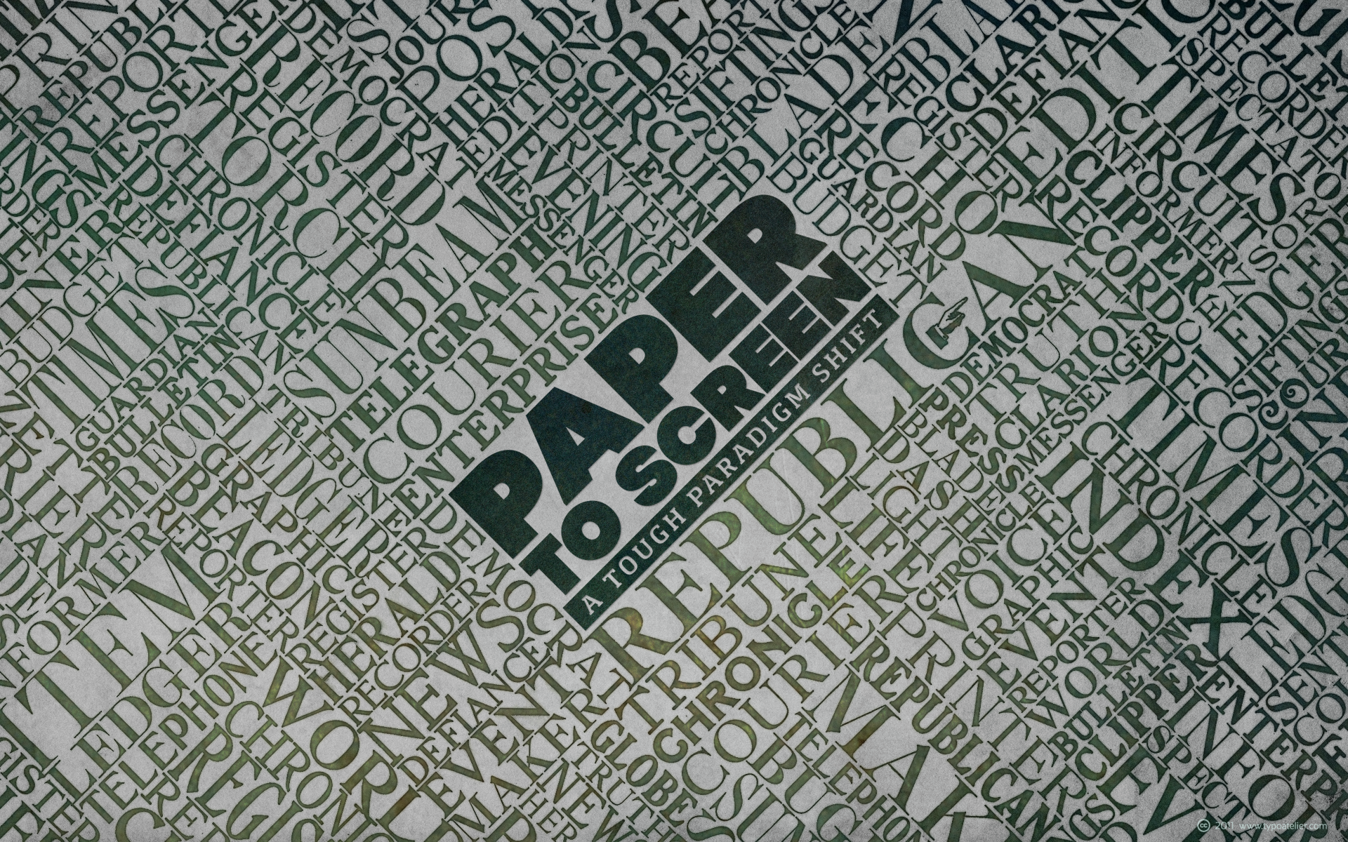
The beautiful »Newspaper Headings« which I used for this Wallpaper, I »recovered« from the following old »Foundry Specimen Books«:
Keystone Type Foundry (1906)
American Type Founders Co. (1906)
Barnhart Bros. & Spindler Type Founders
Palmer & Rey Type Founders (1887)
The typefaces which I used for the lettering in the center are:
Svetoslav Simov’s (Fontfabric) clean, elegant, sans serif typeface »Code Pro«.
Code Pro is a font family inspired by the original Sans Serif fonts like Avant Garde or Futura, but with a modern twist. It is clean, elegant and straight-to-the-point. Code font is applicable for any type of graphic design—web, print, motion graphics, etc.—and perfect for t-shirts and other items like posters and logos.
Rui Abreu’s (Fountain) balanced, modern slab serif typeface »Foral Pro«.
Foral Pro is a modern slab serif, organic and balanced, with harmonized proportions and polished forms. It is a eight-weight typeface, ranging from Light to Extra Bold with matching italics. It come with Small Caps and a wide range of OpenType features, allowing extensive and versatile use.
Dimensia was released around 1970 as part of Alphabet Innovations, vol. 2. A second Light weight followed in vol. 5. George Thomas credits Roc Mitchell for the design. The typeface comes with so-called common caps (small caps) that can be combined with the lowercase for a biform look.
New font by Ale Paul for www.sudtipos.com
--
Get the font MyFonts with a 35% introductory price > www.myfonts.com/fonts/sudtipos/auberge-script/
ABOUT AUBERGE SCRIPT
It took me a long time, but I think I now understand why people of my generation and older feel the need to frame current events in an historical context or precedents, while most of the young couldn't care less about what happened ten years ago, let alone centuries back. After living for a few decades, you get to a point when time seems to be moving quite fast, and it’s humbling to see that your entire existence so far can be summed up in a paragraph or two which may or may not be useful to whoever ends up reading the stuff anyhow. I suppose one way to cope with the serenity of aging is trying to convince yourself that your life and work are really an extension of millenia of a species striving to accept, adapt to, and improve the human condition through advancing the many facets of civilization -- basically making things more understandable and comfortable for ourselves and each other while we go about doing whatever it is we are trying to do. And when you do finally convince yourself of that, history becomes a source of much solace and even a little premonition, so you end up spending more time there.
Going far back into the history of what I do, one can easily see that for the most part it was ruled by the quill. Western civilization’s writing was done with quill pens for more than thirteen centuries and with newer instruments for about two. By the mid-18th century, the height of the quill experience, various calligraphy techniques could be discerned and writing styles were arranged in distinct categories. There are many old books that showcase the history of it all. I recommend looking at some whenever the urge comes calling and you have to get away from backlit worlds.
Multiple sources usually help me get a better perspective on the range of a specific script genre, so many books served as reference to this quill font of mine. Late 17th century French and Spanish professional calligraphy guides were great aides in understanding the ornamental scope of what the scribes were doing back then. The French books, with their showings of the Ronde, Bâtarde and Coulée alphabets, were the ones I referenced the most. So I decided to name the font Auberge, a French word for hotel or inn, because I really felt like a guest in different French locales (and times) when I going through all that stuff.
Because it is multi-sourced, Auberge does not strictly fit in a distinct quill pen category. Instead, it shows strong hints of both Bâtarde and Coulée alphabets. And like most of my fonts, it is an exercise in going overboard with alternates, swashes, and ornamental devices. Having worked with it for a while, I find it most suitable for display calligraphic setting in general, but it works especially well for things like wine labels and event invitations. It also shines in the original quill pen application purpose, which of course was stationery. Also, as it just occurred to me, if you find yourself in a situation where you have to describe your entire life in 50 words or less, you may as well make it look good and swashy, so Auberge would probably be a good fit there as well.
This is one quill script that no large bird had to die for.
A few technical notes
The Auberge Script Pro version includes 1800 glyphs, everything is included there. Also latin language support. We recommend you to use the latest design application to have full access to alternates, swashes, small caps, ornaments, etc. The images from the gallery uses this version. For better results use the fonts with “liga” feature on.
Awards
During 2014 the early develop of Auberge Script was chosen to be part of Tipos Latinos, the most important type exhibition in South America.
Take a look of the complet project at on.be.net/15Yq5XY
The Benefits of Investing in Small Cap Stocks
Every #investor likes to earn more through retained shares. There are several elements on the basis of which the quality of a share is determined. Sometimes, sustainability becomes an attractive thing for investors.
#SmallCapStocks
New font by Ale Paul for www.sudtipos.com
--
Get the font MyFonts with a 35% introductory price > www.myfonts.com/fonts/sudtipos/auberge-script/
ABOUT AUBERGE SCRIPT
It took me a long time, but I think I now understand why people of my generation and older feel the need to frame current events in an historical context or precedents, while most of the young couldn't care less about what happened ten years ago, let alone centuries back. After living for a few decades, you get to a point when time seems to be moving quite fast, and it’s humbling to see that your entire existence so far can be summed up in a paragraph or two which may or may not be useful to whoever ends up reading the stuff anyhow. I suppose one way to cope with the serenity of aging is trying to convince yourself that your life and work are really an extension of millenia of a species striving to accept, adapt to, and improve the human condition through advancing the many facets of civilization -- basically making things more understandable and comfortable for ourselves and each other while we go about doing whatever it is we are trying to do. And when you do finally convince yourself of that, history becomes a source of much solace and even a little premonition, so you end up spending more time there.
Going far back into the history of what I do, one can easily see that for the most part it was ruled by the quill. Western civilization’s writing was done with quill pens for more than thirteen centuries and with newer instruments for about two. By the mid-18th century, the height of the quill experience, various calligraphy techniques could be discerned and writing styles were arranged in distinct categories. There are many old books that showcase the history of it all. I recommend looking at some whenever the urge comes calling and you have to get away from backlit worlds.
Multiple sources usually help me get a better perspective on the range of a specific script genre, so many books served as reference to this quill font of mine. Late 17th century French and Spanish professional calligraphy guides were great aides in understanding the ornamental scope of what the scribes were doing back then. The French books, with their showings of the Ronde, Bâtarde and Coulée alphabets, were the ones I referenced the most. So I decided to name the font Auberge, a French word for hotel or inn, because I really felt like a guest in different French locales (and times) when I going through all that stuff.
Because it is multi-sourced, Auberge does not strictly fit in a distinct quill pen category. Instead, it shows strong hints of both Bâtarde and Coulée alphabets. And like most of my fonts, it is an exercise in going overboard with alternates, swashes, and ornamental devices. Having worked with it for a while, I find it most suitable for display calligraphic setting in general, but it works especially well for things like wine labels and event invitations. It also shines in the original quill pen application purpose, which of course was stationery. Also, as it just occurred to me, if you find yourself in a situation where you have to describe your entire life in 50 words or less, you may as well make it look good and swashy, so Auberge would probably be a good fit there as well.
This is one quill script that no large bird had to die for.
A few technical notes
The Auberge Script Pro version includes 1800 glyphs, everything is included there. Also latin language support. We recommend you to use the latest design application to have full access to alternates, swashes, small caps, ornaments, etc. The images from the gallery uses this version. For better results use the fonts with “liga” feature on.
Awards
During 2014 the early develop of Auberge Script was chosen to be part of Tipos Latinos, the most important type exhibition in South America.
Take a look of the complet project at on.be.net/15Yq5XY
Costa Rica / A Hat of Clouds on Arenal Volcano.
On the third day, after a night of heavy rain, we awoke to this beautiful small cap of cloud on the volcano.
It was the best view of the volcano during our time there. A perfect day.
You can also find my images at: Fluidr - Tumblr - 500px
All rights reserved - Copyright © 2013 les yeux heureux
All rights reserved - Copyright © 2013 Christopher Casilli
Please...
Do not reproduce, copy, edit, publish, transmit or upload this image
in any way without my expressed written permission.
Thanks!
Fairy Chimneys and Vineyard at Cappadocia
Fairy chimneys are conical rock formations, typically found in the Cappadocia region of Turkey. A fairy chimney (hoodoo) consists of a cap of hard rock resting on a cone-shaped pinnacle of softer rock. In Cappadocia, houses have been carved from these formations.
The geology of areas where fairy chimneys form typically comprises a thick layer of tuff (consolidated volcanic ash, here in Cappadocia, of Mt. Erciyes and Hasandag), covered by a thin layer of basalt or other volcanic rocks that are more resistant to erosion than the underlying tuff. Over time, cracks in the basalt allow the much softer tuff to be eroded and washed away. Fairy chimneys are formed where a small cap or boulder of the original basalt remains, and protects a cone of tuff beneath it from erosion. Eventually, the tuff will be undercut to the extent that the cap falls off, and the remaining cone is then quickly eroded.
C.E. Weber Schriftgießerei
7 Stuttgart Postfach 340
ABC der Trump-Schriften* und bewährte Schriften unseres Gußprogramms
* Originalschriften nach Entwürfen von Prof. Georg Trump München
A Trump-Mediäval normal
B Trump-Mediäval kursiv
C Trump-Mediäval halbfett
D Trump-Mediäval fett
E Trump-Mediäval kursiv fett
F Trump-Mediäval schmalhalbfett
G Trump-Gravur
H Delphin
I Delphin 2
K Jaguar
There is no ‘J’ in this alphabet. All in all, Trump published 32 to 34 typeface designs, depending on how you count. The missing ones are City fett, City halbfett, Trump-Deutsch and Trump-Deutsch mager (for H. Berthold AG) and the three styles of Mauritius that were released by Weber in 1968. № 33 would be the light cut of City, added in 1937, seven years after the initial two styles. It is not listed in Vita activa as a design by Trump. № 34 is Trump-Mediäval Kapitälchen – the small caps have their own entry in that list.
We believe a young business cannot keep itself alive, sustainable and profitable altogether without following an aggressive plan in this cutthroat #business stage.
#SmallCapStocks goo.gl/rq6xYH
Small (caps to 2 cm) soft delicate mushroom growing on a very well rotted disintegrating log after persistent warm rain. Undersides of other specimens of the same species growing in the same place in the comment below.
Lepiota sp. Cap 2.5 cm. Most of this particular specie seem to have much smaller caps, usually around 1.5 to 2cm. My block.
New font by Ale Paul for www.sudtipos.com
--
Get the font MyFonts with a 35% introductory price > www.myfonts.com/fonts/sudtipos/auberge-script/
ABOUT AUBERGE SCRIPT
It took me a long time, but I think I now understand why people of my generation and older feel the need to frame current events in an historical context or precedents, while most of the young couldn't care less about what happened ten years ago, let alone centuries back. After living for a few decades, you get to a point when time seems to be moving quite fast, and it’s humbling to see that your entire existence so far can be summed up in a paragraph or two which may or may not be useful to whoever ends up reading the stuff anyhow. I suppose one way to cope with the serenity of aging is trying to convince yourself that your life and work are really an extension of millenia of a species striving to accept, adapt to, and improve the human condition through advancing the many facets of civilization -- basically making things more understandable and comfortable for ourselves and each other while we go about doing whatever it is we are trying to do. And when you do finally convince yourself of that, history becomes a source of much solace and even a little premonition, so you end up spending more time there.
Going far back into the history of what I do, one can easily see that for the most part it was ruled by the quill. Western civilization’s writing was done with quill pens for more than thirteen centuries and with newer instruments for about two. By the mid-18th century, the height of the quill experience, various calligraphy techniques could be discerned and writing styles were arranged in distinct categories. There are many old books that showcase the history of it all. I recommend looking at some whenever the urge comes calling and you have to get away from backlit worlds.
Multiple sources usually help me get a better perspective on the range of a specific script genre, so many books served as reference to this quill font of mine. Late 17th century French and Spanish professional calligraphy guides were great aides in understanding the ornamental scope of what the scribes were doing back then. The French books, with their showings of the Ronde, Bâtarde and Coulée alphabets, were the ones I referenced the most. So I decided to name the font Auberge, a French word for hotel or inn, because I really felt like a guest in different French locales (and times) when I going through all that stuff.
Because it is multi-sourced, Auberge does not strictly fit in a distinct quill pen category. Instead, it shows strong hints of both Bâtarde and Coulée alphabets. And like most of my fonts, it is an exercise in going overboard with alternates, swashes, and ornamental devices. Having worked with it for a while, I find it most suitable for display calligraphic setting in general, but it works especially well for things like wine labels and event invitations. It also shines in the original quill pen application purpose, which of course was stationery. Also, as it just occurred to me, if you find yourself in a situation where you have to describe your entire life in 50 words or less, you may as well make it look good and swashy, so Auberge would probably be a good fit there as well.
This is one quill script that no large bird had to die for.
A few technical notes
The Auberge Script Pro version includes 1800 glyphs, everything is included there. Also latin language support. We recommend you to use the latest design application to have full access to alternates, swashes, small caps, ornaments, etc. The images from the gallery uses this version. For better results use the fonts with “liga” feature on.
Awards
During 2014 the early develop of Auberge Script was chosen to be part of Tipos Latinos, the most important type exhibition in South America.
Take a look of the complet project at on.be.net/15Yq5XY
Failure and success, the continuing story of the Papermate ballpoint pens, part 4 (new readers can see part 1 here, part 2 here and part 3 here) I thought I'd done it by wrapping tape round the refill but I was wrong. Overnight the pressure of the spring had pushed the final piece of adhesive tape away and the refill slipped down. However, I found a small cap in a box in the garage and by cutting a bit off I was able to push it over the refill and, with a little shaving, get it into the pen. And so far it works 😀