View allAll Photos Tagged Proportion
1) this image represents proportion because the small walnut in my hand
2) the colours in the picture
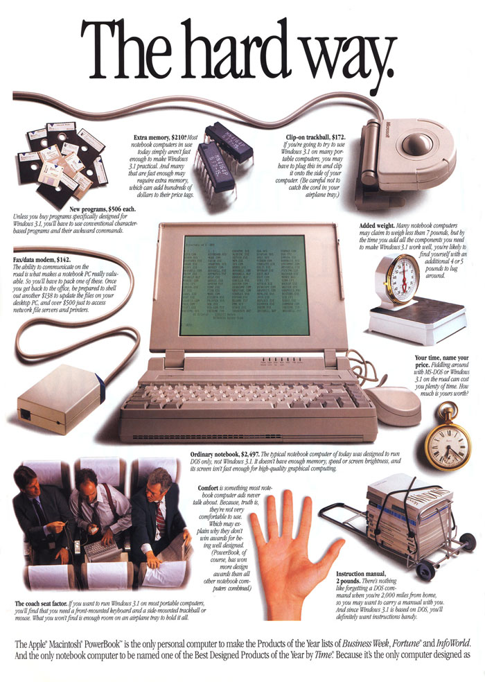
www.macmothership.com/gallery/newads8/92PowerBook2.jpg
The proportion we see in this ad shows us that all images are related to one another, with the laptop in the middle being the primary image, with attention drawn to its size and proximity among the other images. It is easy and logical to see which object should have our primary attention.
Proportion of Nepal's aggregate education aid dollars by district, 2010-2012
Credit: Doug Nicholson, AidData Project Manager
1. This photo shows proportion through the difference of size between the shadow and the gun
2. I think the most visually striking thing about this photo is the contrast of the dark red colour and the black,
Photo By Design (Feb 2013), Week 7
Highlighting the details of the texture of this crocheted window decoration by filling the frame with a close-up. The sun streaming through the window makes the yellow colour of the yarn come alive. On such a close-up image, we do not see the overall shape, but are plunged into the fascinating world of detail.
With an adaptable building structure and integrated well-proportioned public spaces, this project offers a sustainable contribution to the revival of a former industrial quar- ter in the centre of Milan.
Three building volumes extend the surrounding urban fabric into the site. Two of them are connected by a glazed atrium space, shaping a figure of ‚H‘. A public passage between its western wing and a third volume opens a diagonal passage to a new green space which is being developed to the north. This third volume continues the building line of Via Imbonati and rehabilitates its cross-section. Shops and cafes on its ground floor level contribute to the life of both the street and this newly created passage. At two important intersections these volumes rise to greater height than the surrounding 5 storey buildings. Two towers of 28 m and 36 m are announcing the development from the South and North respectively.
While the urban layout suggests a certain continuity of the historic fabric, the external appearance of the new buildings is unashamedly new: The façades are to be made of coloured glass cladding with flexible external glass shading. The colours of the clad- ding are translating the hues of the surrounding into a contemporary material. With up-to-date low-energy technology and strategies, the aim of this scheme is to reduce its energy consumption and CO2 production by approximately fifty percent compared to standard office buildings.
This month our sketch session took place while on a walk from our Sacramento office on Folsom Boulevard down to Alhambra Boulevard. We sketched the businesses and homes along the way, working on a key skill: Proportion.
1, This image represents proportion because of the amount of space surrounding the person.
2. the rock is the most visually striking element in this photo.
when you think you've had a bad day at work, you probably haven't really, in the wider scheme of things
1.This image represents proportion. It is reflected in the composition because there are both the same book but they are different sizes.
2.I think the most visually striking part of this picture is the design on the books.
I like airports. Have actually spent an indecent proportion of my life at airports. I mean, whats not to like? Interesting diverse faces, lots of food choices, duty free and my favorite - abundance of man made patterns. There is so much repetition at an airport... you should notice it sometime. Everything is built for scale at an airport... and predictable patterns are the way to go. Here's one example as today's project 366 picture.
This month our sketch session took place while on a walk from our Sacramento office on Folsom Boulevard down to Alhambra Boulevard. We sketched the businesses and homes along the way, working on a key skill: Proportion.