View allAll Photos Tagged Proportion
Photo By Design (Feb 2013) Week 7.
A clear-cut view of triangles with the visual element of the pen to add impact.
©Mary Phelps, StarMagic Studios
They toys were so disproportionate that I had to see how they were going to look together. Perhaps there is a story here, or maybe and entire novel, haha
It was a dark and stormy night at the race track..........
The subject in the foreground is in focus and looks as though his upper half of his body is as tall as the train, when in fact he is not. The subject in the foreground appears to be much larger than what he actually is.
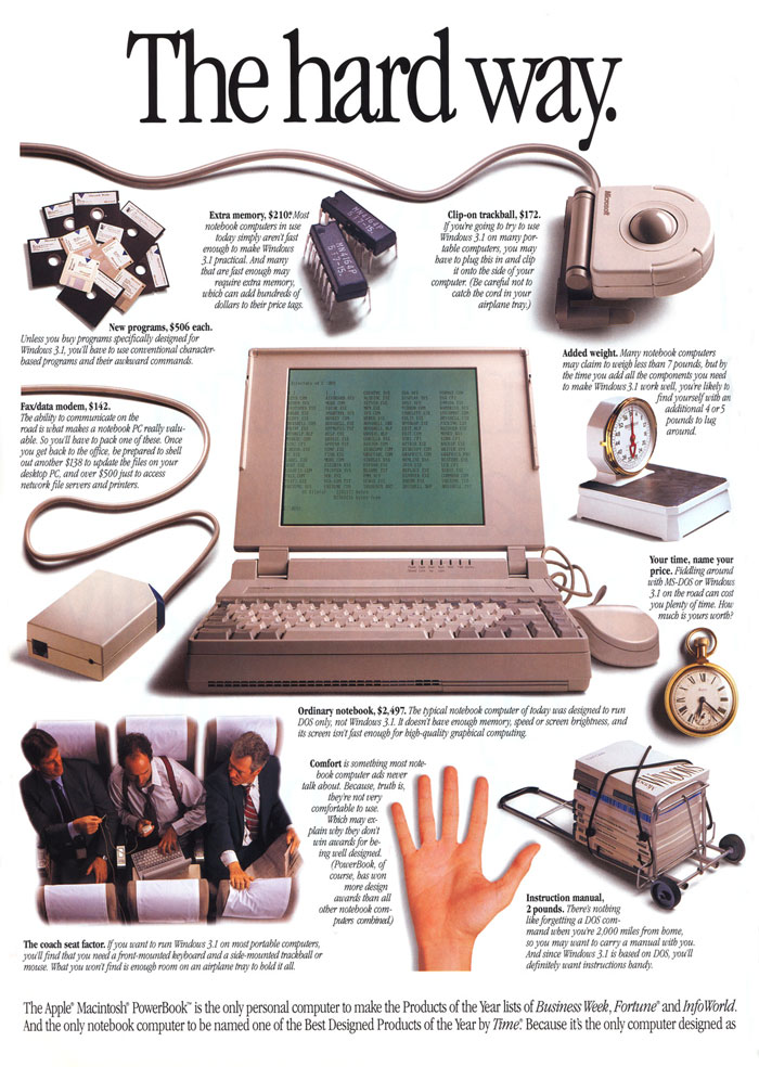
www.macmothership.com/gallery/newads8/92PowerBook2.jpg
The proportion we see in this ad shows us that all images are related to one another, with the laptop in the middle being the primary image, with attention drawn to its size and proximity among the other images. It is easy and logical to see which object should have our primary attention.
1. This photo shows proportion through the difference of size between the shadow and the gun
2. I think the most visually striking thing about this photo is the contrast of the dark red colour and the black,
Photo By Design (Feb 2013), Week 7
Highlighting the details of the texture of this crocheted window decoration by filling the frame with a close-up. The sun streaming through the window makes the yellow colour of the yarn come alive. On such a close-up image, we do not see the overall shape, but are plunged into the fascinating world of detail.
1, This image represents proportion because of the amount of space surrounding the person.
2. the rock is the most visually striking element in this photo.
when you think you've had a bad day at work, you probably haven't really, in the wider scheme of things