View allAll Photos Tagged Map+
Description: Two page spread containing a tactile map with braille. War Maps, Belgium and North-Eastern France.
Note: Map with tactile elements for use by the blind.
Creator: The National Institute for the Blind, London
Date: undated
Format: book
Digital Identifier: MAPS-00048
Rights: Samuel P. Hayes Research Library, Perkins School for the Blind, Watertown, MA
While exploring my archive I've stumbled on this map of Amman, it was published by "International Media Services", as you see their credentials at the map footer.
It's really a strange thing to find! I don't recall how it came into my archive.. it's like seeing a visualised memory directly in my hands. Anway, the map is really interesting, it shows you the brands, shops, venues and landmarks of Amman two decades ago, I'm sure many of us still remembering few parts of this map, the map of a vivid city who changed a lot.
The map, obviously, was drawn by hand, the artist who done that used some weird orientations, so you find Rainbow street is west of Al-Husseini Mosque and they share the same horizontal level, then you keep going west until you reach Abdoun, a few steps after Abdoun you find yourself in the Queen Alia Airport! Funny..
However, the artist made a good effort to draw the building's facade, I was impressed to see some iconic buildings of Amman drawn in a nice way, it seems like someone did a big research for photos and logos, and delivered them to the artist's hands.
Many brands in this map have been extinct, and many are still surviving, but it still Amman that we love!
All rights reserved by - Muhammad Amit [ goo.gl/m1Pe8h ]
Check - Amit Photography [ goo.gl/jqLb8h ]
Pakage Detail : goo.gl/rDhHK3
Email :- muhammadamit2@gmail.com
Thanks in advance
This map has links to places where we took photos.
The map is best viewed in either large or original format.
Map source, Wikipedia, map author Eric Gaba – Wikimedia Commons user: Sting.
Collection of old maps scanned from books and other print sources Download them all at Photoshop Roadmap.
Vintage map of Hokkaido, the northern island of Japan.
I bought a packet of 1960s tourist ephemera on eBay about a year ago. The graphics and maps are awesome. The text for almost everything is written in Japanese. Most of the items concern sites you can visit on Hokkaido, the northern island of Japan.
The trouble with dot plots is that sometimes changes in the random positions look like meaningful changes. The most obvious real changes since 2000 are places that were totally unpopulated then but have people now, like Jack London Square, South Beach, and Mission Bay. The demographic shift that jumps out at me is that West Oakland is much less solidly black than it was before.
The other thing about Census data is that they fixed a lot of alignment problems in the TIGER maps between 2000 and 2010. The maps are a better match to physical reality now, but it means that everything in Alameda County looks like it shifted to the east because it was all misaligned before.
There are a bunch of things I should change, but for the moment, as before, Red is White, Blue is Black, Green is Asian, Orange is Hispanic, Gray is Other, and each dot is 25 people.
Title: Moll's Map of Dublin
Year: 1714
Scale: 1 inch to 1 mile
Size: 13cm x 9.5cm
Location / recall no.: Special Collection
Notes: Herman Moll. (plate XI photocopy) Inset from ‘A new map of Ireland’
Dublin City Library and Archive houses a collection of maps of ancient and modern Dublin from the 17th century to the present day. From Speed's map of 1610 to Rocque's map of 1756, through to the Dublin City Development plans of today this collection traces the growth of the capital city. Maps of Ireland and the counties are also held.
Map background courtesy of:
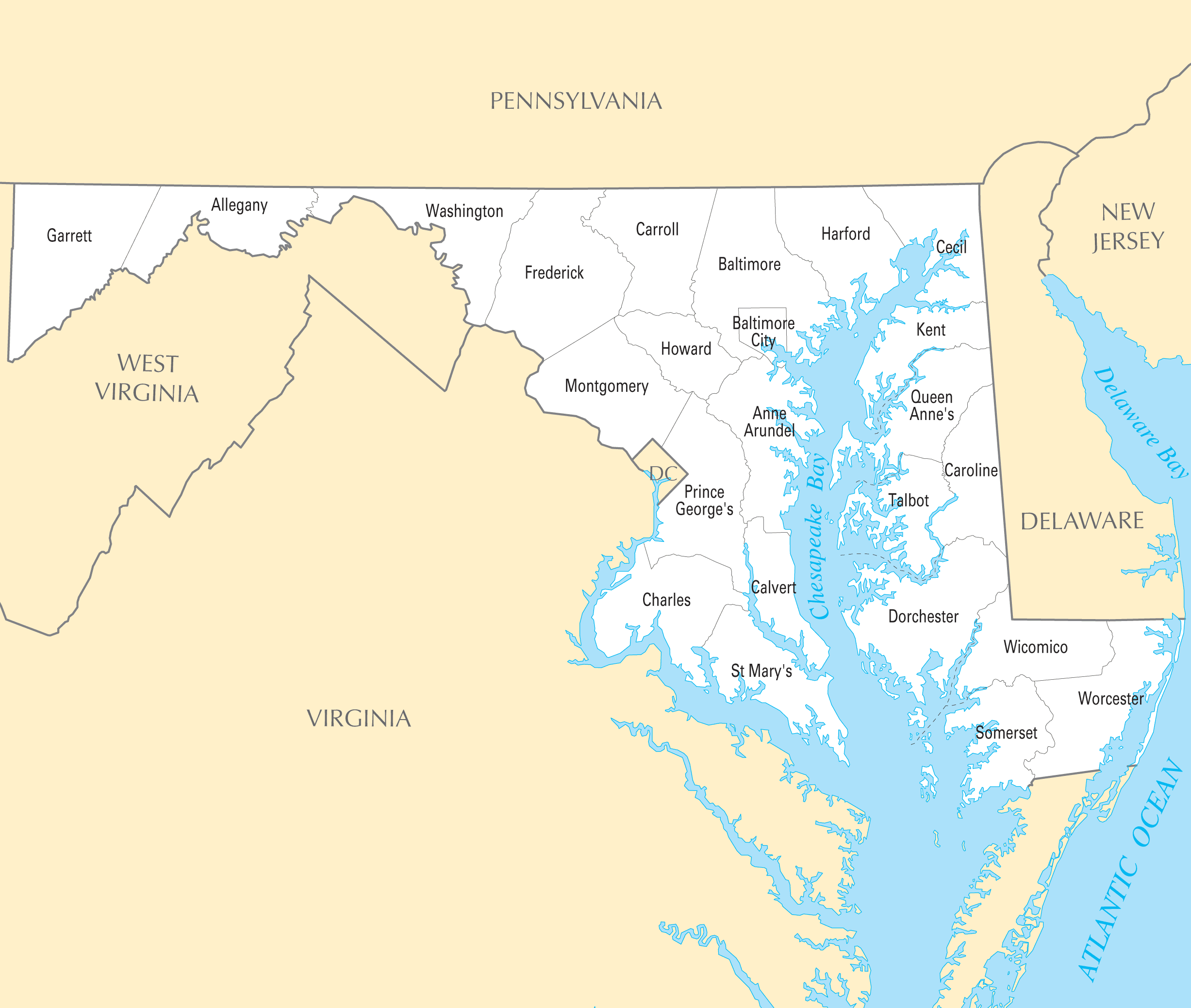
mapsof.net/uploads/static-maps/maryland_county_map.png
------------------------------------------------------------------------------------------
If you would like to use THIS picture in any sort of media elsewhere (such as newspaper or article), please send me a Flickrmail or send me an email at natehenderson6@gmail.com.
The updated Sydney Trains map including the South West Rail link that opened in February 2015. See the map with it under construction from 2014 here. Circa November 2015.
Here is the old Sydney Cityrail map.
Pratt Connector trail map from the Forest Service contract document.
Update 6 years later - This trail has been built and has been in use for several years now. It's a great walk and provides reasonably easy access to the Pratt Valley.
The Southwest Airlines route map in October 2020. The map shows the nine new destinations planned through June 2021.
Courtesy of Southwest Airlines.
sneak peek of twisted fall 2016 womens gift
Taken at Sandbox - cleans every 4 hours. No combat, no selling!, Sandbox Astutula (119, 106, 27)
The USGS GNIS placename database was used to make this map. Any stream whose name ends in "Branch" gets a purple dot, any whose name ends in "Run" gets a green dot, and any whose name ends in "Brook" gets an orange dot. Stream names that end with other terms, like "River" or "Bayou" are not shown.
This map shows a strong geographic pattern in the use of these stream terms. "Brook" occurs mostly in New England and New York. "Run" is confined mainly to Pennsylvania, Ohio, and northern West Virginia. "Branch" is common in the South, including Missouri. Indiana, Maryland and Appalachian Virginia use both "Branch" and "Run". New Jersey uses all three terms. There are other curious patterns, such as a cluster of "Branches" in southwest Wisconsin and "Brooks" in Minnesota. All three terms are rare in the West.
Source data, USGS GNIS placename database and ESRI's state boundary data. Software, ESRI ArcGIS.
Ukraine is located in Eastern Europe, bordering the Black Sea, between Poland, Romania, and Moldova in the west and Russia in the east, comprising of 603,700 sq km. It has a population of 47,425,336 (2005). Major environmental concerns are: inadequate supplies of potable water; air and water pollution; deforestation; radiation contamination in the northeast from 1986 accident at Chernobyl Nuclear Power Plant.
For any form of publication, please include the link to this page:
This photo has been graciously provided to be used in the GRID-Arendal resources library by: Philippe Rekacewicz, Emmanuelle Bournay, UNEP/GRID-Arendal
Panel in John Berry's Plan of the Towns of Manchester & Salford. Published by John Berry, grocer, at the New Tea Warehouse, Manchester, 1750.
The map shows the Manchester as it was at the time of the Civil War, when its population was somewhere between 5,000 and 10,000 people. The Collegiate Church (now Manchester Cathedral) at the centre of the medieval street layout. This copy has been coloured at a later date.
Ref GB124.G7
For a pocket plan, this 200 year old map has survived pretty well!
This map shows the city as it was in 1800, which is 28 years after yesterday's map. Manchester's population had doubled in that short time to somewhere between 70,000 and 95,000, in the wake the advances in textile production that came from Arkwright's spinning mill and Crompton's spinning mule.
The conurbation's expansion to the south and east is clear, although Oxford Street is still mostly undeveloped. In Piccadilly Gardens can be seen the old Royal Infirmary, which did not move to Oxford Road until 1908. In St Peter's Square stands St Peter's Church, which was built in 1788 and not demolished until 1907.
New Bailey Prison, construction of which started in 1878, can be seen just over the Irwell in Salford, alongside the new bridge. In 1795, five years before the map was drawn, this escape took place from the prison. Prison records for the late nineteenth century can be searched online here here.
Here is Manchester as it was in 1819. This was the year of the Peterloo Massacre. The title panel shows the 'new' Blackfriars Bridge.
Giant map of NYC in the Queens Museum of Art. I uploaded this full size panorama of downtown Manhattan so my neighbors can have fun finding their own apartment building.
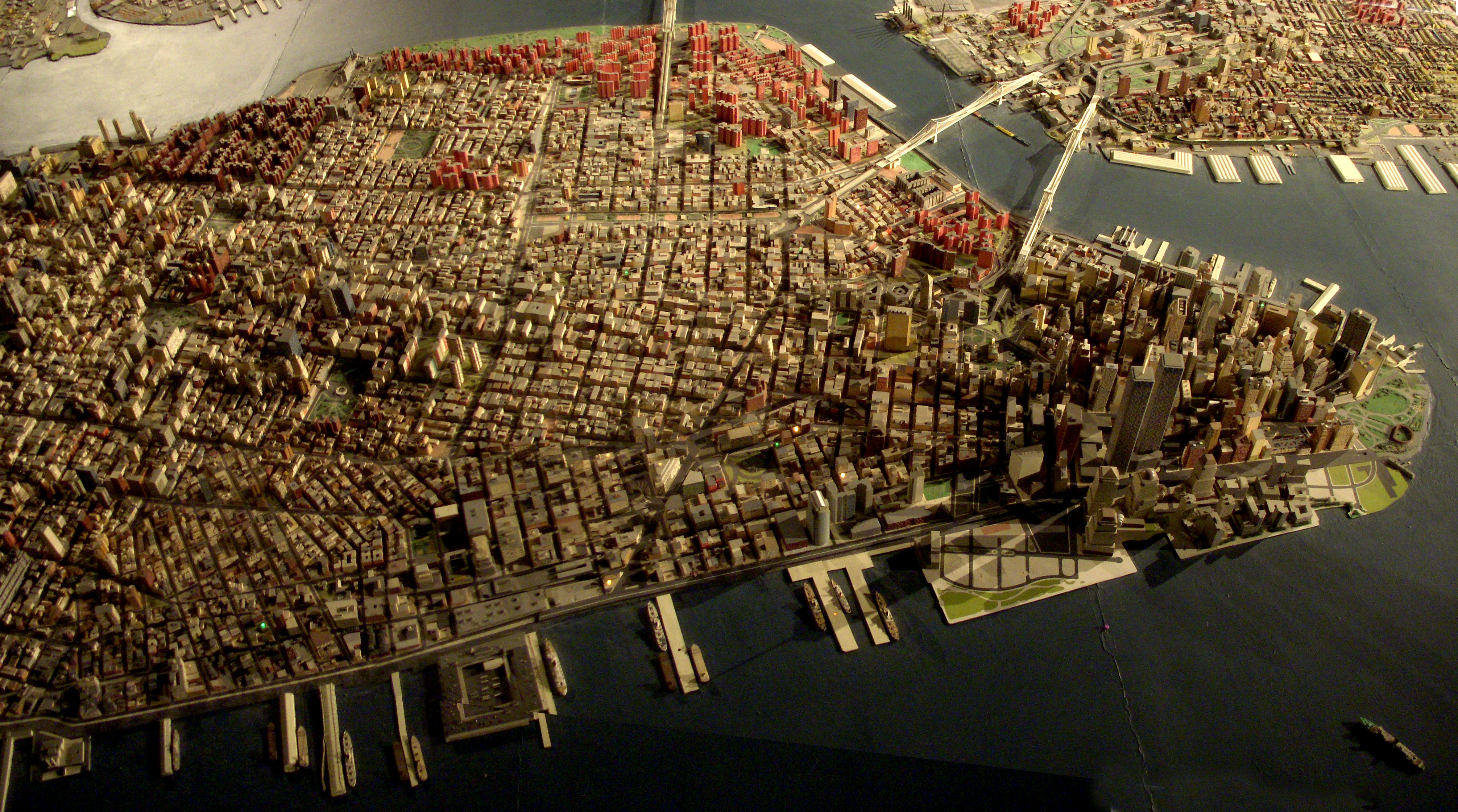
Robert Moses had 'The Panorama of the City of New York' built for the 1964 World's Fair, but it has been updated, and supposedly has every building built before 1992. Originally you flew over it on a simulate helicopter ride. Now there is a ramp that spirals around it from the first to second floor of the museum.
Remember that one illustrated map I uploaded a while back? Well, I found out that that was the back to the Cities Service Map series (its cover was torn off so I didn't know that there was a cool cover to it). Here is what the front of those maps look like. I did the eBay thing and found the best quality map that was available: Kansas.
I suggest doing the "All sizes" thing or just click here.
This map goes along with this post, which was an attempt to inventory all the independant shops and businesses in my area of central Austin.
This was my big summer project this year! A full map of the continental United States all in patchwork and embroidered! You can see more pictures at:
As it was such a glorious sunny day, this persuaded at the last minute to get out for a shorter, 6.8km, than normal walk. I set out from Cadmore End, through Hanger Wood taking in Fingest returning across the fields enjoying the autumnal views.
More stunning views of the Chilterns - Walkabouts 2025 .... flic.kr/s/aHBqjBXsk2