View allAll Photos Tagged Map+
This map has links to places where we took photos.
The map is best viewed in either large or original format.
Map source, Wikipedia, map author Eric Gaba – Wikimedia Commons user: Sting.
Vintage map of Hokkaido, the northern island of Japan.
I bought a packet of 1960s tourist ephemera on eBay about a year ago. The graphics and maps are awesome. The text for almost everything is written in Japanese. Most of the items concern sites you can visit on Hokkaido, the northern island of Japan.
Title: Moll's Map of Dublin
Year: 1714
Scale: 1 inch to 1 mile
Size: 13cm x 9.5cm
Location / recall no.: Special Collection
Notes: Herman Moll. (plate XI photocopy) Inset from ‘A new map of Ireland’
Dublin City Library and Archive houses a collection of maps of ancient and modern Dublin from the 17th century to the present day. From Speed's map of 1610 to Rocque's map of 1756, through to the Dublin City Development plans of today this collection traces the growth of the capital city. Maps of Ireland and the counties are also held.
Pratt Connector trail map from the Forest Service contract document.
Update 6 years later - This trail has been built and has been in use for several years now. It's a great walk and provides reasonably easy access to the Pratt Valley.
The Southwest Airlines route map in October 2020. The map shows the nine new destinations planned through June 2021.
Courtesy of Southwest Airlines.
The USGS GNIS placename database was used to make this map. Any stream whose name ends in "Branch" gets a purple dot, any whose name ends in "Run" gets a green dot, and any whose name ends in "Brook" gets an orange dot. Stream names that end with other terms, like "River" or "Bayou" are not shown.
This map shows a strong geographic pattern in the use of these stream terms. "Brook" occurs mostly in New England and New York. "Run" is confined mainly to Pennsylvania, Ohio, and northern West Virginia. "Branch" is common in the South, including Missouri. Indiana, Maryland and Appalachian Virginia use both "Branch" and "Run". New Jersey uses all three terms. There are other curious patterns, such as a cluster of "Branches" in southwest Wisconsin and "Brooks" in Minnesota. All three terms are rare in the West.
Source data, USGS GNIS placename database and ESRI's state boundary data. Software, ESRI ArcGIS.
Panel in John Berry's Plan of the Towns of Manchester & Salford. Published by John Berry, grocer, at the New Tea Warehouse, Manchester, 1750.
The map shows the Manchester as it was at the time of the Civil War, when its population was somewhere between 5,000 and 10,000 people. The Collegiate Church (now Manchester Cathedral) at the centre of the medieval street layout. This copy has been coloured at a later date.
Ref GB124.G7
Here is Manchester as it was in 1819. This was the year of the Peterloo Massacre. The title panel shows the 'new' Blackfriars Bridge.
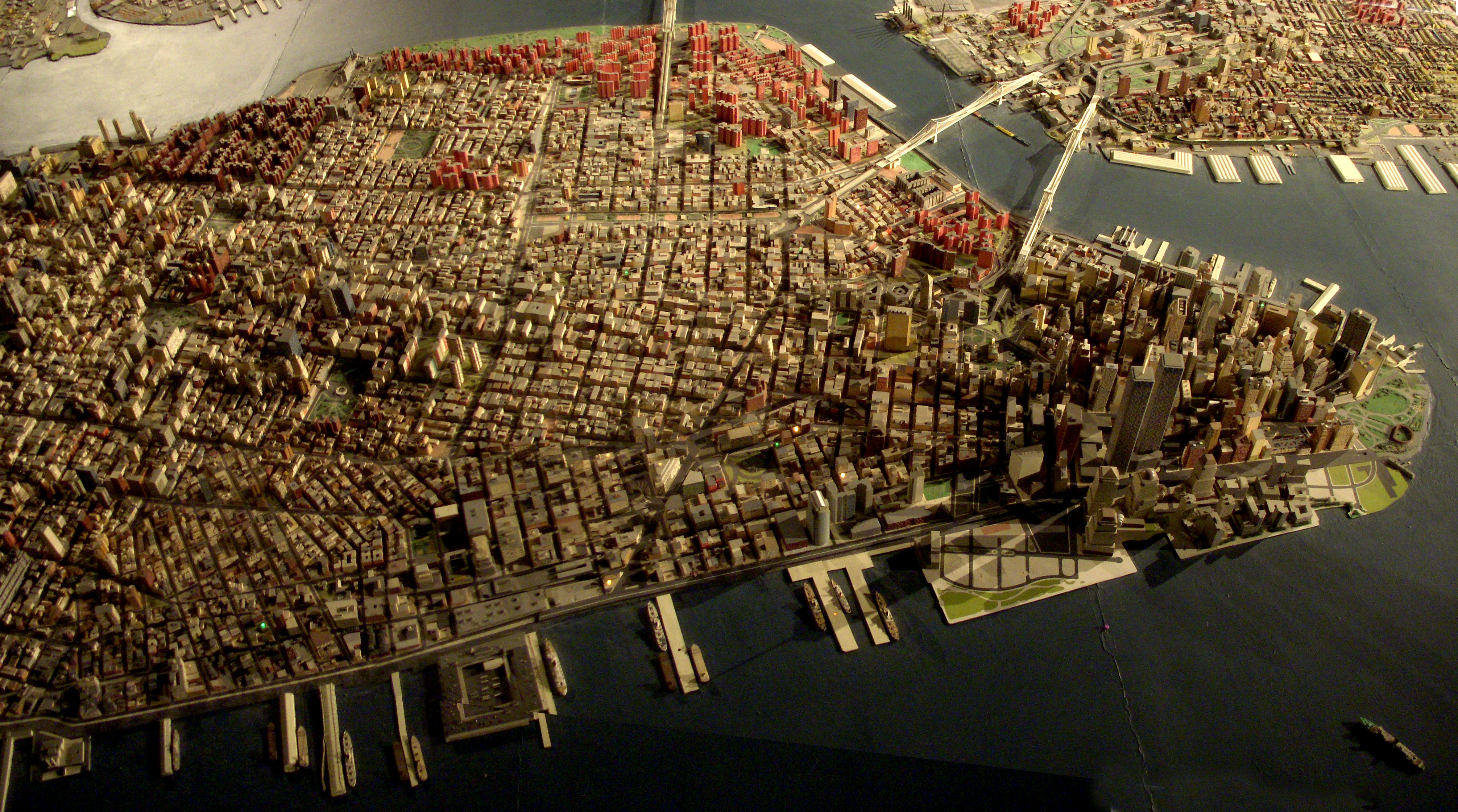
Giant map of NYC in the Queens Museum of Art. I uploaded this full size panorama of downtown Manhattan so my neighbors can have fun finding their own apartment building.
Robert Moses had 'The Panorama of the City of New York' built for the 1964 World's Fair, but it has been updated, and supposedly has every building built before 1992. Originally you flew over it on a simulate helicopter ride. Now there is a ramp that spirals around it from the first to second floor of the museum.
As it was such a glorious sunny day, this persuaded at the last minute to get out for a shorter, 6.8km, than normal walk. I set out from Cadmore End, through Hanger Wood taking in Fingest returning across the fields enjoying the autumnal views.
More stunning views of the Chilterns - Walkabouts 2025 .... flic.kr/s/aHBqjBXsk2
I was astounded by Bill Rankin's map of Chicago's racial and ethnic divides and wanted to see what other cities looked like mapped the same way. To match his map, Red is White, Blue is Black, Green is Asian, Orange is Hispanic, Gray is Other, and each dot is 25 people. Data from Census 2000. Base map © OpenStreetMap, CC-BY-SA
I've uploaded the image on the right a few times already. That image is of my map of the current Kmart stores in Florida, which currently stands at a total of 41 stores. For the first part of the upcoming AFB on flickr photoseries, we're going to be taking a look at the most recent Florida Kmart casualty - the closing of the West Palm Beach Kmart. The closing of the West Palm Kmart began on May 20, 2016, and that store's closing should be entering it's final days by now, if it hasn't closed for good already. I visited the West Palm Kmart on May 18, 2016, two days before the closure began. For the record, I had no idea the store was going to close when I made the trip down there. The timing was a complete coincidence. However during my visit there were a few signs of an upcoming closure in the works, which I will discuss in more detail as I get into those photos.
As I was looking for some information on Kmart not too long ago, I stumbled upon a list of licensing data from the State of Florida from 1996. Their list included information on the locations of every Kmart in the state in that year. So using that data, and filling in a few gaps with some other stores I knew of that closed prior to 1996, I complied a list and map of every Kmart (that I know of) to have existed in Florida over the years. You can see that map on the left. According to my count, there have been at least 184 Kmart stores to have operated in Florida over the years (that count includes original stores and their replacements). As of today, over three quarters of the Kmarts to have operated in Florida have since closed. However, I think the comparison between the two maps speaks the loudest over any statistical figures.
If you would like to view an interactive version of the map of all Kmarts to have operated in Florida, please click here. To view an interactive version of the map of current Kmart stores in Florida, please click here.
Please comment below if those links don't work or if you know of a former Kmart location that I may have missed.
This was my big summer project this year! A full map of the continental United States all in patchwork and embroidered! You can see more pictures at:
In the Four Corners region, drawings like this are often maps. This is a different cultural area (Wyoming), but I assume that it too is a map of something, or a guide to something.
Population density at MSOA level recalculated using only residential land as the denominator. Land use data from the EU Urban Atlas. Map created using R and QGIS.
Map from an official guide published by the Cape Town City Council in 1950. Note the railway line crossing the bottom of Adderley str. Most probably also the line that went to Sea Point.
Google maps recently added the option to get route directions via walking, biking, mass transit, etc. Very cool. check out the podcast... thegreentax.com
source of this map:
en.wikipedia.org/wiki/Image:DesertStormMap_v2.svg
PSP Buckeye was just south of the Breach line, with the grey line going right through for the Big Red 1, is where we were located at.