View allAll Photos Tagged Retrostyle
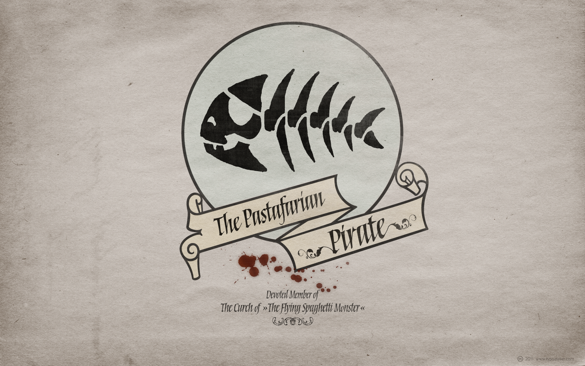
I created this wallpaper on inquiry of a friend and »devoted« member of »The Church of The Flying Spaghetti Monster«.
Typefaces in use:
Philip Bouwsma’s (Canada Type) mysterious, calligraphic blackletter typeface »Torquemada«.
Torquemada marks the return of eminent American calligrapher Philip Bouwsma to the type scene after almost 7 years of hiatus, and he is certainly coming back with a lot of bells and whistles!
Torquemada offers the same kind of excitement that emanated from Bouwsma’s work in 1970s and 1980s New York, when he was one of the most important leaders of the New Calligraphy movement that brought calligraphy forth as a mainstream art and craft, and spawned many of today’s known calligraphers. Not only is this calligraphic art at its very digital finest, but it also introduces a completely new concept in drawing letters with a broad pen. Bouwsma’s Torquemada Principle defines the harmony of weight, contrast, tension and space by consistently changing the angle of the broad pen between 0 and 80 degrees throughout all strokes. When the strokes become hairlines at the lowest angles, the paths made by the actual corners of the pen cross over one another, making the outline flat or slightly hollowed. This new calligraphic idea gives us the rare opportunity to quote an old Monty Python joke: Nobody expects the Spanish Inquisition!
Torquemada comes in four variations: Torquemada One regular and bold, and Torquemada Two regular and bold. The difference between Torquemada One and Two is not just a simple change in vertical metrics. The stroke proportions of each variation were also optically adjusted for maximum readability at small sizes, as well as maximum aesthetics for display work. Check the PDF included in the MyFonts gallery section for further information on the Torquemada Principle, visual samples, and the differences between the font’s four variations.
Torquemada comes in all major font formats, in two separate packages priced affordably, or in one complete bundle, also priced very affordably. The OpenType version is two fonts, a regular and a bold, with the proportional alternates slotted as contextual substitutions in the programming of the font. A few alternates and random swashings are also included within the fonts.
Torquemada’s applications are virtually endless. This is a real calligraphic workhorse that has the power to elevate any design to higher levels of visual appeal. You can trust this work to be the perfect choice for book, film and music covers, titling, posters, signage, flyers, packaging and all kinds of branding.
Models: (left) Britt Lynn, (right) Casie Shea Cortez.
Makeup/Hair: Cynthia Perazzo.
Instagram: @CryscoPhotography
FB: Crysco Photography at The Industry Studio
"It wasn’t always easy, but this? This is wonderful."
He took a deep breath, enjoying the cool morning air as he leaned against his beloved scooter. The outfit today was particularly fun: a soft cream colored sweater tucked into a skirt with a gentle A-line shape, and an oversized beige jacket that almost felt like a cozy hug. He’d added a scarf in a muted shade of grey for texture, its woolly softness contrasting beautifully the crispness of cotton shirt beneath. The colors were soothing – earth tones reflecting his love for calm mornings like this one.
He remembered years of listening to others, letting their opinions dictate the shapes he wore. Then he realized how much he’d been missing! Now, he's free to embrace a look that resonates with him, and often it is playful.
This morning, heading to his ceramics class where he makes whimsical animal mugs, he felt a little self-conscious. He expected a double take or two. Instead? Smiles. A nod of approval from the baker. The young girl across the street shouted, "Lovely skirt!" It's amazing how many people you can connect with just by being yourself!
Typefaces in use:
Gunnar Link’s friendly, strong slab serif typeface »Frido Narrow«. The ampersand is set in »Frido Black«.
Frido Narrow is a strong serif typeface to give your messages a friendly and warm visual appearance. It’s a revised version of Frido Black with decreased white space within and between the letters.
The title I borrowed from »Cry Freedom«, a 1987 British drama film directed by Richard Attenborough, set in the late 1970s, during the apartheid era of South Africa. It was written from a screenplay by John Briley based on a pair of books by journalist Donald Woods. The film centers on the real-life events involving black activist Steve Biko and his friend Donald Woods, who initially finds him destructive, and attempts to understand his way of life. Denzel Washington stars as Biko, while actor Kevin Kline portrays Woods. Cry Freedom delves into the ideas of discrimination, political corruption, and the repercussions of violence.
I dedicate this wallpaper to all the brave people in the Middle East and North Africa struggling against suppression.
Typefaces in use:
Chris E. Lozos’ (DEZCOM) striking, »multiple-personality« type family »DEZ Boulder«
DEZ Boulder is a Bold Display Family in Three Personalities: ego, id, and alter.
Dez Boulder works like a character actor, presenting the author’s lines but not with the deadpan delivery of a news reporter. Boulder develops the role, adding meaning through facial expression, gesture, and body language.
The Dez Boulder family of display faces acts in a supporting role to give meaning to message and context to content. It is a very bold face, not understated. Each of its three personalities (and their sub-personalities) have a different timbre to speak the nuance of your message in a bold voice.
Dez Boulder averages more than 800 glyphs per style with uppercase, lowercase, small caps, proportional lining figures, small cap figures, superiors, inferiors, fractions, stylistic sets, alternates, ordinals, case specific punctuation, and more. It has a full range of diacritics and covers all European languages using the Latin script.
and
Rae Kaiser’s (Outside the Line) hand-drawn Didone »Fondly Yourz«.
Fondly Yourz is a less than serious, hand drawn serif font. This headline font has nice thick and thin lines. Pair it with a san serif font for body copy for a fresh contemporary look.
Portrait of Miss Malì
Picture: Davide Morino
Edit: Davide Morino
Outfit, makeup and hairstyle: Miss Malì
Portrait of Miss Malì
Picture: Davide Morino
Edit: Davide Morino
Outfit, makeup and hairstyle: Miss Malì
Closer shot of the bedroom...the bowl holding the flowers is from the Re-ment Room Data Japanese room set, and the gerbera daisies are from Re-ment Storage Beauty. The lamp is Megahouse Retro Style. : )
☃ ☃
.. approx. 4"; "Heirloom Ornament Collection" ; plays portion of original TMNT animated series theme. Slightly resculpted in the arms and hands from the pose of prior ( similarly sculpted ) Turtles in the series to accommodate Don's Bo weapon.
~ t
Photo was taken at the festival "Retro trip 2023" | Фото было сделано на фестивале "Ретро рейс 2023"
Sepia-toned vintage portrait of a young girl standing on a patterned blanket, holding a small toy. Taken in Hungary in 1938.
Wallpaper 1920x1200 | I created an imaginary cover for a book I love: »The Flowers of Evil« by Charles Baudelaire.
Typeface in use:
Maximiliano Sproviero’s (LIÁN TYPES) charming, breathtaking beauty »Reina«.
Reina Reina is Sproviero’s didone of the year. We recommend seeing its »user guide.
Inspired in the sweet letters of calligraphy and typography masters of our past; such as Didot, Bodoni and the incredible Herb Lubalin, its aim was to incorporate the decorative accolades from blackletter and copperplate styles of calligraphy into a Modern Roman typeface.
Reina reflects sovereignty due to the enveloping atmosphere and the sensation of greatness that can be felt when using it. It has an unique way of standing over paper and screen, being its swashes responsible of an extreme elegance.
Similar to what Lian did in his last font Breathe, Reina was designed to be playful yet formal: While none of its alternates are activated it can be useful for short to medium length texts; and when the user chooses to make use of its open-type decorative glyphs, it can be useful for headlines with dazzling results.
TECHNICAL
Reina is a family with many members. In order to achieve better results when printing, Lian took his time to design the necessary styles: Reina 72 Pro, prepared for display sizes; Reina 36 Pro, for medium sizes; and Reina 12 Pro, the best for text or decorative words in small size.
Each of these members have variants inside, which are open-type programmed: The user decides which glyph to alternate, equalizing the amount of decoration wanted.
Reina Engraved Pro has the same features than the variants mentioned above.
The family also contains variants which were made exclusively for decoration. These are: Reina Words, a set of the most common words used in english, german, italian, french and spanish; Reina Capitals, which consists in a big set of ornamented capitals; and Reina Fleurons, those little friends which always help to embellish our work by combining them in the way the we want to.
der Lederfabrik Resart-Ihm im Raunheimer Industriegebiet. In dem letzten noch verbliebenen Gebäudekomplex war die Gerberei und Lederfabrik seit 1911 untergebracht. Das Gebäude wurde jetzt auch zum Abriss freigegeben.
Grund genug für letzte fotografische Impressionen . . .
Panorama aus drei Aufnahmen.
Panasonic 7-14 an der Lumix GX80
Or maybe not as she's having to pull the curtains aside herself.
The delightful Hannah again from the Littlehampton shoot.
Single 540EZ, no modifier, high and camera left triggered with RF-602. Lots of fill from the curtains.
FACEBOOK:https://www.facebook.com/Mss.Diversity
INSTAGRAM: instagram.com/rragtime_cat
Photographer: Jens Peltzer
Picture is made with the film camera fully immersed under water. Film size 18x24 cm. Monocle. Without shutter. Xray film. DS51 flash. In the shooting process we used live saving diver's dry suite СПГ-К and sealing off rebreather ИДА-59М. Both were used as a diver's life saving equipment in Russian Navy for emersion from submarine (deep until 220 m).
Black-and-white portrait of a Hungarian man in formal attire, stamped by the Royal Hungarian State Police, Szeged Captaincy, circa 1930.
Chinese door knocker against chinese lanterns illuminated at night for the year of the dragon in DongMenShiJi market Chengdu, Sichuan province, China
More on my Website
Order a Print
License on Getty Images
© Philippe LEJEANVRE. All rights reserved.
| Getty Image | Website | Facebook | Twitter | Instagram |