View allAll Photos Tagged Proportion
Fine art photography series taking a look at a hidden fantasy world where objects and people and mismatched. The series is symbolic of how things can easily be blown out of proportion.
1) Proportion is reflected in this image because it shows the doll shoe and the large size difference between it and the normal-sized shoe.
2) The most successful aspect of this photo is how every detail in the shoes and even in the wood is shown.
The smaller buildings show how tall the biggest building is, and the street lights, trees, and people help show the proportions of everything else too!
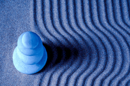
1) This image investigates the principle of proportion being that a harmonious relationship exists between the elements with respect to size.
2) The ring around the light pole in a way makes it more clear
1. This image investigates the principle proportion. it is reflected in this composition because of the person on the left is bigger and closer to the camera then the grand canyon is.
2. The aspect of the subject I think is most visually striking is the different colous and textures in the rocks int he background.
This image portrays proportion as it shows two nearly identical objects in the same frame although their sizes are completely different. Placing the smaller subject first furthers this as it makes the object look as though its counterpart is so large it is able to look over it.
1) This image represents proportion because the street car and the people walking are proportioned to the buildings.
2) This most successful part of this image is that there are many objects that you can compare to the buildings.