View allAll Photos Tagged timechart
This advertising wheel chart for Gübelin watches and clocks displays the difference in time around the world and includes a "bright Swiss coin" to "bring you luck."
Originally posted on Ipernity: Gübelin Watches and Clocks Show the Time Anytime Anywhere.
World Time Chart. Compliments of WGY radio broadcasting station, General Electric Co., Schenectady, N.Y., U.S.A.
This chart is useful for novice and amateur alike. Its chief use to the former is in determining the time at different points of the U.S., while to the latter its use is extended to include other countries.
For centuries all the land in this part of the Isle of Mull belonged to the Maclean's of Duart. Unfortunately, they lost their estates during the first Jacobite uprising in 1689, and the land was given to the Dukes of Argyll. Torosay and Duart were sold to Colonel Campbell of Possil Park in Glasgow in the 1820s. The Colonel immediately started work on gardens and on a Georgian house that in 1829 stood on the site now occupied by Torosay Castle.
John Campbell, the Colonol's son, inherited the house and demolished his father's Georgian mansion, commissioning Edinburgh architect David Bryce to build something grander. Originally named Duart House, the name was changed following the restoration Duart Castle. Unfortunately John Campbell was forced to sell Torosay after only 10 years, when his business interests were damaged by the American Civil War, to Arbuthnot Charles Guthrie. The Guthrie family have remained there ever since.
Sitting in 12 acres of ornamental gardens, including a Japanese Garden, terracing and a statue walk, it is still a family home.
There are some fascinating accounts of the life of the late head of the family, David Guthrie Jones. He was captured on his motor gunboat during World War Two, then escaped from Colditz. After the War, he sailed around the world on his yacht, and took part in a polar exploration. He was an MP, and visitors can leaf through the big red book from his appearance on the TV show "This is Your Life".
One room houses a huge table covered with scrapbooks containing newspaper clippings cataloguing decades of local events. Signs around the house encourage you to sit on the furniture and stay a while if the weather is inclement outside.
The grounds include a series of magnificent Italian statues, sculpted fountains, water garden, Japanese garden, rockery, stone lions, a domed folly and elaborate square towers on the edge of the terrace which house a very comprehensive display of the geological history of Mull, complete with photographs, timecharts and models. Well worth a visit.
www.youtube.com/watch?v=ECub4tpRaic
ZoomCharts Co-Founder and CEO Janis Volbergs gave a well received presentation at a UI/UX meetup event to talk about the array of progressive ZoomCharts features available today and the great things the team is coming up with for the near future.
Check out this overview of Volbergsâ presentation to discover why ZoomCharts is a world leader in interactive data visualization software:
The name of our product is ZoomCharts, and what we are producing is ZoomCharts SDK, which is the worldâs most interactive data software. We are a new startup established in Latvia just last year. The product, since March of this year, is available for purchase and has been purchased by many different customers from all over the world. The actual product is entirely new data visualization software development GIT, which puts in the center not the technology, but the person sitting behind the device that every one of us has in the pockets; users of mobile phones, users of iPads.
We wanted to make such a development toolkit that would allow developers to create interfaces that make it easy to access data, to analyze data, to interact with data. We are not a library that lets you create a chart, we are a library that lets you create an interface that then engages the user into an immersive, interactive data exploration venture.
To give you an idea of what sort of visualizations you can achieve using our development kit, we have products like the network chart. The network chart lets you visualize different networks of data, whether they are social networks, whether they are Internet of things networks. All of that you can visualize on any device you have, basically, whether itâs an iPhone, iPad, notebook, or touch TV. The interactive time chart lets you access big data with time and explore what happens within specific areas of that data without using any other interface component. We have also reinvented the pie chart and the facet chart.
What makes our SDK unique? First of all, itâs built to make data navigation engaging, so it wonât be just a boring chart or boring interface. It will be interesting for people to actually use your software that would include a ZoomCharts application. We also know that most of you like the performance of the application, so we put a lot of effort in creating this development kit such that it will be super nice looking and super fast on most contemporary devices. We have also added different aspects of how you can visualize different data in a compelling way. And for those of you who already have some applications or products, ZoomCharts helps you sell your product because when we show our products to actual consumers, when they see the interface built with ZoomCharts, they love it, and they can immediately see how they can use it for other purposes. So basically, what we are doing with ZoomCharts is accelerating the emergence of new ideas that couldnât have been done yesterday because there wasnât such development yet available.
I could talk a lot about it, but itâs better to show you some real life examples of how we have applied ZoomCharts to tackle some of the issues in the real world. With a product called myinstabank, the Internet account statements show a long boring list, and when you need to see the big picture, you just canât. All you get is just a list. Normally you would just use the export option to make some Excel charts. We found that we could use our interface to give all this information another meaning in the hands of users. We applied our charts to the already existing data within the Internet banks.
What we have here is a time chart. It shows you data aggregated by timestamps. So if you have any data that has timestamps, you can use the time chart. The picture is where most of the chart libraries end; it is the end product of their libraries. In our case, the chart is just the beginning of your venture because now letâs imagine you wanted to see what happened in the year 2012. What do you have to do? One click. You just click on it, and immediately the chart communicates with the banking database, retrieves more data for that period, and immediately aggregates data. No more dropdowns where you have to pick specific dates or unintuitive actions. The rest of the interface then responds to the time period you have selected. The list is there, but now itâs filtered for that one year you just selected. If you need some other information, just one click, and the interface is communicating back to the server and fetching data. Speaking about the pie charts, they immediately show you where your money is coming from, and how you spent your money. All our charts are interactive, so you can click on any slice to filter out the time chart. I said before that we have reinvented certain aspects of the pie chart and one of the key aspects that we have reinvented is, normally if you have a pie chart, you have a grey area that says âothersâ and you never know whatâs inside there. Well, we have fixed that problem. Just one click and it automatically expands. So now, using one pie chart, you can explore all the data.
All of this is interactive, so on iPad, you can use gestures to swipe in, swipe out, do all sorts of things. All charts come bundled with extensive API, which means that you can combine these charts with other JavaScript components that exist within your application to create an interface and an experience to your user that you are looking forward to. The time chart is big data ready because it comes with a very smart data cache and if you attach it to the data sources that handle a lot of data, whenever you do some navigation, it automatically reflects only data for that particular period of time, so there is no unnecessary data being fetched from your servers. Thus, you keep the loads small, the interface fluid, and the overall experience very nice.
One of the very unique products that we have within ZoomCharts is the network chart component. The network chart component lets you visualize different social, financial and other network structures directly within your device. In this particular example, what we did is fetch a subset of the IMDb database to show you how you can use the network chart to visualize information that is already there but in a totally different way. So imagine you get home and you would like to see a new movie but you are not really sure what you want to look for. You know that you like Al Pacino, so what you do is type in âAl Pacinoâ and immediately you see the actor and the top movies of his. This is the point where your joy of data exploration begins. With a single tap, you can explore what other actors are involved in that particular movie. And you can continue this exploration until you find content that youâd be happy to consume. What is good here is this moment of trust because you started with Al Pacino, you trust that person, you love movies with him, and now you can see that there is Andy Garcia that is linked to him. So you think, âhmm, if I like Al Pacino, they are linked in this movie together, maybe thatâs something worth watching today.â With a right click, you can instantly access more information about the movie, and watch a trailer or buy the movie. So what Iâm saying here is, using ZoomCharts as a core component of visual interface, you can let people discover your content, find something they like, and also buy it or consume it. So itâs not just seeing the big picture, but itâs interacting and consuming. And all of this is happening within one interface.
In the next year, weâre also thinking about expanding the charts to let cross device communication, which would mean that you would go home, take your iPad, open up this software, and when you find a movie that you want to watch, you would click âbuyâ or âwatchâ, and it would start playing on your TV. So, devices would be cross linked through using the ZoomCharts interface.
This chart comes with extensive API so you can apply different filters to the data. For instance, in this particular example, we have applied this IMDb filter here, so if youâre really are not looking at anything below 9, you can click on 9 and see that there are not that many movies within this subset. If you are not that kind of person, you can put the star limit to something smaller, and movies appear.
Another interesting aspect is the time machine within which you can filter out movies that are very old, or on the other hand, you can focus on movies that are contemporary. All of that can be easily configured for your application, for your customers, for your product, as you need it. You can style any aspect of your charts with pictures line, arrows.
Many companies, among which is Hewlett-Packard from the United States have already found usage for their cloud solutions to visualize all sorts of different things.
If you go to our webpage you can see other examples of ways you can use our charts. Our charts can be cross combined in very interesting ways. What you see here is Juliaâs social network and who her friends are. You can play around with the network and expand and see what other people are there in real time, but when you click again on Julia, a pie chart pops up and says what social networks Julia is using most. So in this user interface, we are already combining a lot of data that is easily accessible with just a few taps. And it doesnât stop there. So, she loves Facebook. We can click on Facebook, and the second level of the pie chart comes up. There can be unlimited levels. The second level shows which tags she is using within that social network. So now we know that Julia loves Facebook, and within Facebook, she loves to talk about love. Another thing you can do is click on Love, and you get this interactive time chart that says when exactly she is talking about love on Facebook.
In the close future, in a year or two, we are looking forward to integrating support for a number of new human-machine interfaces that are emerging. We are also looking forward to integrating voice control into our charts so you can easily zoom in, zoom out or do other sorts of navigational things.
There are many new chart types coming up, such as the GeoChart, which will let you easily put those interactive pie charts on a map so you can display different statistics for people within one chart.
We are also looking forward to creating a bunch of cloud services that would enable cross chart communication on the one hand, and other things that Iâm not really allowed to tell you now, but there will be some big things that you will hear about.
What is good is availability. As I mentioned before, the software is already available to download on our webpage. You can easily get a 30 day free trial to just play around with it. We are giving away free licenses also for non commercial projects, for students, for charities. But if you have a commercial project you would still need to obtain a developer license.
Check out ZoomCharts products:
Network Chart
Big network exploration
Explore linked data sets. Highlight relevant data with dynamic filters and visual styles. Incremental data loading. Exploration with focus nodes.
Time Chart
Time navigation and exploration tool
Browse activity logs, select time ranges. Multiple data series and value axes. Switch between time units.
Pie Chart
Amazingly intuitive hierarchical data exploration
Get quick overview of your data and drill down when necessary. All in a single easy to use chart.
Facet Chart
Scrollable bar chart with drill-down
Compare values side by side and provide easy access to the long tail.
ZoomCharts
The worldâs most interactive data visualization software
#zoomcharts #interactive #data #datavisualization #charts #graphs #bigdata #dataviz #CEO #cofounder #JanisVolbergs #Latvia #UI #UX #userexperience #userinterface #SDK #GIT #visualization #iPad #iPhone #network #facet #piechart #timechart #IMDb #AlPacino #AndyGarcia #myinstabank #Facebook #love #API #HP #HewlettPackard #freetrial
Step 2: Tap on the legend item again to reveal the data. The data becomes visible in the legend as well.
zoomcharts.com/en/gallery/all:time-chart-legend
ZoomChartsâ line of advanced data visualization software makes it easy and efficient to understand, analyze, and present large amounts of information. Further customization options such as Legends help you tailor the presentation of your data so that you are able to work with exactly the information you need.
ZoomCharts Time Chart Legend is an interactive feature that is being used in a variety of educational fields, including sciences and mathematics, such as anatomy, biochemistry, ecology, microbiology, nutrition, neuroscience, physiology, zoology, chemical engineering, geochemistry, molecular biology, geology, paleontology, physics, astronomy, algebra, computer science, geometry, logic, and statistics, and the arts such as, music, dance, theatre, film, animation, architecture, applied arts, photography, graphic design, interior design, and mixed media.
- Show or hide data series with a simple click using legends
- Information is organized and accessible
- View changes in data over time
Check out ZoomCharts products:
Network Chart
Big network exploration
Explore linked data sets. Highlight relevant data with dynamic filters and visual styles. Incremental data loading. Exploration with focus nodes.
Time Chart
Time navigation and exploration tool
Browse activity logs, select time ranges. Multiple data series and value axes. Switch between time units.
Pie Chart
Amazingly intuitive hierarchical data exploration
Get quick overview of your data and drill down when necessary. All in a single easy to use chart.
Facet Chart
Scrollable bar chart with drill-down
Compare values side by side and provide easy access to the long tail.
ZoomCharts
The worldâs most interactive data visualization software
#zoomcharts #timechart #chart #charts #graph #graphs #data #interactivedata #visual #visualdata #visualdatarepresentation #legend #iphone
www.youtube.com/watch?v=ECub4tpRaic
ZoomCharts Co-Founder and CEO Janis Volbergs gave a well received presentation at a UI/UX meetup event to talk about the array of progressive ZoomCharts features available today and the great things the team is coming up with for the near future.
Check out this overview of Volbergsâ presentation to discover why ZoomCharts is a world leader in interactive data visualization software:
The name of our product is ZoomCharts, and what we are producing is ZoomCharts SDK, which is the worldâs most interactive data software. We are a new startup established in Latvia just last year. The product, since March of this year, is available for purchase and has been purchased by many different customers from all over the world. The actual product is entirely new data visualization software development GIT, which puts in the center not the technology, but the person sitting behind the device that every one of us has in the pockets; users of mobile phones, users of iPads.
We wanted to make such a development toolkit that would allow developers to create interfaces that make it easy to access data, to analyze data, to interact with data. We are not a library that lets you create a chart, we are a library that lets you create an interface that then engages the user into an immersive, interactive data exploration venture.
To give you an idea of what sort of visualizations you can achieve using our development kit, we have products like the network chart. The network chart lets you visualize different networks of data, whether they are social networks, whether they are Internet of things networks. All of that you can visualize on any device you have, basically, whether itâs an iPhone, iPad, notebook, or touch TV. The interactive time chart lets you access big data with time and explore what happens within specific areas of that data without using any other interface component. We have also reinvented the pie chart and the facet chart.
What makes our SDK unique? First of all, itâs built to make data navigation engaging, so it wonât be just a boring chart or boring interface. It will be interesting for people to actually use your software that would include a ZoomCharts application. We also know that most of you like the performance of the application, so we put a lot of effort in creating this development kit such that it will be super nice looking and super fast on most contemporary devices. We have also added different aspects of how you can visualize different data in a compelling way. And for those of you who already have some applications or products, ZoomCharts helps you sell your product because when we show our products to actual consumers, when they see the interface built with ZoomCharts, they love it, and they can immediately see how they can use it for other purposes. So basically, what we are doing with ZoomCharts is accelerating the emergence of new ideas that couldnât have been done yesterday because there wasnât such development yet available.
I could talk a lot about it, but itâs better to show you some real life examples of how we have applied ZoomCharts to tackle some of the issues in the real world. With a product called myinstabank, the Internet account statements show a long boring list, and when you need to see the big picture, you just canât. All you get is just a list. Normally you would just use the export option to make some Excel charts. We found that we could use our interface to give all this information another meaning in the hands of users. We applied our charts to the already existing data within the Internet banks.
What we have here is a time chart. It shows you data aggregated by timestamps. So if you have any data that has timestamps, you can use the time chart. The picture is where most of the chart libraries end; it is the end product of their libraries. In our case, the chart is just the beginning of your venture because now letâs imagine you wanted to see what happened in the year 2012. What do you have to do? One click. You just click on it, and immediately the chart communicates with the banking database, retrieves more data for that period, and immediately aggregates data. No more dropdowns where you have to pick specific dates or unintuitive actions. The rest of the interface then responds to the time period you have selected. The list is there, but now itâs filtered for that one year you just selected. If you need some other information, just one click, and the interface is communicating back to the server and fetching data. Speaking about the pie charts, they immediately show you where your money is coming from, and how you spent your money. All our charts are interactive, so you can click on any slice to filter out the time chart. I said before that we have reinvented certain aspects of the pie chart and one of the key aspects that we have reinvented is, normally if you have a pie chart, you have a grey area that says âothersâ and you never know whatâs inside there. Well, we have fixed that problem. Just one click and it automatically expands. So now, using one pie chart, you can explore all the data.
All of this is interactive, so on iPad, you can use gestures to swipe in, swipe out, do all sorts of things. All charts come bundled with extensive API, which means that you can combine these charts with other JavaScript components that exist within your application to create an interface and an experience to your user that you are looking forward to. The time chart is big data ready because it comes with a very smart data cache and if you attach it to the data sources that handle a lot of data, whenever you do some navigation, it automatically reflects only data for that particular period of time, so there is no unnecessary data being fetched from your servers. Thus, you keep the loads small, the interface fluid, and the overall experience very nice.
One of the very unique products that we have within ZoomCharts is the network chart component. The network chart component lets you visualize different social, financial and other network structures directly within your device. In this particular example, what we did is fetch a subset of the IMDb database to show you how you can use the network chart to visualize information that is already there but in a totally different way. So imagine you get home and you would like to see a new movie but you are not really sure what you want to look for. You know that you like Al Pacino, so what you do is type in âAl Pacinoâ and immediately you see the actor and the top movies of his. This is the point where your joy of data exploration begins. With a single tap, you can explore what other actors are involved in that particular movie. And you can continue this exploration until you find content that youâd be happy to consume. What is good here is this moment of trust because you started with Al Pacino, you trust that person, you love movies with him, and now you can see that there is Andy Garcia that is linked to him. So you think, âhmm, if I like Al Pacino, they are linked in this movie together, maybe thatâs something worth watching today.â With a right click, you can instantly access more information about the movie, and watch a trailer or buy the movie. So what Iâm saying here is, using ZoomCharts as a core component of visual interface, you can let people discover your content, find something they like, and also buy it or consume it. So itâs not just seeing the big picture, but itâs interacting and consuming. And all of this is happening within one interface.
In the next year, weâre also thinking about expanding the charts to let cross device communication, which would mean that you would go home, take your iPad, open up this software, and when you find a movie that you want to watch, you would click âbuyâ or âwatchâ, and it would start playing on your TV. So, devices would be cross linked through using the ZoomCharts interface.
This chart comes with extensive API so you can apply different filters to the data. For instance, in this particular example, we have applied this IMDb filter here, so if youâre really are not looking at anything below 9, you can click on 9 and see that there are not that many movies within this subset. If you are not that kind of person, you can put the star limit to something smaller, and movies appear.
Another interesting aspect is the time machine within which you can filter out movies that are very old, or on the other hand, you can focus on movies that are contemporary. All of that can be easily configured for your application, for your customers, for your product, as you need it. You can style any aspect of your charts with pictures line, arrows.
Many companies, among which is Hewlett-Packard from the United States have already found usage for their cloud solutions to visualize all sorts of different things.
If you go to our webpage you can see other examples of ways you can use our charts. Our charts can be cross combined in very interesting ways. What you see here is Juliaâs social network and who her friends are. You can play around with the network and expand and see what other people are there in real time, but when you click again on Julia, a pie chart pops up and says what social networks Julia is using most. So in this user interface, we are already combining a lot of data that is easily accessible with just a few taps. And it doesnât stop there. So, she loves Facebook. We can click on Facebook, and the second level of the pie chart comes up. There can be unlimited levels. The second level shows which tags she is using within that social network. So now we know that Julia loves Facebook, and within Facebook, she loves to talk about love. Another thing you can do is click on Love, and you get this interactive time chart that says when exactly she is talking about love on Facebook.
In the close future, in a year or two, we are looking forward to integrating support for a number of new human-machine interfaces that are emerging. We are also looking forward to integrating voice control into our charts so you can easily zoom in, zoom out or do other sorts of navigational things.
There are many new chart types coming up, such as the GeoChart, which will let you easily put those interactive pie charts on a map so you can display different statistics for people within one chart.
We are also looking forward to creating a bunch of cloud services that would enable cross chart communication on the one hand, and other things that Iâm not really allowed to tell you now, but there will be some big things that you will hear about.
What is good is availability. As I mentioned before, the software is already available to download on our webpage. You can easily get a 30 day free trial to just play around with it. We are giving away free licenses also for non commercial projects, for students, for charities. But if you have a commercial project you would still need to obtain a developer license.
Check out ZoomCharts products:
Network Chart
Big network exploration
Explore linked data sets. Highlight relevant data with dynamic filters and visual styles. Incremental data loading. Exploration with focus nodes.
Time Chart
Time navigation and exploration tool
Browse activity logs, select time ranges. Multiple data series and value axes. Switch between time units.
Pie Chart
Amazingly intuitive hierarchical data exploration
Get quick overview of your data and drill down when necessary. All in a single easy to use chart.
Facet Chart
Scrollable bar chart with drill-down
Compare values side by side and provide easy access to the long tail.
ZoomCharts
The worldâs most interactive data visualization software
#zoomcharts #interactive #data #datavisualization #charts #graphs #bigdata #dataviz #CEO #cofounder #JanisVolbergs #Latvia #UI #UX #userexperience #userinterface #SDK #GIT #visualization #iPad #iPhone #network #facet #piechart #timechart #IMDb #AlPacino #AndyGarcia #myinstabank #Facebook #love #API #HP #HewlettPackard #freetrial
Step 2: Hover over time segments to display detailed information.
zoomcharts.com/en/gallery/all:time-chart-custom-backgroun...
With ZoomChartsâ Custom Background Image feature, you can incorporate custom visuals into your graphs to enhance data presentation. Instead of a bland background, why not support your data with visuals that match your subject matter?
ZoomChartsâ Custom Background Image is an attractive feature currently being used to meet the advanced data visualization needs of various educational fields, including sciences and mathematics, such as anatomy, biochemistry, ecology, microbiology, nutrition, neuroscience, physiology, zoology, chemical engineering, geochemistry, molecular biology, geology, paleontology, physics, astronomy, algebra, computer science, geometry, logic, and statistics, and the arts such as, music, dance, theatre, film, animation, architecture, applied arts, photography, graphic design, interior design, and mixed media.
- Interactive chart that supports large amounts of data
- Chart background can be customized to suit your needs
- Data presentation is functional and visually appealing
Check out ZoomCharts products:
Network Chart
Big network exploration
Explore linked data sets. Highlight relevant data with dynamic filters and visual styles. Incremental data loading. Exploration with focus nodes.
Time Chart
Time navigation and exploration tool
Browse activity logs, select time ranges. Multiple data series and value axes. Switch between time units.
Pie Chart
Amazingly intuitive hierarchical data exploration
Get quick overview of your data and drill down when necessary. All in a single easy to use chart.
Facet Chart
Scrollable bar chart with drill-down
Compare values side by side and provide easy access to the long tail.
ZoomCharts
The worldâs most interactive data visualization software
#zoomcharts #datavisualization #timechart #customization #custom #customvisuals #chartbackground #background #backgroundimage #backgroundcustomization #custombackground #custombackgroundimage #image #visual #visuals #iphone
Step 3: Click on a time segment to expand data.
zoomcharts.com/en/gallery/all:time-chart-custom-backgroun...
With ZoomChartsâ Custom Background Image feature, you can incorporate custom visuals into your graphs to enhance data presentation. Instead of a bland background, why not support your data with visuals that match your subject matter?
ZoomChartsâ Custom Background Image is an attractive feature currently being used to meet the advanced data visualization needs of various educational fields, including sciences and mathematics, such as anatomy, biochemistry, ecology, microbiology, nutrition, neuroscience, physiology, zoology, chemical engineering, geochemistry, molecular biology, geology, paleontology, physics, astronomy, algebra, computer science, geometry, logic, and statistics, and the arts such as, music, dance, theatre, film, animation, architecture, applied arts, photography, graphic design, interior design, and mixed media.
- Interactive chart that supports large amounts of data
- Chart background can be customized to suit your needs
- Data presentation is functional and visually appealing
Check out ZoomCharts products:
Network Chart
Big network exploration
Explore linked data sets. Highlight relevant data with dynamic filters and visual styles. Incremental data loading. Exploration with focus nodes.
Time Chart
Time navigation and exploration tool
Browse activity logs, select time ranges. Multiple data series and value axes. Switch between time units.
Pie Chart
Amazingly intuitive hierarchical data exploration
Get quick overview of your data and drill down when necessary. All in a single easy to use chart.
Facet Chart
Scrollable bar chart with drill-down
Compare values side by side and provide easy access to the long tail.
ZoomCharts
The worldâs most interactive data visualization software
#zoomcharts #datavisualization #timechart #customization #custom #customvisuals #chartbackground #background #backgroundimage #backgroundcustomization #custombackground #custombackgroundimage #image #visual #visuals #iphone
This is a model I created as an aid for when I played Bloodcraft The Magic. Bloodcraft is a Jubensha, a Chinese live action role palying murder mystery game. Not many are translated to English, but a friend of mine discovered this one on Reddit (if you're curious about Jubensha, I recommend this video from People Make Games). They're quite comprehensive, with detailed role descriptions, timecharts and of course, maps. Because the layout of Thorn Island is quite elaborate yet crucial for Bloodcraft's story, I built a scale model of it to reference during the game. It was fun to build, particularly letting go of aesthetic building and prioritizing a functional purpose. And it was a fun little setpiece to have while trying to solve a brutal murder!
The ZoomCharts team is proud to unveil the newly updated ZoomCharts software, v1.4.
Weâve been listening to your feedback and working hard to make your requests a reality. The updated software includes a handful of significant improvements and impressive features, such as the introduction of a new chart type: the Geo Chart.
Version 1.4 upgrade highlights include:
⢠The new Geo Chart, which allows for visualization of map locations
⢠Text caching, which makes for faster Net Chart rendering
⢠A fix for Net Chart label overlapping
⢠New zooming feature for Net Chart labels, an update from the former fixed width labels
â¢Â New radial layout option for Net Charts
⢠Major updates to documentation
⢠Bug fixes
ZoomCharts, the worldâs most interactive data visualization software, allows you to create completely interactive visual representations of big data sets on all modern devices, at incredibly fast speeds.
ZoomCharts product roster includes:
The Pie Chart, which allows for intuitive hierarchical data exploration, giving you a quick overview of your data and, unlike a traditional pie chart, lets you click on slices to drill down further into information when needed.
The Facet Chart, a modern bar chart that lets you compare data values side by side in one easy to read representation, and where you can drill down deeper when necessary.
The Time Chart, which allows you explore to statistical data within various time ranges, and which supports multiple data series and value axes.
The Network Chart, a completely interactive way to explore linked data sets with movable focus nodes, with features such as incremental data loading and exploration of data using dynamic filters.
The newly unveiled Geo Chart, an interactive map that lets you explore geographical data, allowing you to plot data over specific locations or regions.
Check out our demos that allow you to explore the fully interactive chart experience. The simple click of a mouse or scroll on a track pad lets you zoom in, zoom out, and drill down further into more data.
Become one of the growing number of clients who are discovering the exciting potential that ZoomCharts opens up in analyzing, presenting, and using big data. ZoomChartsâ is supporting data visualization needs in a number of educational fields, including science and mathematics, such as anatomy, biochemistry, ecology, microbiology, nutrition, neuroscience, physiology, zoology, chemical engineering, geochemistry, molecular biology, geology, paleontology, physics, astronomy, algebra, computer science, geometry, logic, and statistics, and the arts such as, music, dance, theatre, film, animation, architecture, applied arts, photography, graphic design, interior design, and mixed media.
For more information on ZoomChartsâ full range of capabilities, please visit zoomcharts.com/en.
Check out ZoomCharts products:
Network Chart
Big network exploration
Explore linked data sets. Highlight relevant data with dynamic filters and visual styles. Incremental data loading. Exploration with focus nodes.
Time Chart
Time navigation and exploration tool
Browse activity logs, select time ranges. Multiple data series and value axes. Switch between time units.
Pie Chart
Amazingly intuitive hierarchical data exploration
Get quick overview of your data and drill down when necessary. All in a single easy to use chart.
Facet Chart
Scrollable bar chart with drill-down
Compare values side by side and provide easy access to the long tail.
ZoomCharts
The worldâs most interactive data visualization software
#zoomcharts #interactive #data #datavisualization #charts #graphs #bigdata #dataviz #update #v1.4 #version1.4 #newversion #bugfixes #GeoChart #NetworkChart #NetChart #TimeChart #PieChart #FacetChart #science #math #anatomy #biochemistry #ecology #microbiology #nutrition #neuroscience #physiology #zoology #engineering #geochemistry #biology #geology #paleontology #physics #astronomy #algebra #compsci #computerscience #geometry #logic #statistics #arts #music #dance #theatre #film #animation #architecture #appliedarts #photography #graphicdesign #interiordesign #mixedmedia #drilldown #hierarchical #barchart #bargraph #statisticaldata #dataseries #nodes #incremental #dynamic #geographical
Step 3: Sort and display specific types of data using the filters at the top right.
zoomcharts.com/en/gallery/all:mixed-timechart-columns-are...
Working with a mass amount of data can seem daunting, but the process is becoming increasingly easier with advanced data visualization tools. ZoomChartsâ Time Chart Mixed Columns and Area tool makes it easy to present large amounts of data simply and effectively.
Clients from many different fields, including science, medicine, business, law, administration, information technology, transportation, media, marketing, engineering, consulting, education, and more, have unlocked the possibilities of analyzing and using their data with ZoomChartsâ data visualization tools.
- Display large amounts of data in one place
- Work with mixed data in the same graph or chart
- Expand and zoom in and out of data with a simple click or scroll
- Filter and display data according to specific time intervals
- Export data to open in various file types
Check out ZoomCharts products:
Network Chart
Big network exploration
Explore linked data sets. Highlight relevant data with dynamic filters and visual styles. Incremental data loading. Exploration with focus nodes.
Time Chart
Time navigation and exploration tool
Browse activity logs, select time ranges. Multiple data series and value axes. Switch between time units.
Pie Chart
Amazingly intuitive hierarchical data exploration
Get quick overview of your data and drill down when necessary. All in a single easy to use chart.
Facet Chart
Scrollable bar chart with drill-down
Compare values side by side and provide easy access to the long tail.
ZoomCharts
The worldâs most interactive data visualization software
#zoomcharts #timechart #timecharts #time #interactive #data #datavisualization #interactivedatavisualization #mixedcolumnsarea #mixedcolumns #mixedarea #mixeddata #mixed #sort #filter #export #expand #zoom #zoomout #zoomin
Step 5: Go back to the full data display using the Back feature at the top right.
zoomcharts.com/en/gallery/all:mixed-timechart-columns-are...
Working with a mass amount of data can seem daunting, but the process is becoming increasingly easier with advanced data visualization tools. ZoomCharts’ Time Chart Mixed Columns and Area tool makes it easy to present large amounts of data simply and effectively.
Clients from many different fields, including science, medicine, business, law, administration, information technology, transportation, media, marketing, engineering, consulting, education, and more, have unlocked the possibilities of analyzing and using their data with ZoomCharts’ data visualization tools.
- Display large amounts of data in one place
- Work with mixed data in the same graph or chart
- Expand and zoom in and out of data with a simple click or scroll
- Filter and display data according to specific time intervals
- Export data to open in various file types
Check out ZoomCharts products:
Network Chart
Big network exploration
Explore linked data sets. Highlight relevant data with dynamic filters and visual styles. Incremental data loading. Exploration with focus nodes.
Time Chart
Time navigation and exploration tool
Browse activity logs, select time ranges. Multiple data series and value axes. Switch between time units.
Pie Chart
Amazingly intuitive hierarchical data exploration
Get quick overview of your data and drill down when necessary. All in a single easy to use chart.
Facet Chart
Scrollable bar chart with drill-down
Compare values side by side and provide easy access to the long tail.
ZoomCharts
The world’s most interactive data visualization software
#zoomcharts #timechart #timecharts #time #interactive #data #datavisualization #interactivedatavisualization #mixedcolumnsarea #mixedcolumns #mixedarea #mixeddata #mixed #sort #filter #export #expand #zoom #zoomout #zoomin
Andy Riley: Loads More Lies to Tell Small Kids
Steven Johnson: Everything Bad is Good for You.
Lynne Truss: Talk to the Hand - The Utter Bloody Rudeness of Everyday Life (or six good reasons to stay home and bolt the door)
Alberto Manguel: En historia om läsning
Jaakko Hämeen-Anttila: Mare nostrum - Länsimaisen kulttuurin juurilla
The Timechart History of the World
Step 4: Zoom in and out of the chart by swiping up or down with your mouse scroll pad, or by using the Zoom-out feature at the top left.
zoomcharts.com/en/gallery/all:time-chart-custom-backgroun...
With ZoomChartsâ Custom Background Image feature, you can incorporate custom visuals into your graphs to enhance data presentation. Instead of a bland background, why not support your data with visuals that match your subject matter?
ZoomChartsâ Custom Background Image is an attractive feature currently being used to meet the advanced data visualization needs of various educational fields, including sciences and mathematics, such as anatomy, biochemistry, ecology, microbiology, nutrition, neuroscience, physiology, zoology, chemical engineering, geochemistry, molecular biology, geology, paleontology, physics, astronomy, algebra, computer science, geometry, logic, and statistics, and the arts such as, music, dance, theatre, film, animation, architecture, applied arts, photography, graphic design, interior design, and mixed media.
- Interactive chart that supports large amounts of data
- Chart background can be customized to suit your needs
- Data presentation is functional and visually appealing
Check out ZoomCharts products:
Network Chart
Big network exploration
Explore linked data sets. Highlight relevant data with dynamic filters and visual styles. Incremental data loading. Exploration with focus nodes.
Time Chart
Time navigation and exploration tool
Browse activity logs, select time ranges. Multiple data series and value axes. Switch between time units.
Pie Chart
Amazingly intuitive hierarchical data exploration
Get quick overview of your data and drill down when necessary. All in a single easy to use chart.
Facet Chart
Scrollable bar chart with drill-down
Compare values side by side and provide easy access to the long tail.
ZoomCharts
The worldâs most interactive data visualization software
#zoomcharts #datavisualization #timechart #customization #custom #customvisuals #chartbackground #background #backgroundimage #backgroundcustomization #custombackground #custombackgroundimage #image #visual #visuals #iphone
Step 3: Sort and display specific types of data using the filters at the top right.
zoomcharts.com/en/gallery/all:dashed
The possibilities for data analysis are opened up with ZoomChartsâ advanced data visualization software. Start planning for the future today with the Dashed Line tool, one of the many options available in the ZoomCharts line that adds a layer of flexibility to your data presentation.
ZoomChartsâ Dashed Lines feature is enhancing the data visualization needs of various educational fields, including sciences and mathematics, such as anatomy, biochemistry, ecology, microbiology, nutrition, neuroscience, physiology, zoology, chemical engineering, geochemistry, molecular biology, geology, paleontology, physics, astronomy, algebra, computer science, geometry, logic, and statistics, and the arts such as, music, dance, theatre, film, animation, architecture, applied arts, photography, graphic design, interior design, and mixed media.
- Designate between current and proposed figures with separate line styles
- Expand and zoom in and out of data with a simple click or scroll
- Filter and display data according to specific time intervals
- Export data to open in various file types
Check out ZoomCharts products:
Network Chart
Big network exploration
Explore linked data sets. Highlight relevant data with dynamic filters and visual styles. Incremental data loading. Exploration with focus nodes.
Time Chart
Time navigation and exploration tool
Browse activity logs, select time ranges. Multiple data series and value axes. Switch between time units.
Pie Chart
Amazingly intuitive hierarchical data exploration
Get quick overview of your data and drill down when necessary. All in a single easy to use chart.
Facet Chart
Scrollable bar chart with drill-down
Compare values side by side and provide easy access to the long tail.
ZoomCharts
The worldâs most interactive data visualization software
#zoomcharts #timechart #timecharts #time #interactive #data #datavisualization #interactivedatavisualization #dashed #dashedlines #proposeddata #future #forecast #forecastdata #iphone
Step 2: Hover over time segments to display detailed information.
zoomcharts.com/en/gallery/all:time-chart-custom-backgroun...
With ZoomCharts’ Custom Background Image feature, you can incorporate custom visuals into your graphs to enhance data presentation. Instead of a bland background, why not support your data with visuals that match your subject matter?
ZoomCharts’ Custom Background Image is an attractive feature currently being used to meet the advanced data visualization needs of various educational fields, including sciences and mathematics, such as anatomy, biochemistry, ecology, microbiology, nutrition, neuroscience, physiology, zoology, chemical engineering, geochemistry, molecular biology, geology, paleontology, physics, astronomy, algebra, computer science, geometry, logic, and statistics, and the arts such as, music, dance, theatre, film, animation, architecture, applied arts, photography, graphic design, interior design, and mixed media.
- Interactive chart that supports large amounts of data
- Chart background can be customized to suit your needs
- Data presentation is functional and visually appealing
Check out ZoomCharts products:
Network Chart
Big network exploration
Explore linked data sets. Highlight relevant data with dynamic filters and visual styles. Incremental data loading. Exploration with focus nodes.
Time Chart
Time navigation and exploration tool
Browse activity logs, select time ranges. Multiple data series and value axes. Switch between time units.
Pie Chart
Amazingly intuitive hierarchical data exploration
Get quick overview of your data and drill down when necessary. All in a single easy to use chart.
Facet Chart
Scrollable bar chart with drill-down
Compare values side by side and provide easy access to the long tail.
ZoomCharts
The world’s most interactive data visualization software
#zoomcharts #datavisualization #timechart #customization #custom #customvisuals #chartbackground #background #backgroundimage #backgroundcustomization #custombackground #custombackgroundimage #image #visual #visuals #tablet
Step 3: Sort and display specific types of data using the filters at the top right.
zoomcharts.com/en/gallery/all:mixed-timechart-columns-are...
Working with a mass amount of data can seem daunting, but the process is becoming increasingly easier with advanced data visualization tools. ZoomCharts’ Time Chart Mixed Columns and Area tool makes it easy to present large amounts of data simply and effectively.
Clients from many different fields, including science, medicine, business, law, administration, information technology, transportation, media, marketing, engineering, consulting, education, and more, have unlocked the possibilities of analyzing and using their data with ZoomCharts’ data visualization tools.
- Display large amounts of data in one place
- Work with mixed data in the same graph or chart
- Expand and zoom in and out of data with a simple click or scroll
- Filter and display data according to specific time intervals
- Export data to open in various file types
Check out ZoomCharts products:
Network Chart
Big network exploration
Explore linked data sets. Highlight relevant data with dynamic filters and visual styles. Incremental data loading. Exploration with focus nodes.
Time Chart
Time navigation and exploration tool
Browse activity logs, select time ranges. Multiple data series and value axes. Switch between time units.
Pie Chart
Amazingly intuitive hierarchical data exploration
Get quick overview of your data and drill down when necessary. All in a single easy to use chart.
Facet Chart
Scrollable bar chart with drill-down
Compare values side by side and provide easy access to the long tail.
ZoomCharts
The world’s most interactive data visualization software
#zoomcharts #timechart #timecharts #time #interactive #data #datavisualization #interactivedatavisualization #mixedcolumnsarea #mixedcolumns #mixedarea #mixeddata #mixed #sort #filter #export #expand #zoom #zoomout #zoomin
Step 1. Hover over data items to display detailed information.
zoomcharts.com/en/gallery/all:mixed-timechart-columns-are...
Working with a mass amount of data can seem daunting, but the process is becoming increasingly easier with advanced data visualization tools. ZoomCharts’ Time Chart Mixed Columns and Area tool makes it easy to present large amounts of data simply and effectively.
Clients from many different fields, including science, medicine, business, law, administration, information technology, transportation, media, marketing, engineering, consulting, education, and more, have unlocked the possibilities of analyzing and using their data with ZoomCharts’ data visualization tools.
- Display large amounts of data in one place
- Work with mixed data in the same graph or chart
- Expand and zoom in and out of data with a simple click or scroll
- Filter and display data according to specific time intervals
- Export data to open in various file types
Check out ZoomCharts products:
Network Chart
Big network exploration
Explore linked data sets. Highlight relevant data with dynamic filters and visual styles. Incremental data loading. Exploration with focus nodes.
Time Chart
Time navigation and exploration tool
Browse activity logs, select time ranges. Multiple data series and value axes. Switch between time units.
Pie Chart
Amazingly intuitive hierarchical data exploration
Get quick overview of your data and drill down when necessary. All in a single easy to use chart.
Facet Chart
Scrollable bar chart with drill-down
Compare values side by side and provide easy access to the long tail.
ZoomCharts
The world’s most interactive data visualization software
#zoomcharts #timechart #timecharts #time #interactive #data #datavisualization #interactivedatavisualization #mixedcolumnsarea #mixedcolumns #mixedarea #mixeddata #mixed #sort #filter #export #expand #zoom #zoomout #zoomin
Step 1: Add forecast data to your timeline and differentiate it using the dashed line style.
zoomcharts.com/en/gallery/all:dashed
The possibilities for data analysis are opened up with ZoomChartsâ advanced data visualization software. Start planning for the future today with the Dashed Line tool, one of the many options available in the ZoomCharts line that adds a layer of flexibility to your data presentation.
ZoomChartsâ Dashed Lines feature is enhancing the data visualization needs of various educational fields, including sciences and mathematics, such as anatomy, biochemistry, ecology, microbiology, nutrition, neuroscience, physiology, zoology, chemical engineering, geochemistry, molecular biology, geology, paleontology, physics, astronomy, algebra, computer science, geometry, logic, and statistics, and the arts such as, music, dance, theatre, film, animation, architecture, applied arts, photography, graphic design, interior design, and mixed media.
- Designate between current and proposed figures with separate line styles
- Expand and zoom in and out of data with a simple click or scroll
- Filter and display data according to specific time intervals
- Export data to open in various file types
Check out ZoomCharts products:
Network Chart
Big network exploration
Explore linked data sets. Highlight relevant data with dynamic filters and visual styles. Incremental data loading. Exploration with focus nodes.
Time Chart
Time navigation and exploration tool
Browse activity logs, select time ranges. Multiple data series and value axes. Switch between time units.
Pie Chart
Amazingly intuitive hierarchical data exploration
Get quick overview of your data and drill down when necessary. All in a single easy to use chart.
Facet Chart
Scrollable bar chart with drill-down
Compare values side by side and provide easy access to the long tail.
ZoomCharts
The worldâs most interactive data visualization software
#zoomcharts #timechart #timecharts #time #interactive #data #datavisualization #interactivedatavisualization #dashed #dashedlines #proposeddata #future #forecast #forecastdata #iphone
Have altered charts from H. G. Wells - Outline of history (1920). The format seemed quite useful but there were so many glaring omissions (e.g. Brusilov offensive, 3rd battle of Ypres) that I thought I'd do some alterations.The charts also look better side by side as I vaguely remember them being, in the original book.
The originals can be found at:
Western front
www.ibiblio.org/pub/docs/books/sherwood/Wells-Outline/Wel...
Eastern front
www.ibiblio.org/pub/docs/books/sherwood/Wells-Outline/Wel...
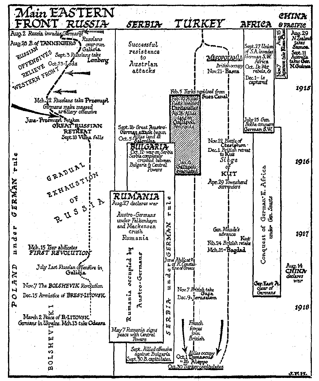
[ there are one or two corrections I'd make if I revise this: the Germans regained territory lost in the Brusilov ofensive in counter-attacks the following winter, so the 'front line' should be moved back a bit to the right. French attacks in Aug 1914 were 'into' Alsace Lorraine and the arrows don't indicate that the Germans advanced into, and retained, French territory, in their counterattack. Should have found room for Turkish/Russian fighting in the Caucusus and trans-Caucusus, mention abdication of Constantine from Greek throne in Jun 1917 but not that Greece entered the war in July; fall of Warsaw, 4th Aug 1915 should go in; if Austrians shown coming from the east, I suppose it should have shown French and British divisions transferred to Italy in Nov 1917 as well; lots other things could have been included, of course.]
Step 1: Customizable images allow you to style your chart background.
zoomcharts.com/en/gallery/all:time-chart-custom-backgroun...
With ZoomChartsâ Custom Background Image feature, you can incorporate custom visuals into your graphs to enhance data presentation. Instead of a bland background, why not support your data with visuals that match your subject matter?
ZoomChartsâ Custom Background Image is an attractive feature currently being used to meet the advanced data visualization needs of various educational fields, including sciences and mathematics, such as anatomy, biochemistry, ecology, microbiology, nutrition, neuroscience, physiology, zoology, chemical engineering, geochemistry, molecular biology, geology, paleontology, physics, astronomy, algebra, computer science, geometry, logic, and statistics, and the arts such as, music, dance, theatre, film, animation, architecture, applied arts, photography, graphic design, interior design, and mixed media.
- Interactive chart that supports large amounts of data
- Chart background can be customized to suit your needs
- Data presentation is functional and visually appealing
Check out ZoomCharts products:
Network Chart
Big network exploration
Explore linked data sets. Highlight relevant data with dynamic filters and visual styles. Incremental data loading. Exploration with focus nodes.
Time Chart
Time navigation and exploration tool
Browse activity logs, select time ranges. Multiple data series and value axes. Switch between time units.
Pie Chart
Amazingly intuitive hierarchical data exploration
Get quick overview of your data and drill down when necessary. All in a single easy to use chart.
Facet Chart
Scrollable bar chart with drill-down
Compare values side by side and provide easy access to the long tail.
ZoomCharts
The worldâs most interactive data visualization software
#zoomcharts #datavisualization #timechart #customization #custom #customvisuals #chartbackground #background #backgroundimage #backgroundcustomization #custombackground #custombackgroundimage #image #visual #visuals #iphone
Step 5: Go back to the full data display using the Back feature at the top right.
zoomcharts.com/en/gallery/all:mixed-timechart-columns-are...
Working with a mass amount of data can seem daunting, but the process is becoming increasingly easier with advanced data visualization tools. ZoomCharts’ Time Chart Mixed Columns and Area tool makes it easy to present large amounts of data simply and effectively.
Clients from many different fields, including science, medicine, business, law, administration, information technology, transportation, media, marketing, engineering, consulting, education, and more, have unlocked the possibilities of analyzing and using their data with ZoomCharts’ data visualization tools.
- Display large amounts of data in one place
- Work with mixed data in the same graph or chart
- Expand and zoom in and out of data with a simple click or scroll
- Filter and display data according to specific time intervals
- Export data to open in various file types
Check out ZoomCharts products:
Network Chart
Big network exploration
Explore linked data sets. Highlight relevant data with dynamic filters and visual styles. Incremental data loading. Exploration with focus nodes.
Time Chart
Time navigation and exploration tool
Browse activity logs, select time ranges. Multiple data series and value axes. Switch between time units.
Pie Chart
Amazingly intuitive hierarchical data exploration
Get quick overview of your data and drill down when necessary. All in a single easy to use chart.
Facet Chart
Scrollable bar chart with drill-down
Compare values side by side and provide easy access to the long tail.
ZoomCharts
The world’s most interactive data visualization software
#zoomcharts #timechart #timecharts #time #interactive #data #datavisualization #interactivedatavisualization #mixedcolumnsarea #mixedcolumns #mixedarea #mixeddata #mixed #sort #filter #export #expand #zoom #zoomout #zoomin
For centuries all the land in this part of the Isle of Mull belonged to the Maclean's of Duart. Unfortunately, they lost their estates during the first Jacobite uprising in 1689, and the land was given to the Dukes of Argyll. Torosay and Duart were sold to Colonel Campbell of Possil Park in Glasgow in the 1820s. The Colonel immediately started work on gardens and on a Georgian house that in 1829 stood on the site now occupied by Torosay Castle.
John Campbell, the Colonol's son, inherited the house and demolished his father's Georgian mansion, commissioning Edinburgh architect David Bryce to build something grander. Originally named Duart House, the name was changed following the restoration Duart Castle. Unfortunately John Campbell was forced to sell Torosay after only 10 years, when his business interests were damaged by the American Civil War, to Arbuthnot Charles Guthrie. The Guthrie family have remained there ever since.
Sitting in 12 acres of ornamental gardens, including a Japanese Garden, terracing and a statue walk, it is still a family home.
There are some fascinating accounts of the life of the late head of the family, David Guthrie Jones. He was captured on his motor gunboat during World War Two, then escaped from Colditz. After the War, he sailed around the world on his yacht, and took part in a polar exploration. He was an MP, and visitors can leaf through the big red book from his appearance on the TV show "This is Your Life".
One room houses a huge table covered with scrapbooks containing newspaper clippings cataloguing decades of local events. Signs around the house encourage you to sit on the furniture and stay a while if the weather is inclement outside.
The grounds include a series of magnificent Italian statues, sculpted fountains, water garden, Japanese garden, rockery, stone lions, a domed folly and elaborate square towers on the edge of the terrace which house a very comprehensive display of the geological history of Mull, complete with photographs, timecharts and models. Well worth a visit.
Step 3: Click on a time segment to expand data.
zoomcharts.com/en/gallery/all:time-chart-custom-backgroun...
With ZoomCharts’ Custom Background Image feature, you can incorporate custom visuals into your graphs to enhance data presentation. Instead of a bland background, why not support your data with visuals that match your subject matter?
ZoomCharts’ Custom Background Image is an attractive feature currently being used to meet the advanced data visualization needs of various educational fields, including sciences and mathematics, such as anatomy, biochemistry, ecology, microbiology, nutrition, neuroscience, physiology, zoology, chemical engineering, geochemistry, molecular biology, geology, paleontology, physics, astronomy, algebra, computer science, geometry, logic, and statistics, and the arts such as, music, dance, theatre, film, animation, architecture, applied arts, photography, graphic design, interior design, and mixed media.
- Interactive chart that supports large amounts of data
- Chart background can be customized to suit your needs
- Data presentation is functional and visually appealing
Check out ZoomCharts products:
Network Chart
Big network exploration
Explore linked data sets. Highlight relevant data with dynamic filters and visual styles. Incremental data loading. Exploration with focus nodes.
Time Chart
Time navigation and exploration tool
Browse activity logs, select time ranges. Multiple data series and value axes. Switch between time units.
Pie Chart
Amazingly intuitive hierarchical data exploration
Get quick overview of your data and drill down when necessary. All in a single easy to use chart.
Facet Chart
Scrollable bar chart with drill-down
Compare values side by side and provide easy access to the long tail.
ZoomCharts
The world’s most interactive data visualization software
#zoomcharts #datavisualization #timechart #customization #custom #customvisuals #chartbackground #background #backgroundimage #backgroundcustomization #custombackground #custombackgroundimage #image #visual #visuals #tablet
Step 4: Zoom in and out of the chart by swiping up or down with your mouse scroll pad, or by using the Zoom-out feature at the top left.
zoomcharts.com/en/gallery/all:dashed
The possibilities for data analysis are opened up with ZoomChartsâ advanced data visualization software. Start planning for the future today with the Dashed Line tool, one of the many options available in the ZoomCharts line that adds a layer of flexibility to your data presentation.
ZoomChartsâ Dashed Lines feature is enhancing the data visualization needs of various educational fields, including sciences and mathematics, such as anatomy, biochemistry, ecology, microbiology, nutrition, neuroscience, physiology, zoology, chemical engineering, geochemistry, molecular biology, geology, paleontology, physics, astronomy, algebra, computer science, geometry, logic, and statistics, and the arts such as, music, dance, theatre, film, animation, architecture, applied arts, photography, graphic design, interior design, and mixed media.
- Designate between current and proposed figures with separate line styles
- Expand and zoom in and out of data with a simple click or scroll
- Filter and display data according to specific time intervals
- Export data to open in various file types
Check out ZoomCharts products:
Network Chart
Big network exploration
Explore linked data sets. Highlight relevant data with dynamic filters and visual styles. Incremental data loading. Exploration with focus nodes.
Time Chart
Time navigation and exploration tool
Browse activity logs, select time ranges. Multiple data series and value axes. Switch between time units.
Pie Chart
Amazingly intuitive hierarchical data exploration
Get quick overview of your data and drill down when necessary. All in a single easy to use chart.
Facet Chart
Scrollable bar chart with drill-down
Compare values side by side and provide easy access to the long tail.
ZoomCharts
The worldâs most interactive data visualization software
#zoomcharts #timechart #timecharts #time #interactive #data #datavisualization #interactivedatavisualization #dashed #dashedlines #proposeddata #future #forecast #forecastdata #iphone
Step 5: Go back to the full data display using the Back feature at the top right.
zoomcharts.com/en/gallery/all:mixed-timechart-columns-are...
Working with a mass amount of data can seem daunting, but the process is becoming increasingly easier with advanced data visualization tools. ZoomChartsâ Time Chart Mixed Columns and Area tool makes it easy to present large amounts of data simply and effectively.
Clients from many different fields, including science, medicine, business, law, administration, information technology, transportation, media, marketing, engineering, consulting, education, and more, have unlocked the possibilities of analyzing and using their data with ZoomChartsâ data visualization tools.
- Display large amounts of data in one place
- Work with mixed data in the same graph or chart
- Expand and zoom in and out of data with a simple click or scroll
- Filter and display data according to specific time intervals
- Export data to open in various file types
Check out ZoomCharts products:
Network Chart
Big network exploration
Explore linked data sets. Highlight relevant data with dynamic filters and visual styles. Incremental data loading. Exploration with focus nodes.
Time Chart
Time navigation and exploration tool
Browse activity logs, select time ranges. Multiple data series and value axes. Switch between time units.
Pie Chart
Amazingly intuitive hierarchical data exploration
Get quick overview of your data and drill down when necessary. All in a single easy to use chart.
Facet Chart
Scrollable bar chart with drill-down
Compare values side by side and provide easy access to the long tail.
ZoomCharts
The worldâs most interactive data visualization software
#zoomcharts #timechart #timecharts #time #interactive #data #datavisualization #interactivedatavisualization #mixedcolumnsarea #mixedcolumns #mixedarea #mixeddata #mixed #sort #filter #export #expand #zoom #zoomout #zoomin
Step 5: Go back to the full data display using the Back feature at the top left.
zoomcharts.com/en/gallery/all:dashed
The possibilities for data analysis are opened up with ZoomChartsâ advanced data visualization software. Start planning for the future today with the Dashed Line tool, one of the many options available in the ZoomCharts line that adds a layer of flexibility to your data presentation.
ZoomChartsâ Dashed Lines feature is enhancing the data visualization needs of various educational fields, including sciences and mathematics, such as anatomy, biochemistry, ecology, microbiology, nutrition, neuroscience, physiology, zoology, chemical engineering, geochemistry, molecular biology, geology, paleontology, physics, astronomy, algebra, computer science, geometry, logic, and statistics, and the arts such as, music, dance, theatre, film, animation, architecture, applied arts, photography, graphic design, interior design, and mixed media.
- Designate between current and proposed figures with separate line styles
- Expand and zoom in and out of data with a simple click or scroll
- Filter and display data according to specific time intervals
- Export data to open in various file types
Check out ZoomCharts products:
Network Chart
Big network exploration
Explore linked data sets. Highlight relevant data with dynamic filters and visual styles. Incremental data loading. Exploration with focus nodes.
Time Chart
Time navigation and exploration tool
Browse activity logs, select time ranges. Multiple data series and value axes. Switch between time units.
Pie Chart
Amazingly intuitive hierarchical data exploration
Get quick overview of your data and drill down when necessary. All in a single easy to use chart.
Facet Chart
Scrollable bar chart with drill-down
Compare values side by side and provide easy access to the long tail.
ZoomCharts
The worldâs most interactive data visualization software
#zoomcharts #timechart #timecharts #time #interactive #data #datavisualization #interactivedatavisualization #dashed #dashedlines #proposeddata #future #forecast #forecastdata #iphone
Step 2: Click on a data item to expand it.
zoomcharts.com/en/gallery/all:mixed-timechart-columns-are...
Working with a mass amount of data can seem daunting, but the process is becoming increasingly easier with advanced data visualization tools. ZoomCharts’ Time Chart Mixed Columns and Area tool makes it easy to present large amounts of data simply and effectively.
Clients from many different fields, including science, medicine, business, law, administration, information technology, transportation, media, marketing, engineering, consulting, education, and more, have unlocked the possibilities of analyzing and using their data with ZoomCharts’ data visualization tools.
- Display large amounts of data in one place
- Work with mixed data in the same graph or chart
- Expand and zoom in and out of data with a simple click or scroll
- Filter and display data according to specific time intervals
- Export data to open in various file types
Check out ZoomCharts products:
Network Chart
Big network exploration
Explore linked data sets. Highlight relevant data with dynamic filters and visual styles. Incremental data loading. Exploration with focus nodes.
Time Chart
Time navigation and exploration tool
Browse activity logs, select time ranges. Multiple data series and value axes. Switch between time units.
Pie Chart
Amazingly intuitive hierarchical data exploration
Get quick overview of your data and drill down when necessary. All in a single easy to use chart.
Facet Chart
Scrollable bar chart with drill-down
Compare values side by side and provide easy access to the long tail.
ZoomCharts
The world’s most interactive data visualization software
#zoomcharts #timechart #timecharts #time #interactive #data #datavisualization #interactivedatavisualization #mixedcolumnsarea #mixedcolumns #mixedarea #mixeddata #mixed #sort #filter #export #expand #zoom #zoomout #zoomin
World time zone chart = 12 X 12 = 144 = hrs to 6 days of 24hrs.
Each of these squares are made of 4 smaller squares = 576 = 24 X 24
concentric square motion of the gif resulting with 168 = hrs to 7 days of 24hrs.
144 + 168 = 312 divide 4 = 78
1+2+3+4+5+6+7+8+9+10+11+12=78 (minute hand of the WW clock)
The hour hand in the WW clock was the 3 the 6 the 9 and the 12 = 30 which required 3 full rotations to the minute hand one full rotation. 3X 30 = 90 + 78 = 168 = 7 days of 24 hrs
Step 4: Zoom in and out of the chart by swiping up or down with your mouse scroll pad, or by using the Zoom-out feature at the top left.
zoomcharts.com/en/gallery/all:time-chart-custom-backgroun...
With ZoomCharts’ Custom Background Image feature, you can incorporate custom visuals into your graphs to enhance data presentation. Instead of a bland background, why not support your data with visuals that match your subject matter?
ZoomCharts’ Custom Background Image is an attractive feature currently being used to meet the advanced data visualization needs of various educational fields, including sciences and mathematics, such as anatomy, biochemistry, ecology, microbiology, nutrition, neuroscience, physiology, zoology, chemical engineering, geochemistry, molecular biology, geology, paleontology, physics, astronomy, algebra, computer science, geometry, logic, and statistics, and the arts such as, music, dance, theatre, film, animation, architecture, applied arts, photography, graphic design, interior design, and mixed media.
- Interactive chart that supports large amounts of data
- Chart background can be customized to suit your needs
- Data presentation is functional and visually appealing
Check out ZoomCharts products:
Network Chart
Big network exploration
Explore linked data sets. Highlight relevant data with dynamic filters and visual styles. Incremental data loading. Exploration with focus nodes.
Time Chart
Time navigation and exploration tool
Browse activity logs, select time ranges. Multiple data series and value axes. Switch between time units.
Pie Chart
Amazingly intuitive hierarchical data exploration
Get quick overview of your data and drill down when necessary. All in a single easy to use chart.
Facet Chart
Scrollable bar chart with drill-down
Compare values side by side and provide easy access to the long tail.
ZoomCharts
The world’s most interactive data visualization software
#zoomcharts #datavisualization #timechart #customization #custom #customvisuals #chartbackground #background #backgroundimage #backgroundcustomization #custombackground #custombackgroundimage #image #visual #visuals #tablet
Step 1. Hover over data items to display detailed information.
zoomcharts.com/en/gallery/all:mixed-timechart-columns-are...
Working with a mass amount of data can seem daunting, but the process is becoming increasingly easier with advanced data visualization tools. ZoomChartsâ Time Chart Mixed Columns and Area tool makes it easy to present large amounts of data simply and effectively.
Clients from many different fields, including science, medicine, business, law, administration, information technology, transportation, media, marketing, engineering, consulting, education, and more, have unlocked the possibilities of analyzing and using their data with ZoomChartsâ data visualization tools.
- Display large amounts of data in one place
- Work with mixed data in the same graph or chart
- Expand and zoom in and out of data with a simple click or scroll
- Filter and display data according to specific time intervals
- Export data to open in various file types
Check out ZoomCharts products:
Network Chart
Big network exploration
Explore linked data sets. Highlight relevant data with dynamic filters and visual styles. Incremental data loading. Exploration with focus nodes.
Time Chart
Time navigation and exploration tool
Browse activity logs, select time ranges. Multiple data series and value axes. Switch between time units.
Pie Chart
Amazingly intuitive hierarchical data exploration
Get quick overview of your data and drill down when necessary. All in a single easy to use chart.
Facet Chart
Scrollable bar chart with drill-down
Compare values side by side and provide easy access to the long tail.
ZoomCharts
The worldâs most interactive data visualization software
#zoomcharts #timechart #timecharts #time #interactive #data #datavisualization #interactivedatavisualization #mixedcolumnsarea #mixedcolumns #mixedarea #mixeddata #mixed #sort #filter #export #expand #zoom #zoomout #zoomin
Step 4: Sort and display data by various time increments using the filters at the top right.
zoomcharts.com/en/gallery/all:time-chart-legend
ZoomChartsâ line of advanced data visualization software makes it easy and efficient to understand, analyze, and present large amounts of information. Further customization options such as Legends help you tailor the presentation of your data so that you are able to work with exactly the information you need.
ZoomCharts Time Chart Legend is an interactive feature that is being used in a variety of educational fields, including sciences and mathematics, such as anatomy, biochemistry, ecology, microbiology, nutrition, neuroscience, physiology, zoology, chemical engineering, geochemistry, molecular biology, geology, paleontology, physics, astronomy, algebra, computer science, geometry, logic, and statistics, and the arts such as, music, dance, theatre, film, animation, architecture, applied arts, photography, graphic design, interior design, and mixed media.
- Show or hide data series with a simple click using legends
- Information is organized and accessible
- View changes in data over time
Check out ZoomCharts products:
Network Chart
Big network exploration
Explore linked data sets. Highlight relevant data with dynamic filters and visual styles. Incremental data loading. Exploration with focus nodes.
Time Chart
Time navigation and exploration tool
Browse activity logs, select time ranges. Multiple data series and value axes. Switch between time units.
Pie Chart
Amazingly intuitive hierarchical data exploration
Get quick overview of your data and drill down when necessary. All in a single easy to use chart.
Facet Chart
Scrollable bar chart with drill-down
Compare values side by side and provide easy access to the long tail.
ZoomCharts
The worldâs most interactive data visualization software
#zoomcharts #timechart #chart #charts #graph #graphs #data #interactivedata #visual #visualdata #visualdatarepresentation #legend #iphone
Step 3: Sort and display specific types of data using the filters at the top right.
hhttps://zoomcharts.com/en/gallery/all:dashed
The possibilities for data analysis are opened up with ZoomCharts’ advanced data visualization software. Start planning for the future today with the Dashed Line tool, one of the many options available in the ZoomCharts line that adds a layer of flexibility to your data presentation.
ZoomCharts’ Dashed Lines feature is enhancing the data visualization needs of various educational fields, including sciences and mathematics, such as anatomy, biochemistry, ecology, microbiology, nutrition, neuroscience, physiology, zoology, chemical engineering, geochemistry, molecular biology, geology, paleontology, physics, astronomy, algebra, computer science, geometry, logic, and statistics, and the arts such as, music, dance, theatre, film, animation, architecture, applied arts, photography, graphic design, interior design, and mixed media.
- Designate between current and proposed figures with separate line styles
- Expand and zoom in and out of data with a simple click or scroll
- Filter and display data according to specific time intervals
- Export data to open in various file types
Check out ZoomCharts products:
Network Chart
Big network exploration
Explore linked data sets. Highlight relevant data with dynamic filters and visual styles. Incremental data loading. Exploration with focus nodes.
Time Chart
Time navigation and exploration tool
Browse activity logs, select time ranges. Multiple data series and value axes. Switch between time units.
Pie Chart
Amazingly intuitive hierarchical data exploration
Get quick overview of your data and drill down when necessary. All in a single easy to use chart.
Facet Chart
Scrollable bar chart with drill-down
Compare values side by side and provide easy access to the long tail.
ZoomCharts
The world’s most interactive data visualization software
#zoomcharts #timechart #timecharts #time #interactive #data #datavisualization #interactivedatavisualization #dashed #dashedlines #proposeddata #future #forecast #forecastdata #tablet
Step 4: Zoom in and out of the chart by swiping up or down with your mouse scroll pad, or by using the Zoom-out feature at the top left.
zoomcharts.com/en/gallery/all:time-chart-custom-backgroun...
With ZoomCharts’ Custom Background Image feature, you can incorporate custom visuals into your graphs to enhance data presentation. Instead of a bland background, why not support your data with visuals that match your subject matter?
ZoomCharts’ Custom Background Image is an attractive feature currently being used to meet the advanced data visualization needs of various educational fields, including sciences and mathematics, such as anatomy, biochemistry, ecology, microbiology, nutrition, neuroscience, physiology, zoology, chemical engineering, geochemistry, molecular biology, geology, paleontology, physics, astronomy, algebra, computer science, geometry, logic, and statistics, and the arts such as, music, dance, theatre, film, animation, architecture, applied arts, photography, graphic design, interior design, and mixed media.
- Interactive chart that supports large amounts of data
- Chart background can be customized to suit your needs
- Data presentation is functional and visually appealing
Check out ZoomCharts products:
Network Chart
Big network exploration
Explore linked data sets. Highlight relevant data with dynamic filters and visual styles. Incremental data loading. Exploration with focus nodes.
Time Chart
Time navigation and exploration tool
Browse activity logs, select time ranges. Multiple data series and value axes. Switch between time units.
Pie Chart
Amazingly intuitive hierarchical data exploration
Get quick overview of your data and drill down when necessary. All in a single easy to use chart.
Facet Chart
Scrollable bar chart with drill-down
Compare values side by side and provide easy access to the long tail.
ZoomCharts
The world’s most interactive data visualization software
#zoomcharts #datavisualization #timechart #customization #custom #customvisuals #chartbackground #background #backgroundimage #backgroundcustomization #custombackground #custombackgroundimage #image #visual #visuals #pc
Step 1: Customizable images allow you to style your chart background.
zoomcharts.com/en/gallery/all:time-chart-custom-backgroun...
With ZoomCharts’ Custom Background Image feature, you can incorporate custom visuals into your graphs to enhance data presentation. Instead of a bland background, why not support your data with visuals that match your subject matter?
ZoomCharts’ Custom Background Image is an attractive feature currently being used to meet the advanced data visualization needs of various educational fields, including sciences and mathematics, such as anatomy, biochemistry, ecology, microbiology, nutrition, neuroscience, physiology, zoology, chemical engineering, geochemistry, molecular biology, geology, paleontology, physics, astronomy, algebra, computer science, geometry, logic, and statistics, and the arts such as, music, dance, theatre, film, animation, architecture, applied arts, photography, graphic design, interior design, and mixed media.
- Interactive chart that supports large amounts of data
- Chart background can be customized to suit your needs
- Data presentation is functional and visually appealing
Check out ZoomCharts products:
Network Chart
Big network exploration
Explore linked data sets. Highlight relevant data with dynamic filters and visual styles. Incremental data loading. Exploration with focus nodes.
Time Chart
Time navigation and exploration tool
Browse activity logs, select time ranges. Multiple data series and value axes. Switch between time units.
Pie Chart
Amazingly intuitive hierarchical data exploration
Get quick overview of your data and drill down when necessary. All in a single easy to use chart.
Facet Chart
Scrollable bar chart with drill-down
Compare values side by side and provide easy access to the long tail.
ZoomCharts
The world’s most interactive data visualization software
#zoomcharts #datavisualization #timechart #customization #custom #customvisuals #chartbackground #background #backgroundimage #backgroundcustomization #custombackground #custombackgroundimage #image #visual #visuals #tablet
Step 5: Go back to the full data display using the Back feature at the top right.
zoomcharts.com/en/gallery/all:mixed-timechart-columns-are...
Working with a mass amount of data can seem daunting, but the process is becoming increasingly easier with advanced data visualization tools. ZoomCharts’ Time Chart Mixed Columns and Area tool makes it easy to present large amounts of data simply and effectively.
Clients from many different fields, including science, medicine, business, law, administration, information technology, transportation, media, marketing, engineering, consulting, education, and more, have unlocked the possibilities of analyzing and using their data with ZoomCharts’ data visualization tools.
- Display large amounts of data in one place
- Work with mixed data in the same graph or chart
- Expand and zoom in and out of data with a simple click or scroll
- Filter and display data according to specific time intervals
- Export data to open in various file types
Check out ZoomCharts products:
Network Chart
Big network exploration
Explore linked data sets. Highlight relevant data with dynamic filters and visual styles. Incremental data loading. Exploration with focus nodes.
Time Chart
Time navigation and exploration tool
Browse activity logs, select time ranges. Multiple data series and value axes. Switch between time units.
Pie Chart
Amazingly intuitive hierarchical data exploration
Get quick overview of your data and drill down when necessary. All in a single easy to use chart.
Facet Chart
Scrollable bar chart with drill-down
Compare values side by side and provide easy access to the long tail.
ZoomCharts
The world’s most interactive data visualization software
#zoomcharts #timechart #timecharts #time #interactive #data #datavisualization #interactivedatavisualization #mixedcolumnsarea #mixedcolumns #mixedarea #mixeddata #mixed #sort #filter #export #expand #zoom #zoomout #zoom in
Step 1: Tap on a legend item to temporarily hide a particular series of data from the chart. The legend will display this series of data as greyed-out.
zoomcharts.com/en/gallery/all:time-chart-legend
ZoomChartsâ line of advanced data visualization software makes it easy and efficient to understand, analyze, and present large amounts of information. Further customization options such as Legends help you tailor the presentation of your data so that you are able to work with exactly the information you need.
ZoomCharts Time Chart Legend is an interactive feature that is being used in a variety of educational fields, including sciences and mathematics, such as anatomy, biochemistry, ecology, microbiology, nutrition, neuroscience, physiology, zoology, chemical engineering, geochemistry, molecular biology, geology, paleontology, physics, astronomy, algebra, computer science, geometry, logic, and statistics, and the arts such as, music, dance, theatre, film, animation, architecture, applied arts, photography, graphic design, interior design, and mixed media.
- Show or hide data series with a simple click using legends
- Information is organized and accessible
- View changes in data over time
Check out ZoomCharts products:
Network Chart
Big network exploration
Explore linked data sets. Highlight relevant data with dynamic filters and visual styles. Incremental data loading. Exploration with focus nodes.
Time Chart
Time navigation and exploration tool
Browse activity logs, select time ranges. Multiple data series and value axes. Switch between time units.
Pie Chart
Amazingly intuitive hierarchical data exploration
Get quick overview of your data and drill down when necessary. All in a single easy to use chart.
Facet Chart
Scrollable bar chart with drill-down
Compare values side by side and provide easy access to the long tail.
ZoomCharts
The worldâs most interactive data visualization software
#zoomcharts #timechart #chart #charts #graph #graphs #data #interactivedata #visual #visualdata #visualdatarepresentation #legend #iphone
Step 2.Click on a data item to expand it.
zoomcharts.com/en/gallery/all:mixed-timechart-columns-are...
Working with a mass amount of data can seem daunting, but the process is becoming increasingly easier with advanced data visualization tools. ZoomChartsâ Time Chart Mixed Columns and Area tool makes it easy to present large amounts of data simply and effectively.
Clients from many different fields, including science, medicine, business, law, administration, information technology, transportation, media, marketing, engineering, consulting, education, and more, have unlocked the possibilities of analyzing and using their data with ZoomChartsâ data visualization tools.
- Display large amounts of data in one place
- Work with mixed data in the same graph or chart
- Expand and zoom in and out of data with a simple click or scroll
- Filter and display data according to specific time intervals
- Export data to open in various file types
Check out ZoomCharts products:
Network Chart
Big network exploration
Explore linked data sets. Highlight relevant data with dynamic filters and visual styles. Incremental data loading. Exploration with focus nodes.
Time Chart
Time navigation and exploration tool
Browse activity logs, select time ranges. Multiple data series and value axes. Switch between time units.
Pie Chart
Amazingly intuitive hierarchical data exploration
Get quick overview of your data and drill down when necessary. All in a single easy to use chart.
Facet Chart
Scrollable bar chart with drill-down
Compare values side by side and provide easy access to the long tail.
ZoomCharts
The worldâs most interactive data visualization software
#zoomcharts #timechart #timecharts #time #interactive #data #datavisualization #interactivedatavisualization #mixedcolumnsarea #mixedcolumns #mixedarea #mixeddata #mixed #sort #filter #export #expand #zoom #zoomout #zoomin
Step 3: Show or hide any combination of data.
zoomcharts.com/en/gallery/all:time-chart-legend
ZoomChartsâ line of advanced data visualization software makes it easy and efficient to understand, analyze, and present large amounts of information. Further customization options such as Legends help you tailor the presentation of your data so that you are able to work with exactly the information you need.
ZoomCharts Time Chart Legend is an interactive feature that is being used in a variety of educational fields, including sciences and mathematics, such as anatomy, biochemistry, ecology, microbiology, nutrition, neuroscience, physiology, zoology, chemical engineering, geochemistry, molecular biology, geology, paleontology, physics, astronomy, algebra, computer science, geometry, logic, and statistics, and the arts such as, music, dance, theatre, film, animation, architecture, applied arts, photography, graphic design, interior design, and mixed media.
- Show or hide data series with a simple click using legends
- Information is organized and accessible
- View changes in data over time
Check out ZoomCharts products:
Network Chart
Big network exploration
Explore linked data sets. Highlight relevant data with dynamic filters and visual styles. Incremental data loading. Exploration with focus nodes.
Time Chart
Time navigation and exploration tool
Browse activity logs, select time ranges. Multiple data series and value axes. Switch between time units.
Pie Chart
Amazingly intuitive hierarchical data exploration
Get quick overview of your data and drill down when necessary. All in a single easy to use chart.
Facet Chart
Scrollable bar chart with drill-down
Compare values side by side and provide easy access to the long tail.
ZoomCharts
The worldâs most interactive data visualization software
#zoomcharts #timechart #chart #charts #graph #graphs #data #interactivedata #visual #visualdata #visualdatarepresentation #legend #iphone
Step 4: Zoom in and out of the chart by swiping up or down with your mouse scroll pad, or by using the Zoom-out feature at the top left.
zoomcharts.com/en/gallery/all:mixed-timechart-columns-are...
Working with a mass amount of data can seem daunting, but the process is becoming increasingly easier with advanced data visualization tools. ZoomCharts’ Time Chart Mixed Columns and Area tool makes it easy to present large amounts of data simply and effectively.
Clients from many different fields, including science, medicine, business, law, administration, information technology, transportation, media, marketing, engineering, consulting, education, and more, have unlocked the possibilities of analyzing and using their data with ZoomCharts’ data visualization tools.
- Display large amounts of data in one place
- Work with mixed data in the same graph or chart
- Expand and zoom in and out of data with a simple click or scroll
- Filter and display data according to specific time intervals
- Export data to open in various file types
Check out ZoomCharts products:
Network Chart
Big network exploration
Explore linked data sets. Highlight relevant data with dynamic filters and visual styles. Incremental data loading. Exploration with focus nodes.
Time Chart
Time navigation and exploration tool
Browse activity logs, select time ranges. Multiple data series and value axes. Switch between time units.
Pie Chart
Amazingly intuitive hierarchical data exploration
Get quick overview of your data and drill down when necessary. All in a single easy to use chart.
Facet Chart
Scrollable bar chart with drill-down
Compare values side by side and provide easy access to the long tail.
ZoomCharts
The world’s most interactive data visualization software
#zoomcharts #timechart #timecharts #time #interactive #data #datavisualization #interactivedatavisualization #mixedcolumnsarea #mixedcolumns #mixedarea #mixeddata #mixed #sort #filter #export #expand #zoom #zoomout #zoomin
Step 3: Sort and display specific types of data using the filters at the top right.
zoomcharts.com/en/gallery/all:mixed-timechart-columns-are...
Working with a mass amount of data can seem daunting, but the process is becoming increasingly easier with advanced data visualization tools. ZoomCharts’ Time Chart Mixed Columns and Area tool makes it easy to present large amounts of data simply and effectively.
Clients from many different fields, including science, medicine, business, law, administration, information technology, transportation, media, marketing, engineering, consulting, education, and more, have unlocked the possibilities of analyzing and using their data with ZoomCharts’ data visualization tools.
- Display large amounts of data in one place
- Work with mixed data in the same graph or chart
- Expand and zoom in and out of data with a simple click or scroll
- Filter and display data according to specific time intervals
- Export data to open in various file types
Check out ZoomCharts products:
Network Chart
Big network exploration
Explore linked data sets. Highlight relevant data with dynamic filters and visual styles. Incremental data loading. Exploration with focus nodes.
Time Chart
Time navigation and exploration tool
Browse activity logs, select time ranges. Multiple data series and value axes. Switch between time units.
Pie Chart
Amazingly intuitive hierarchical data exploration
Get quick overview of your data and drill down when necessary. All in a single easy to use chart.
Facet Chart
Scrollable bar chart with drill-down
Compare values side by side and provide easy access to the long tail.
ZoomCharts
The world’s most interactive data visualization software
#zoomcharts #timechart #timecharts #time #interactive #data #datavisualization #interactivedatavisualization #mixedcolumnsarea #mixedcolumns #mixedarea #mixeddata #mixed #sort #filter #export #expand #zoom #zoomout #zoomin