View allAll Photos Tagged piechart
Artwork by Scott Hug, as part of "Data Deluge" at Ballroom Marfa
Scott Hug
Personal Finance 63% No, did not worry, 38% Yes worried.
(Gallup.com, March 2009), – Litter at Great Pyramid, Egypt, 2009
Collaged Color-aid on found National Geographic magazine page
12.75 x 9.5 inches
Courtesy of the artist
Based on pie charts derived from Gallup.com polls, Scott Hug has translated a selection of surveys into large-scale paintings and small collages of Color-aid pie charts. Initially developed in 1948 as a backdrop for photographers, Color-aid was soon thereafter discovered by teacher-artist Josef Albers, informing his seminal textbook “Interaction of Color” (1975). Color-aid has since served as a traditional guide and teaching aid for modernist color theory. Hug’s act of superimposing charts over iconic images from National Geographic (whose tagline is “Inspiring people to care about the planet since 1888”) highlights modern society’s increasing distance from the natural world and the ubiquity of data removed from its original context. Critically examining the extent to which we rely on abstract interpretations of data and imagery to construct our understanding of the world and inform personal experience, Hug underscores the divide between people, nature and culture.
Data Deluge, March 3 – July 8, 2012
Curated by Rachel Gugelberger & Reynard Loki
Photograph(s) by Fredrik Nilsen
Courtesy of Ballroom Marfa
Step 4: Click on chart center to return to full data display.
zoomcharts.com/en/gallery/all:pie-chart-donut-chart-flat-...
ZoomChartsâ advanced data visualization line of software makes understanding and presenting large amounts of data simple and visually stimulating. ZoomChartsâ Donut Chart, Flat Theme, Hierarchical Structure tool makes it even easier to organize and analyze your information, allowing you to work with the results more efficiently than ever before.
Hierarchical Structure is among many interactive features being offered by ZoomCharts and being used by clients in various educational fields, including sciences and mathematics, such as anatomy, biochemistry, ecology, microbiology, nutrition, neuroscience, physiology, zoology, chemical engineering, geochemistry, molecular biology, geology, paleontology, physics, astronomy, algebra, computer science, geometry, logic, and statistics, and the arts such as, music, dance, theatre, film, animation, architecture, applied arts, photography, graphic design, interior design, and mixed media.
- Interactive data representation lets you visualize large amounts of information
- Single level chart view for visual ease
- View data in hierarchical order for an organized display
Check out ZoomCharts products:
Network Chart
Big network exploration
Explore linked data sets. Highlight relevant data with dynamic filters and visual styles. Incremental data loading. Exploration with focus nodes.
Time Chart
Time navigation and exploration tool
Browse activity logs, select time ranges. Multiple data series and value axes. Switch between time units.
Pie Chart
Amazingly intuitive hierarchical data exploration
Get quick overview of your data and drill down when necessary. All in a single easy to use chart.
Facet Chart
Scrollable bar chart with drill-down
Compare values side by side and provide easy access to the long tail.
ZoomCharts
The worldâs most interactive data visualization software
#zoomcharts #piechart #pie #chart #charts #graph #graphs #data #interactivedata #visual #visualdata #visualdatarepresentation #donutchart #donut #flat #flatheme #hierarchical #hierarchicalstructure #mac
Today is the birthday of Florence Nightingale. “The Lady with the Lamp” as she was called during the Crimean War, was a pioneering nurse, developer of the “Pie Chart” and all round good egg.
Although it must be said that she didn’t invent the actual “Pie Chart” as depicted here, but a form of pie chart called “polar area chart”, a useful tool to show where polar bears were currently looking for beans, if the prop department has done it's research correctly (somewhat doubtful to be honest).
So happy birthday Mrs Nightingale and thanks for all the pies :-)
Piechart shows how little time is actually spent on installation during a typical construction day. Learn more about labor productivity and project pre-planning at labor productivity and project pre-planning at D. Brown Management
Step 2: Hover over chart units for an interactive data display.
zoomcharts.com/en/gallery/pie-chart:piechart-donut-with-c...
Dull data presentation is now a thing of the past thanks to tools such as ZoomCharts’ advanced data visualization line of software. Data visualization opens up a world of exciting possibilities for data analysis, and makes understanding and presenting large amounts of data easy and enjoyable. Visual customization has never been easier with ZoomCharts’ Pie Chart Donut, One Level with Custom Background Image tool, which offers flexibility in the look and feel of data charts.
This is one of the many advanced tools being offered by ZoomCharts and being used by clients in fields such as science, medicine, business, law, administration, information technology, transportation, media, marketing, engineering, consulting, education, and more.
- Complete control over chart graphics
- Interactive data representation
- Single level view for visual ease
Check out ZoomCharts products:
Network Chart
Big network exploration
Explore linked data sets. Highlight relevant data with dynamic filters and visual styles. Incremental data loading. Exploration with focus nodes.
Time Chart
Time navigation and exploration tool
Browse activity logs, select time ranges. Multiple data series and value axes. Switch between time units.
Pie Chart
Amazingly intuitive hierarchical data exploration
Get quick overview of your data and drill down when necessary. All in a single easy to use chart.
Facet Chart
Scrollable bar chart with drill-down
Compare values side by side and provide easy access to the long tail.
ZoomCharts
The world’s most interactive data visualization software
#zoomcharts #piechart #pie #chart #charts #graphs #donut #onelevel #custom #custombackground #custombackgroundimage #backgroundimage #customization #control #data #interactivedata #visual #visualdata #visualdatarepresentation #tablet
Step 3: Tap the middle of the chart to reset chart display.
zoomcharts.com/en/gallery/all:pie-chart-legend
Data visualization tools offer complete control over the presentation of complex data. Unlock the possibilities within your databases by employing efficient ways to understand, analyze, and present your data. Advanced customization options make this process even easier.
ZoomChartsâ Pie Chart Legend Placement is one of the many features being used to meet the advanced data visualization needs among many industries, including science, medicine, business, law, administration, information technology, transportation, media, marketing, engineering, consulting, education, and more.
- Interactive legend makes information access effortless
- Data series expansion possible with a simple click on a legend item
- Easy chart navigation with graph reset option
Check out ZoomCharts products:
Network Chart
Big network exploration
Explore linked data sets. Highlight relevant data with dynamic filters and visual styles. Incremental data loading. Exploration with focus nodes.
Time Chart
Time navigation and exploration tool
Browse activity logs, select time ranges. Multiple data series and value axes. Switch between time units.
Pie Chart
Amazingly intuitive hierarchical data exploration
Get quick overview of your data and drill down when necessary. All in a single easy to use chart.
Facet Chart
Scrollable bar chart with drill-down
Compare values side by side and provide easy access to the long tail.
ZoomCharts
The worldâs most interactive data visualization software
#zoomcharts #piechart #legendplacement #legend #placement #customization #control #position #columns #rows #click #tap #expand #left #right #top #bottom, mac
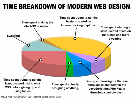
Blogged in The Woodwork:I just like hearing my name.
This is a slide from my eCard Gnomes talk.
If you ever wonder how I have time to blog…
With apologies to Poisoned Minds.
Step 2: Click on an item in the legend to expand data series.
zoomcharts.com/en/gallery/all:pie-chart-legend
Data visualization tools offer complete control over the presentation of complex data. Unlock the possibilities within your databases by employing efficient ways to understand, analyze, and present your data. Advanced customization options make this process even easier.
ZoomChartsâ Pie Chart Legend Placement is one of the many features being used to meet the advanced data visualization needs among many industries, including science, medicine, business, law, administration, information technology, transportation, media, marketing, engineering, consulting, education, and more.
- Interactive legend makes information access effortless
- Data series expansion possible with a simple click on a legend item
- Easy chart navigation with graph reset option
Check out ZoomCharts products:
Network Chart
Big network exploration
Explore linked data sets. Highlight relevant data with dynamic filters and visual styles. Incremental data loading. Exploration with focus nodes.
Time Chart
Time navigation and exploration tool
Browse activity logs, select time ranges. Multiple data series and value axes. Switch between time units.
Pie Chart
Amazingly intuitive hierarchical data exploration
Get quick overview of your data and drill down when necessary. All in a single easy to use chart.
Facet Chart
Scrollable bar chart with drill-down
Compare values side by side and provide easy access to the long tail.
ZoomCharts
The worldâs most interactive data visualization software
#zoomcharts #piechart #legendplacement #legend #placement #customization #control #position #columns #rows #click #tap #expand #left #right #top #bottom, mac
Artwork by Scott Hug, as part of "Data Deluge" at Ballroom Marfa
Scott Hug
Collaged Color-aid on found National Geographic magazine page
12.75 x 9.5 inches
Courtesy of the artist
Based on pie charts derived from Gallup.com polls, Scott Hug has translated a selection of surveys into large-scale paintings and small collages of Color-aid pie charts. Initially developed in 1948 as a backdrop for photographers, Color-aid was soon thereafter discovered by teacher-artist Josef Albers, informing his seminal textbook “Interaction of Color” (1975). Color-aid has since served as a traditional guide and teaching aid for modernist color theory. Hug’s act of superimposing charts over iconic images from National Geographic (whose tagline is “Inspiring people to care about the planet since 1888”) highlights modern society’s increasing distance from the natural world and the ubiquity of data removed from its original context. Critically examining the extent to which we rely on abstract interpretations of data and imagery to construct our understanding of the world and inform personal experience, Hug underscores the divide between people, nature and culture.
Data Deluge, March 3 – July 8, 2012
Curated by Rachel Gugelberger & Reynard Loki
Photograph(s) by Fredrik Nilsen
Courtesy of Ballroom Marfa
Just a little experimenting, I was trying out something (which I can't remember what...). I liked the outcome though...
This graph shows the breakdown of how much of my email was bac'n vs. how much was real email in an arbitrarily selected week.
Step 2: Hover over chart units for an interactive data display.
zoomcharts.com/en/gallery/pie-chart:piechart-donut-with-c...
Dull data presentation is now a thing of the past thanks to tools such as ZoomChartsâ advanced data visualization line of software. Data visualization opens up a world of exciting possibilities for data analysis, and makes understanding and presenting large amounts of data easy and enjoyable. Visual customization has never been easier with ZoomChartsâ Pie Chart Donut, One Level with Custom Background Image tool, which offers flexibility in the look and feel of data charts.
This is one of the many advanced tools being offered by ZoomCharts and being used by clients in fields such as science, medicine, business, law, administration, information technology, transportation, media, marketing, engineering, consulting, education, and more.
- Complete control over chart graphics
- Interactive data representation
- Single level view for visual ease
Check out ZoomCharts products:
Network Chart
Big network exploration
Explore linked data sets. Highlight relevant data with dynamic filters and visual styles. Incremental data loading. Exploration with focus nodes.
Time Chart
Time navigation and exploration tool
Browse activity logs, select time ranges. Multiple data series and value axes. Switch between time units.
Pie Chart
Amazingly intuitive hierarchical data exploration
Get quick overview of your data and drill down when necessary. All in a single easy to use chart.
Facet Chart
Scrollable bar chart with drill-down
Compare values side by side and provide easy access to the long tail.
ZoomCharts
The worldâs most interactive data visualization software
#zoomcharts #piechart #pie #chart #charts #graphs #donut #onelevel #custom #custombackground #custombackgroundimage #backgroundimage #customization #control #data #interactivedata #visual #visualdata #visualdatarepresentation
The last 100 hits as of March 6, 2006 at 2pm. Red is the most recent, green are the last 10, white is the other 90.
Other Years:
An annuity is an investment that gives you a regular payment over a period. The payout from the annuity can be customised to meet the specific needs of the investor.
Blogged in The Woodwork: Sinking a Fleet of Fail (PHP and Enterprise Scalability Part 3/5).
Image from Ed Finker’s website.
Sketching 100 ways to visualize food consumed in 2010
Visualized here:
www.flickr.com/photos/laurenmanning/5658985469/in/set-721...
Seen on FastCo Design here:
www.fastcodesign.com/1664136/infographics-of-the-day-an-e...
Silhouette's Free Shapes in April. Did you use them? Come join the blog party and link up your projects: maggiemugginsdesigns.com
Pies as Pie-Charts and Cakes as Bar Graphs. Showing US Budget Priorities and Income Distribution. Presented at Southern California Americans for Democratic Action, 10/09/2011.
All drawings were done by Benny Banks, locomotive engineer on the BNSF in Bellingham, WA.
Benny retired in 2007.
January 2021- This is now double track since 2016.