View allAll Photos Tagged InfoGraphics
Numbered Infographic graphic available for download at dryicons.com/free-graphics/preview/numbered-infographic/ in EPS (vector) format.
View similar vector graphics at DryIcons Graphics.
While riding the subway:
1. Crouch precariously close to the edge of the platform.
2. Point your eye-lasers at the 2" space next to the train. Be sure to stand directly in front of the doors while doing this.
3. Concentrate. Try to ignore the huge, yellow beam of light shining directly on your head.
4. With your eye-lasers, create a single red bubble.
5. Board the train. Act as if eye-lasers and large red bubbles are perfectly normal.
(from the San Francisco BART)
Is the day over before it’s even begun? We’ve worked out that if mums were paid for all the extra hours they put in, they’d be earning an impressive £37,000 a year! We spoke to over 3,000 mums who told us exactly what chores and activities keep them busy.
Please feel free to use this infographic on your website with the following description:
The differences in life insurance around the world can vary wildly. While you may not have chosen the country you were born in based on this criteria, the quality of healthcare and percentages of GDP where you live can have a profound affect on your life expectancy.
Or simply credit the source using this link:
<a href="http://www.guardianinsurance.com.au/Life-Insurance.aspx">life insurance</a>
Infographic Element graphic available for download at dryicons.com/free-graphics/preview/infographic-element/ in EPS (vector) format.
View similar vector graphics at DryIcons Graphics.
Retro Infographic graphic available for download at dryicons.com/free-graphics/preview/retro-infographic/ in EPS (vector) format.
View similar vector graphics at DryIcons Graphics.
Text Description of Infographic
Top Right Figure: In 2009, 1 in 3 drivers killed in car crashes tested positive for drugs1.
Top Left Figure: More than thirty-one million people drove after drug or alcohol use in 2013. The highest rate was among 18- to 25-year-olds2. Impaired driving in the past year is shown on a bar chart. Two percent of 12−17 year olds, 20% of 18−25 year olds, and 12% of those 26 or older drove under the influence of illicit drugs or alcohol in the past year.
Middle Figure: Driving after marijuana use is more common than driving after alcohol use. College and high-school seniors who drove or rode with a driver after alcohol or marijuana use. Among college students who used in the past month, nearly 1 in 3 drove after marijuana use and nearly 1 in 2 rode with a driver who had been using marijuana3. Among high-school seniors, in the past 2 weeks, 1 in 8 drove after marijuana use and 1 in 5 rode with a driver who had been using marijuana4. The bar chart shows that 7% of college students drove after drinking alcohol and 31% drove after using marijuana; while 16% rode with a driver who had been drinking alcohol and 45% rode with a driver who used marijuana. Among high-school seniors, 9% drove after drinking alcohol and 12% drove after using marijuana; while 15% rode with a driver who had been drinking alcohol and 20% rode with a driver who used marijuana.
Bottom Figure: High-school seniors who smoke marijuana are two times more likely to receive a ticket and 65% more likely to get into a car crash than those who don't smoke.
Bottom Text:
Develop Social Strategies
Offer to be a designated driver
Have the designated driver take all car keys
Avoid driving to parties where drugs and alcohol are present
Talk to friends about the risks of drugged driving
References: 1NHTSA, 2010; 2SAMHSA, NSDUH, 2014; 3Whitehill et al., 2014; 4O'Malley & Johnston, 2013
Credit: NIA
www.drugabuse.gov/related-topics/trends-statistics/infogr...
An infographic showing the four Galilean moons of Jupiter to scale.
Image Credits: Moons: NASA/JPL/Galileo, Jupiter: NASA/JPL/Space Science Institute; Image data processing and layout: Kevin M. Gill
According to the Johns Hopkins Medical Center: “Forty percent of diagnosed breast cancers are detected by women who feel a lump, so establishing a regular breast self-exam is very important”.
Hang this infographic in the bathroom or laminate it and hang it in the shower!
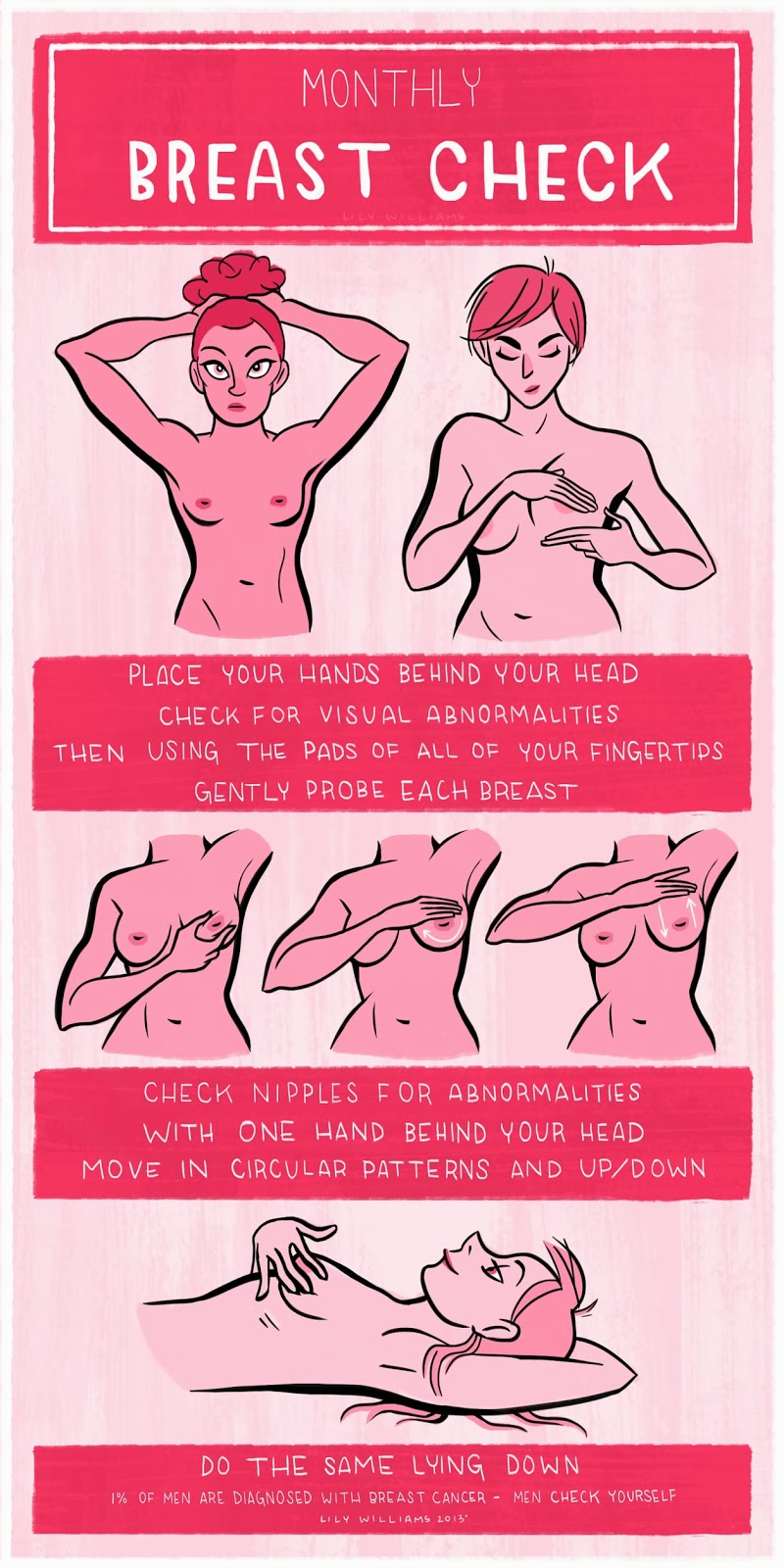
* Image sources: lily-williams, October 1, 2013.
* Watch the video on How to Do a Breast Self-Exam.
* Watch this health infographics album on Flickr.
spectrum.ieee.org/omicron-covid-variant
This image illustrates just how different Omicron is from other major variants. Researchers can use the map to make decisions about updating vaccines. Map courtesy of Barbara Mühlemann (German Center for Infection Research), Xiaoying Shen (Duke University), and Samuel H. Wilks and Derek Smith of the University of Cambridge.DEREK SMITH, SAM WILKS, BARBARA MÜHLEMANN, AND XIAOYING SHEN
This 2D map was generated using a mathematical technique developed by data scientist Derek Smith.
Please feel free to use this infographic on your website with the following description:
Who’s at risk and what puts them at risk? One death in every ten minutes is a result of heart disease, making heart disease the number one cause of morality of both men and women in Australia. Trachea and lung cancer come in second for men, while stoke for women. Lower respiratory disease, colon and rectum cancer and blood and lymph cancer all also top the list. Death may be inevitable; however, some lifestyle choices will affect your quality of life. Regular exercise and following a healthy diet may decrease your chances for becoming a victim, and life insurance will give you a piece of mind just in case you do.
Or simply credit the source using this link:
<a href="http://www.life.realinsurance.com.au">life insurance</a>
World Wide Web is growing at rapid pace. On average, more than a billion new pages are added to it every day. To give you an idea of how big world wide web is, our Infographic 60 Seconds will cover some really interesting facts about websites that we use on day-to-day basis Sponsored Links Inf ... read more at: Yagua Piru
It's been three years since we released our first science images, here's a recap of the last three years of wonder!
Credit: NASA/Julia Shepherd
Image description:
An infographic with a Webb deep field background, black with dotted galaxies and stars. Golden hexagons with stats about Webb written in black are superimposed on the background. Across the top is written: "3 Years of Wonder, James Webb Space Telescope."
In bottom left is an artist illustration of the telescope. In the hexagon at far left it says, "Collected 543 terabytes of data
That's the capacity of 4,200+ smart phones with 128 GB each!"
Next row of hexagons to the right, top: "Showcased 230+ images in press releases by NASA & ESA."
Bottom: "Spent 21,500+hours observing"
Next row, top: "Looked 13.4 billing years into the past & will continue breaking records for the farthest galaxy."
Bottom: "First CO2 detected in the atmosphere of an exoplanet, called WASP-39 b."
At the far right, top: "Completed 862 programs of observation with 274 more beginning in July 2025."
Bottom: "Observed 189+ exoplanets."
Small text in white at the bottom: "As of July 1, 2025"
Infographic on the design process. Each colour follows an idea from conception through refinement to the final product. (click view all sizes for detail)
The Evolution of the Geek.
(Infographic)
Source: www.flowtown.com/blog/the-evolution-of-the-geek?display=wide
From the post on www.ZOMGitsCj.com
Infographic created from data in Latitude's multi-phase "Robots @ School" innovation study, published in collaboration with LEGO® Learning Institute and Project Synthesis. Download the full study report (PDF) here. Explore Latitude's kids research initiatives online at: www.latd.com/#kids
Latitude is an international research consultancy helping clients create engaging content, software and technology that harness the possibilities of the Web. To learn more about Latitude's full range of research and consulting services, click here. Contact: life-connected@latd.com
Infographic created by Latitude in collaboration with ffunction.
12th February to 11th March 2011
This chart is intended to give myself and others an insight into what I watch, when I watch and how I watch television. Over a four week period I kept a record of all the programs I tuned into and scored each out of eight depending on how much attention I was paying at the time. I usually have the TV turned on while I work to provide background noise and I even go to sleep each night with it turned on, for these occasions I score my attention level with a low figure. If I actually make an effort to watch a program I will score it higher. As well as showing all this information in one graph I have split my viewing by week day and by channel to highlight patterns. I have also attempted to discover what channels I prefer by multiplying my attention level with the viewing time for each program. From this we can see that Channel 4 is my favourite, followed by BBC2 and BBC3. The visual style is inspired by an oscilloscope and the typefaces and colours are a reference to the old Teletext system.
For higher quality images visit:
All You Need To Know About Web Designers more info www.testking.com/techking/infographics/all-you-need-to-kn...
An infographic I made to celebrate the arrival of NASA's Juno probe at Jupiter, July 4, 2016. See the preparatory sketches at www.flickr.com/photos/gschroeder/27473778674 .
If you'd like to purchase a 20" X 16" poster of this infographic, you can do that through my Zazzle store.
a framework for implementation
I finally finished my research study and this is a summary of the outcomes.
Full pdf paper here: www.slideshare.net/leelearning/research-study-lee-ballantyne
Intro to Graphic Design. Create an infographic that includes at least ten related points to your image. The images behind each related point are darker here due to how it printed out.
I'm finding out that what you create on your screen and what you print out can be two different things. I just so happened to pick colors that are the hardest to predict when printing out for this project. 👍
Please feel free to use this infographic on your website with the following description:
The harsh reality these days is that the global economy is struggling, and no jobs are guaranteed. In Australia, some industries and regions are more stable than others, and there are thousands of people looking for anyone that will hire. If you’re lucky enough to be employed, there’s never been a better time to consider getting income protection insurance.
Or simply credit the source using this link:
<a href="http://www.life.realinsurance.com.au/Income-Protection-Insurance.aspx">income protection insurance</a>