ILLUSTRATION/ART (the best of yours)
View allAll Photos Tagged ILLUSTRATIVE
... is the calculated illustrative calendar date on which humanity's resource consumption for the year exceeds Earth’s capacity to regenerate those resources that year.
The term "overshoot" represents the level by which human population overshoots the sustainable amount of resources on Earth. When viewed through an economic perspective, EOD represents the day in which humanity enters environmental deficit spending. EOD is calculated by dividing the world biocapacity (the amount of natural resources generated by Earth that year), by the world ecological footprint (humanity's consumption of Earth's natural resources for that year), and multiplying by 365, the number of days in a year: (Wikipedia)
In 1971 EOD was on December 21,
in 1987 it was on October 23,
last year the day was on July 29
and even the worldwide 'Corona lockdown break' this year brought only about 3 more weeks ...
UPDATE: in 2021 it was on July 29 again :-((
Robust tufted capuchins / Gehaubte Kapuziner (Sapajus apella)
at Pousada Rio Claro, Transpantaneira, Pantanal, MT, Brazil,
meditating about their future!
What about us?
Actually we need 1.75 planets with our style of living in worldwide average :-((
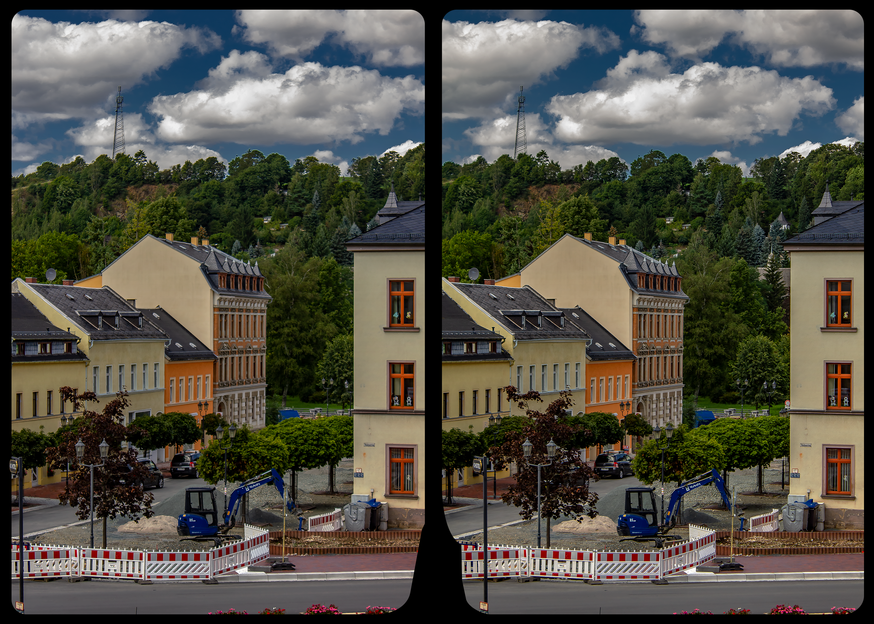
..Well messing about to create a kind of HDR look..:-)
Thanks for the end of year gift of Explore..:-)
This picture is illustrative, because it shows the line of normal ascent route. As a part of Loška stena, Vrh Krnice is a high and demanding goal. The normal route starts left below, just at the junction of Bavščica and Koritnica. Then it goes up all the way till the tree line and further across the slopes to the right. The upper climb again requires good orientation and choosing the right passages. Unfortunately, I never did that route :(
A semi-profile shot of this pheasant-tailed jacana (hydrophasianus chirurgus) provides a decent view of the bird's extended tail feathers from which it gets the first part of its name. Photographed in the margins of Parakrama Samudra Reservoir, in Polonnaruwa, Sri Lanka. More at "Colin Pacitti Wildlife Photography & Fishing Travels" - www.colin-pacitti.com.
Finger painting I did in iPad ‘Notes’ with a little post editing.
THANKS SO MUCH FOR YOUR VIEWS, COMMENTS AND FAVES, ETC.
By Bill Simone (http://www.billsimonephotography.com/)
Full details about this photo, the lighting and composite, are available from Bill at our blog on the page, billsimonephotography.com/wordpress/?p=28
Beautiful and sensuous Vanessa with a light canvas texture applied illustrative style captured by Adrian of www.luminouslight.com
CLICK TO ZOOM IN to see CANVAS TEXTURE DETAILS!
Illustrative style photo art image on canvas texture of the gorgeous beauty Sylvia captured and artistically enhanced by Adrian of www.luminouslight.com
CLICK ON THE IMAGE ONCE or TWICE: to zoom in and see the extreme detail of the canvas texture applied in Photoshop. The rendering texture techniques applied look similar to hand drawing with pencil, conte or charcoal stick (mixed media black and white).
Beauty and elegance in an illustrative pencil style on textured canvas from a photo filter conversion with manual adjusted artistic touches in refinement, captured and designed by Adrian of www.luminouslight.com
This image of a well-preserved unnamed elliptical crater in Terra Sabaea, is illustrative of the complexity of ejecta deposits forming as a by-product of the impact process that shapes much of the surface of Mars.
Here we see a portion of the western ejecta deposits emanating from a 10-kilometer impact crater that occurs within the wall of a larger, 60-kilometer-wide crater. In the central part is a lobe-shaped portion of the ejecta blanket from the smaller crater. The crater is elliptical not because of an angled (oblique) impact, but because it occurred on the steep slopes of the wall of a larger crater. This caused it to be truncated along the slope and elongated perpendicular to the slope. As a result, any impact melt from the smaller crater would have preferentially deposited down slope and towards the floor of the larger crater (towards the west).
Within this deposit, we can see fine-scale morphological features in the form of a dense network of small ridges and pits. These crater-related pitted materials are consistent with volatile-rich impact melt-bearing deposits seen in some of the best-preserved craters on Mars (e.g., Zumba, Zunil, etc.). These deposits formed immediately after the impact event, and their discernible presence relate to the preservation state of the crater. This image is an attempt to visualize the complex formation and emplacement history of these enigmatic deposits formed by this elliptical crater and to understand its degradation history.
The University of Arizona, Tucson, operates HiRISE, which was built by Ball Aerospace & Technologies Corp., Boulder, Colo. NASA's Jet Propulsion Laboratory, a division of Caltech in Pasadena, California, manages the Mars Reconnaissance Orbiter Project for NASA's Science Mission Directorate, Washington.
Wishing everyone Happy Holidays from Simone Associates Inc. :)
www.billsimonephotography.com/
Photo was composited together from several images, some shot on location and some in the studio. For more information, visit Bill's Blog after 12/22
P.S. Thanks everyone for your comments! Bill's ecstatic that you like it :)
Sensual beauty Ivory Flame in a photo illustrative style (edge lines and texture added) for artistic impression and enhanced hair. Captured and designed by Adrian of www.luminouslight.com
Beauty and sensuality with Dane Halo with illustrative edge effect from Topaz Studio captured by Adrian of www.luminouslight.com
Beauty and spontaneity in expression with glamour girl Jessica, rendered in a photo art illustrative style (hair is stylized with Topaz AI Remix, captured by Adrian of www.luminouslight.com
An illustrative moment of the 798 artist's colony in Beijing. The site is a reused ammunition plant from the war, and it has a gritty nature to it. It's odd to see the jet-set art crew hanging around in the same place as people using horses and carts to move construction materials. Horse and buggy and bluetooth headsets on the same street!
Illustrative skills as relentlessly inquiring Justice at
www.oyez.org/cases/1986/86-281
in Ray v. United States
Argued on Apr 28, 1987
Decided on May 18, 1987
Citation at 481 US 736 (1987)
Sensual elegance of the beautiful boudoir model Jennifer with an illustrative style effect captured by Adrian of www.luminouslight.com
“Marken was an island in the Zuiderzee.
For some time during the later 19th and early 20th centuries, Marken and its inhabitants were the focus of considerable attention by folklorists, ethnographers and physical anthropologists, who regarded the small fishing town as a relic of the traditional native culture that was destined to disappear as modernization of the Netherlands gained pace. Among them were Johann Friedrich Blumenbach who examined a human skull from the island which he called Batavus genuinus; and was the Belgian painter Xavier Mellery who stayed in Marken at the request of Charles De Coster. Mellery was asked to create illustrative work and delivered several intimist works.
Cornelis Lely's designs incorporated the island into a proposed Markerwaard. A partial dike, built in 1941 in the north, is the first phase of that project which was stopped by World War II.”
Read more:
Beauty and enthusiasm with a delightful young lady with bokeh backdrop captured by Adrian of www.luminouslight.com
See more photos at my other site at ...
Alyssa Wainio as Winter Goddess in vintage dress, rendered as photo art with an illustrative canvas texture and pencil drawing simulated rendering quality (half length image) captured and designed by Adrian of www.luminouslight.com
CLICK ON IMAGE TO ZOOM IN TO SEE CANVAS TEXTURE!
A capture on the edge of Featherbed Nature Reserve with almost illustrative processing at the edge of the ocean on the West Knysna head. These walkways are new and have been rebuilt since the devestating fire but above what remains are the charcoaled trees destroyed forever. The Reserve remains closed at the moment
The Great Fire of Knysna began on June 7 2017. It was a sunny Wednesday, a beautiful day that would be destroyed by evening. The first fires began in the rural area of Elandskraal, inland and far away from town itself. Though invisible, the smell of smoke was in the air.
30km away, on the other side of town, on the way to Plettenberg Bay, trees caught alight too. The West Head, along the ocean, became ablaze. The fire jumped the ocean to land on the East Head. By evening, 26 fires were raging. Knysna was not only cut off from the world but in hell as smoke gathered in the bowl that is the centre of town surround by hills.
The wind was the biggest enemy, gusting up to 120km/h, throwing burning branches hundreds of metres. These fiery catapults flew across the Salt River Valley and they landed on houses in many different places. However, those near valleys of alien pine trees faced almost certain disaster, the grooves in the earth funneling a furious wind that turned fire into a monstrous river of flame that broke on Knysna Heights.
Imagine 2000C heat, double that of a normal building fire, incinerating buildings and collapsing the soil structure of a town whose economy is based on its visitors love for nature. It would take 2 weeks and the greatest mobilisation of firefighters in South Africa’s history to get the fire under control. Even then, out in the bush, it smoldered and flared for weeks more.
22,000 hectares and over 1000 houses in the Garden Route were destroyed, most in Knysna, many uninsured. The homeless have yet to be counted but the unemployed are estimated at 2500. Animals have been greatly affected.
Fine art illustrative image of the beautiful ballerina Julia posing in style captured partly in silhouette and photo effects enhanced by Adrian of www.luminouslight.com
NEW VERSION: Glamour and beauty with the sensational Ivory Flame with "illustrative style filter applied" captured by Adrian of www.luminouslight.com
© 2016 Lyn Randle.
Please DO NOT USE, copy, sell, share or download this image. It is illegal to use someone else's images without their permission. My work is NOT for free.
Illustrative style (similar to pencil drawing) photo art captured and image artistically enhanced by Adrian of www.luminouslight.com
The history of redlining in Baltimore, Maryland, is both significant and illustrative of the broader systemic racism that shaped urban development across the United States. Baltimore played a key role in the evolution of racially discriminatory housing policies. Here’s a detailed outline of that history:
I. Early Roots of Housing Segregation in Baltimore
A.
Nation’s First Racial Zoning Law (1910)
In 1910, Baltimore became the first U.S. city to pass a racial zoning ordinance, mandating that Black residents could not move onto blocks where whites were the majority and vice versa.
This ordinance was struck down by the U.S. Supreme Court in 1917 (Buchanan v. Warley), but the mindset and intent behind it continued in subtler forms.
B.
Restrictive Covenants (1920s–1940s)
Private contracts called restrictive covenants were widely used to prevent Black people and other minorities from buying or renting homes in white neighborhoods.
These covenants were supported by real estate boards and neighborhood associations, often promoted by the Baltimore Real Estate Board.
The Supreme Court declared such covenants unenforceable in 1948 (Shelley v. Kraemer), though they remained influential.
II. Federal Redlining and the Home Owners’ Loan Corporation (HOLC)
A.
1930s HOLC “Residential Security Maps”
The Home Owners’ Loan Corporation (HOLC) created maps of U.S. cities in the 1930s to assess the risk of mortgage lending. Baltimore’s map (1937) is a stark example.
Neighborhoods were color-coded:
Green (“Best”) – Wealthy, white, new suburbs.
Blue (“Still Desirable”)
Yellow (“Definitely Declining”)
Red (“Hazardous”) – Usually older, inner-city areas with Black or immigrant populations.
The red areas were denied access to mortgage loans—this is where the term “redlining” comes from.
B.
Impact on Baltimore
Virtually all Black neighborhoods in Baltimore were redlined.
Black families could not access federally backed home loans, driving disinvestment in those communities.
The map institutionalized racial segregation and underdevelopment.
III. Post-WWII Suburbanization and Segregation
A.
White Flight and Suburban Growth
Federal policies like the GI Bill and FHA loans enabled white families to move to suburban developments (like Levittown, MD, and others), while Black families were excluded.
Baltimore’s Black residents were confined to aging, overcrowded inner-city areas.
B.
Urban Renewal and Displacement
“Urban renewal” in the mid-20th century (especially in the 1950s–70s) demolished Black neighborhoods in the name of progress (e.g., highway construction, public housing).
Examples: Old West Baltimore was cut off by the construction of Highway 40 (the “Highway to Nowhere”), displacing thousands.
Public housing projects like Lexington Terrace and Murphy Homes became concentrated zones of poverty.
IV. Civil Rights Era and Legal Challenges
A.
Protests and Activism
Baltimore was active in the Civil Rights Movement. Activists fought against housing discrimination, school segregation, and employment inequality.
B.
Lawsuits and Policy Changes
In the 1970s and 1980s, lawsuits challenged discriminatory housing policies.
Example: The Thompson v. HUD case (filed in 1995) accused the federal government of continuing segregation through public housing policy. The court ruled that HUD had failed to affirmatively further fair housing.
V. Long-Term Consequences of Redlining
A.
Persistent Racial Wealth Gap
Redlining kept Black families from building generational wealth through homeownership.
Today, Black Baltimoreans are far less likely to own homes than white residents, and property values are often lower in formerly redlined neighborhoods.
B.
Health and Education Disparities
Redlined areas today correlate with poor health outcomes, underfunded schools, and environmental hazards.
Lack of investment has led to deteriorating infrastructure and social services in those communities.
C.
Modern-Day Segregation
Despite the end of formal redlining, racial segregation in Baltimore remains stark.
Neighborhoods often still reflect the 1937 HOLC map in terms of racial demographics, income, and opportunity.
VI. Current Efforts and Reckoning
A.
Mapping Inequality and Public Awareness
Projects like the “Mapping Inequality” initiative (University of Richmond) have digitized HOLC maps, helping visualize historical redlining’s legacy.
Baltimore organizations, universities, and city government have launched equity-based planning and housing justice initiatives.
B.
Equity and Reparative Policy
Proposals include affordable housing, reinvestment in marginalized neighborhoods, tenant protections, and reparative justice approaches.
In 2021, Baltimore acknowledged racial zoning and redlining’s role in creating inequality and pledged to address its effects.
Further Reading & Resources
Ta-Nehisi Coates, Baltimore native, has written extensively on housing discrimination and racial injustice.
The Color of Law by Richard Rothstein includes detailed discussion of Baltimore’s role.
“Baltimore: A History of Race and Real Estate” – online archives and maps from Johns Hopkins University and Baltimore Heritage.
a fanzine of my illustrative work is out now! it's called 'A Quiet Stage' and was published by Atem Books, an independent publishing house based in Catalunya, Spain. so if you want to buy one then you can do so through Atem Book's website (link below). :)
www.atembooks.com/products-page/little-books-fanzines/a-q...
- Bodies compatible:
• Kupra
• Legacy
• Maitreya
• Reborn
» About our products:
Our vendors (or hud) photos are morphs, illustrative, but using at the same time the real product.
* WHERE IS THE DEMO?
So we dont have demo but we make availablei the mesh in front of the vendor showing the nail on SL, please visit the store to chek it out.
* ORIGINAL TEXTURES!!
I DON'T ACCEPT ANY FORM OF PLAGIUM and we are against any kind of work that does that!!!
#SayNoToPLAGIUM
Finally, Thank you for reading this far and trusting in our work. We are extremely grateful !
THANK YOU! ❤
-Instagram: www.instagram.com/sl.beez/
-Marketplace: marketplace.secondlife.com/stores/239981
-Mainstore: maps.secondlife.com/secondlife/Miami%20City/217/61/895
An illustrative/conceptual image that holds personal meaning and attempts to communicate the end of my corporate days and jumping free from the expectations and poisonous influences of western society. And where the water beneath will carry me onto a new more fulfilling path.
Saturday evening in Florence. I decided to go with an illustrative look in this photo. You can see thunderheads building in the distance over the Superstition Mountains.
Preston Temple. I only managed to get a couple of shots because a security man from the church didn't really like me taking pictures. Such a shame because it's a beautiful building. It got a 1st place in the PDI section of the "Illustrative" competition at St Helens Camera Club 12/11/18.
Musée d'art contemporain du xxie siècle de Kanazawa
Musée d’art contemporain du xxie siècle
Image illustrative de l'article Musée d'art contemporain du XXIe siècle de Kanazawa
Le musée d'art contemporain du xxie siècle de Kanazawa est un musée d'art contemporain situé à Kanazawa dans la préfecture de Ishikawa au Japon. Le musée a été conçu par les architectes japonais Kazuyo Sejima et Ryue Nishizawa du cabinet d'architecture SANAA en 2004. En octobre 2005, un an après son ouverture, le musée avait déjà enregistré 1 570 000 visiteurs.
La collection du musée d'art contemporain du xxie siècle de Kanazawa se concentre sur les œuvres produites depuis 1980 et produite de préférence in situ en vue d'être « étroitement associé à la zone de Kanazawa ».
La collection du musée comprend notamment les œuvres des artistes suivants :
Francis Alÿs
Matthew Barney
Tony Cragg
Olafur Eliasson
Leandro Erlich
Isa Genzken
Kojima Hisaya
Gordon Matta-Clark
Peter Newman
Carsten Nicolai
Giuseppe Penone
Gerhard Richter
Murayama Ruriko
Hiraki Sawa
Atsuko Tanaka
James Turrell
Patrick Tuttofuoco
Anne Wilson
Suda Yoshihiro
fr.wikipedia.org/wiki/Musée_d'art contemporain_du_xxie_siècle_de_Kanazawa.
___________________________________
The museum was designed by Japanese architects Kazuyo Sejima and Ryue Nishizawa of the architectural office SANAA in 2004. In October 2005, one year after its opening the Museum marked 1,570,000 visitors.
The Museum is located in the center of Kanazawa, near Kenroku-en garden and the Ishikawa Prefectural Museum of Art. The building has a circular form, with a diameter of 112.5 metres. This shape aims to keep the appearance of the overall building volume low, to mitigate the scale of the project and allows access from multiple points of entry. The transparency of the building further manifests the wish to avoid the museum being perceived as a large, introverted mass.
The building includes community gathering spaces, such as a library, lecture hall, and children’s workshop, located on the periphery, and museum spaces in the middle. The exhibition areas comprise numerous galleries with multiple options for division, expansion, or concentration. The galleries are of various proportions and light conditions – from bright daylight through glass ceilings to spaces with no natural light source, their height ranging from 4 to 12 metres. The circulation spaces are designed to make them usable as additional exhibition areas. Four fully glazed internal courtyards, each unique in character, provide ample daylight to the center of the building and a fluent border between community spaces and museum spaces.
The collection of the 21st Century Museum of Contemporary Art, Kanazawa is focused on works produced since 1980 that "propose new values".[3]
Artists in the collection are encouraged to produce site-specific installations that become "closely associated with the Kanazawa area".[3]
Artists in the permanent collection include; Francis Alys, Matthew Barney, Tony Cragg, Olafur Eliasson, Leandro Erlich, Isa Genzken, Kojima Hisaya, Gordon Matta Clark, Peter Newman, Carsten Nicolai, Giuseppe Penone, Gerhard Richter, Murayama Ruriko, Hiraki Sawa, Atsuko Tanaka, James Turrell, Patrick Tuttofuoco, Anne Wilson and Suda Yoshihiro
en.wikipedia.org/wiki/21st_Century_Museum_of_Contemporary...