
WAL*MART SUPERCENTER
SET 1 – West Point Wal-Mart
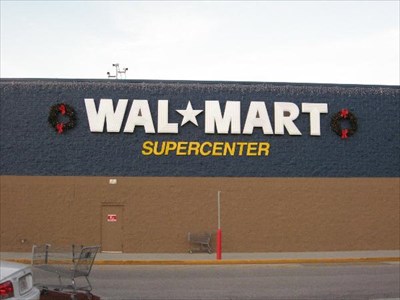
With this style of Wal-Mart signage so rare these days – heck, practically nonexistent, really – naturally I made sure to photograph it to the best of my ability. This shot is a super straight-on close-crop, and while it might be a bit much, I’d rather have it than not, lol.
I always liked the etchwork (?) on the WAL-MART lettering, and I liked seeing the SUPERCENTER lettering below that as well, although I’ve gotta admit, it would look more at home to me in the color yellow, haha. Also, I hate to burst anyone’s bubble on this if this is one of those things you won’t be able to unsee after I point it out, but… that “S” in “Supercenter” was installed incorrectly :/ An amazingly common mistake for any signs that contain the letter S, I tell ya…
Note also that a slightly different font was chosen for the word “Supercenter” from what’s shown in that linked image: I think that was a change that was made only in the last few years of this logo’s existence, prior to the switchover to the spark logo, condensed wordmark, and elimination of the Supercenter name.
(c) 2022 Retail Retell
These places are public so these photos are too, but just as I tell where they came from, I'd appreciate if you'd say who :)
WAL*MART SUPERCENTER
SET 1 – West Point Wal-Mart
With this style of Wal-Mart signage so rare these days – heck, practically nonexistent, really – naturally I made sure to photograph it to the best of my ability. This shot is a super straight-on close-crop, and while it might be a bit much, I’d rather have it than not, lol.
I always liked the etchwork (?) on the WAL-MART lettering, and I liked seeing the SUPERCENTER lettering below that as well, although I’ve gotta admit, it would look more at home to me in the color yellow, haha. Also, I hate to burst anyone’s bubble on this if this is one of those things you won’t be able to unsee after I point it out, but… that “S” in “Supercenter” was installed incorrectly :/ An amazingly common mistake for any signs that contain the letter S, I tell ya…
Note also that a slightly different font was chosen for the word “Supercenter” from what’s shown in that linked image: I think that was a change that was made only in the last few years of this logo’s existence, prior to the switchover to the spark logo, condensed wordmark, and elimination of the Supercenter name.
(c) 2022 Retail Retell
These places are public so these photos are too, but just as I tell where they came from, I'd appreciate if you'd say who :)